
Improper initial resizing of publish in iPad using Captivate versions 8 and 6
I published a screen recording checking off swf and HTML 5 publishing. I do not click the checkmark for 'fill browser screen'. I then place the publish on the web and look at it from Desktop, iPhone and iPad.
THE GOOD
Desktop - the publish horizontally fills the screen. I resize the browser and the published object resizes with the browser.
iPhone - The publish immediately works in any orientation.
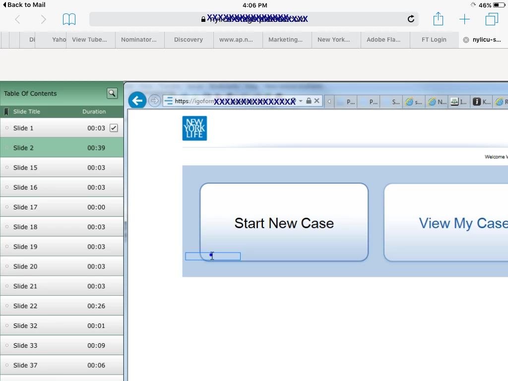
THE STRANGELY BAD
IPad - if I open it in portrait or landscape, the publish is larger than the safari screen, you see most, but not all of the publish, see below. If I then rotate the iPad to the other orientation, the publish snaps to horizontally fill the screen. Then I rotate the iPad back to the origional orientation, and it now horizontally fills that screen properly. Weird!
Below is shows the initial iPad launch. Any tips to resolve this so the publish always re-sizes to the browser size?
 AdChoices