 Adobe Community
- Home
- Acrobat
- Discussions
- Re: Adobe Acrobat DC (64) - fail due changed Windo...
- Re: Adobe Acrobat DC (64) - fail due changed Windo...
Adobe Acrobat DC (64) - fail due changed Windows 11 default font

Copy link to clipboard
Copied
A cautionary tale - unless someone hopefully has a solution. Changed the windows default font which caused Acrobat DC menus to go ineligible. Printing, for example, did not show 'print menu' just shut-down. 'Properties' showed menu frame but ineligble content. Possibly due specific font selection but after a lost day disinclined to re-test


 7
Replies
7
7
Replies
7

Copy link to clipboard
Copied
Hi Susan!
Thank you for reaching out.
Could you please share the screenshot to understand it better?
Share the current version of the application you are using.
It would be helpful if you could share the screen recording.
Thanks,
Meenakshi
Copy link to clipboard
Copied
Hi Meenaskshi
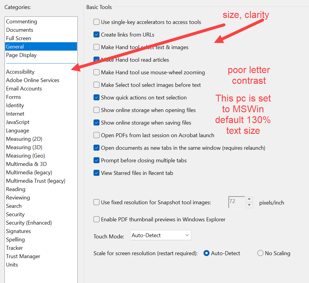
No I don't have a screenshot, could have but didn't (Acrobat always beats me at something). The windows default font is Segoe UI and it has 12 font faces. Via the registry I changed it to a font that in retrospect had only one font face. The outcome might have been different with another font with more faces. The reason I wanted to do it was, as others have mentioned, the poor clarity of the Adobe menus. The smallness, thinness, contrast of the menu lettering, incl. not being dark against an already slightly greyed background. I reinstated the original font and that restored Acrobat. I do have the change files I could re-test for you. Yesterday I set the Acrobat view for high contrast (just cos) but that doesn't change the menu views. Nor does my default 130% text size change in the menu view.

Copy link to clipboard
Copied
Susan25225442ssxz, I don't see any difficulty in reading your screenshot or in Acrobat in general.
[edited by moderator]
Copy link to clipboard
Copied
I agree with you re the captured screenshot. It does not take into account the monitor view. Which is no doubt affected by the monitor spec, lighting and so on. A photo would better present but glare and lighting impede. The program has options for visual contrast setting wrt documents, but not menus.
Copy link to clipboard
Copied
Thank you for sharing the screenshot.
As JR Boulay mentioned, the font looks fine. It seems to be as designed.
If possible, you may share the screen recording showing the changes.
Also, share the Acrobat version on the machine.
Thanks,
Meenakshi
Copy link to clipboard
Copied
I have already agreed the screen capture is as should be. I changed back to the original default windows font. The capture was NOT a changed front. I wont't be changing the system font again in a hurry 🙂
My point now is, whilst it is possible to make accessiblity/readability changes for how Acrobat presents documents for working on, or reading, it seems not possible to improve the visual aspects of Acrobat menus in a simliar way.
I also made the point that screen captures are from the inside out. Only a photo or similar could show how the screen really appears to the viewer (affected by screen etc). Acrobat DC (64) by the way.

Copy link to clipboard
Copied
Consolas font is the only one really supported on windows. This is not android. Just like in MacOS where the only supported font is New York.

 AdChoices