Learn about new Acrobat
Our community of users opens more than 300 billion PDFs every year in Acrobat and processes more than 8 billion digital signatures. Designing a new Acrobat, an application so ubiquitous that it's used by more than 100 million users each day, presents unique challenges.
Even the simplest of changes can have an enormous impact on a wide range of users taking on everyday tasks.
So why change anything? The reason was simple: Users were having difficulty finding and using the tools in Acrobat’s viewer (the landing page that opens on launching a PDF). To create an exceptional experience and a flexible framework for a product like Acrobat, we listened to our users in our community and considered every platform, at every size, for every tool to develop the new Acrobat experience.
The new Acrobat is now available to all users. We will continue to engage with our users to evolve our product and address any concerns they may have. Meanwhile, here is a quick overview of this journey.
Why have we made changes?
We had an overwhelming amount of user behavioral data and qualitative research that helped us identify issues in the Acrobat user experience.
- Discoverability and fluidity. We needed to help users discover the features they couldn’t find and showcase the features they didn’t know existed. Most importantly, we had to remove the friction between tasks so users could effortlessly move between them (for example, someone viewing comments in a PDF should also be able to easily edit the text without interrupting their workflow).
- Complexity. The numerous tools and workflows in Acrobat were scattered across various surfaces, which made it difficult for users to find them easily. Also, our UI looked cluttered, with several options in our top navigation. Finding value under multiple tools required users to switch between multiple tool categories.
- Disconnected experience. Users had to reorient themselves each time they switched devices, which made the experience across platforms feel disjointed. We needed to create an experience that felt consistent and ensured continuity between platforms.
What has changed?
To address the concerns above, we envisioned a flexible Acrobat experience. We conceptualized a framework to support this vision and ensured that our holistic knowledge of tools became the backbone of the improved design.
Megaverbs
To solve the problem of tool discoverability, we logically reorganized more than 250 tools across Acrobat according to their functionalities and significance. We started by looking at what users worked with Acrobat for, and organized those actions into key workflows (for example, “commenting and editing,” “signatures and signing,” “organizing and combining”) and then listed tasks under each of them.
The workflows, which we called “megaverbs,” changed our design approach from one focused on multiple individual tasks (like “organizing pages,” “editing text,” and “adding images”) to one focused on an entire workflow (like “edit” or “sign”).
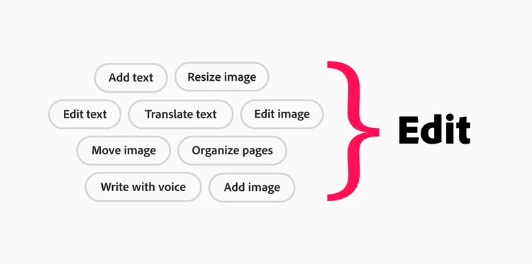
A turning point in the design process was our “megaverbs” concept, consolidating multiple workflows under a single action.
Feature grouping
Keeping in mind the user’s tendency to scan items from left to right, we positioned the megaverbs and all PDF-related tools in the actionable area towards the left side of the document, and grouped supporting tools such as navigation, zoom controls, page information, and comments to the right. This allows us to be flexible with our framework to create different experiences on various screens.
While rearranging the groups, we tried to retain the familiar functionalities of tools and workflows to make sure the transition wasn’t too jarring.
We carried this tool arrangement forward across all Acrobat surfaces (desktop, web, tablet, and mobile) to ensure an optimized, intuitive, and purposeful experience across platforms.
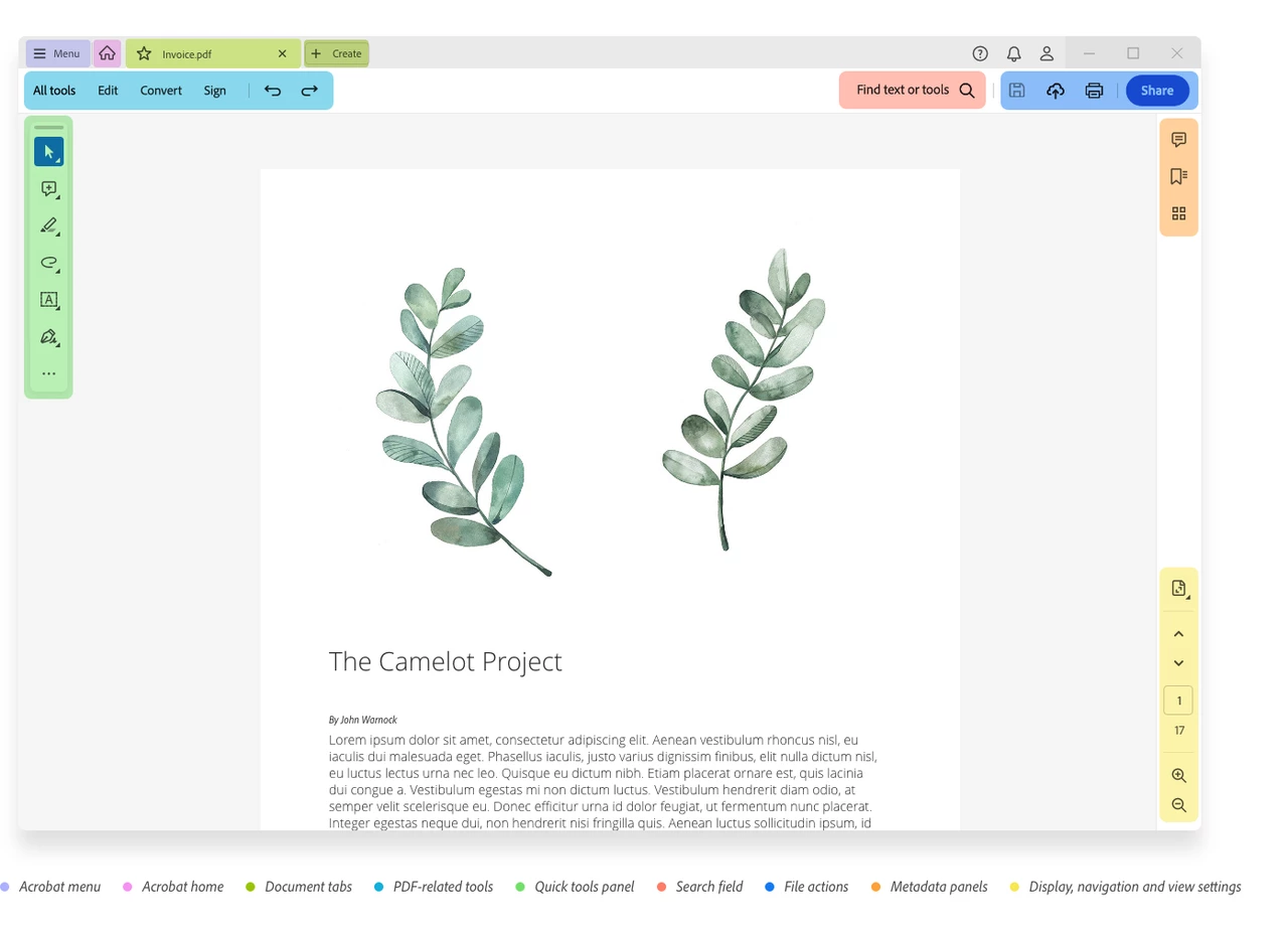
The new desktop interface for Adobe Acrobat on Windows
The revised framework incudes a few experience enhancements worth highlighting.
- The Acrobat (hamburger) menu houses the most-used actions in one place. On Windows, it helps to combine all the options currently available under the existing File, Edit, and View menus. However, on macOS, the File, Edit, and View menus continue to appear separately.
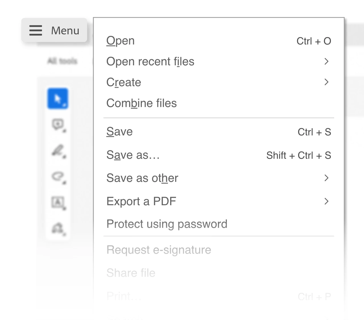
The Acrobat menu
- The All tools panel serves as a single-access touchpoint to all available tools within Acrobat.
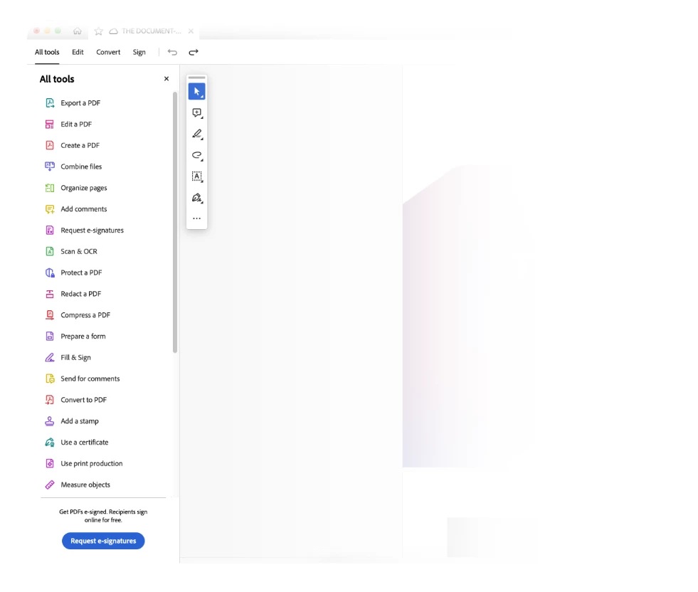
The ‘All tools’ panel
- The top bar separates all PDF-related tools on the left and places file actions (including search, save, print, and share) toward the right.
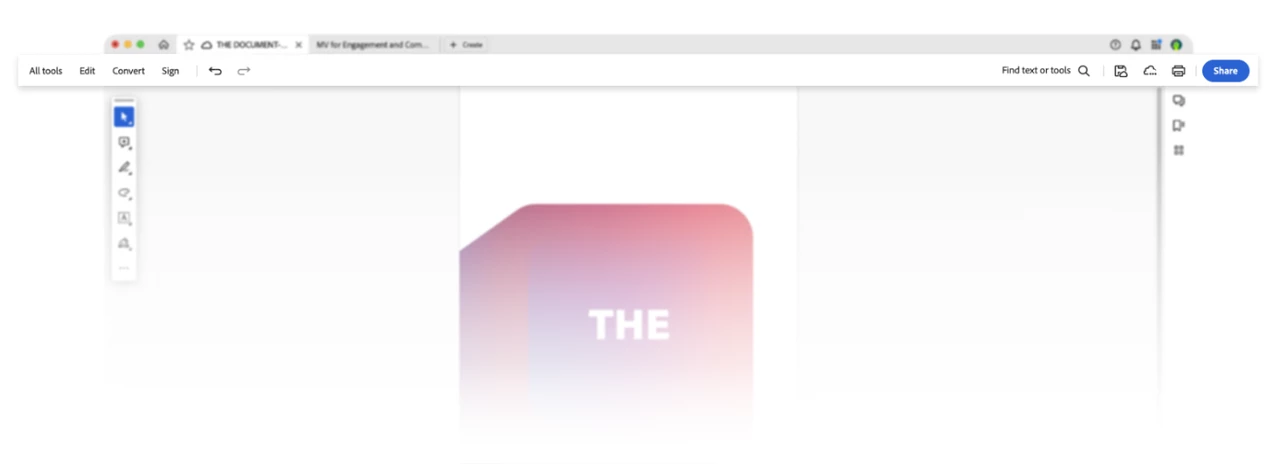
The top bar
- The quick tools panel is a floating widget that can be customized for specific workflow requirements, such as commenting on, annotating, and filling out forms.
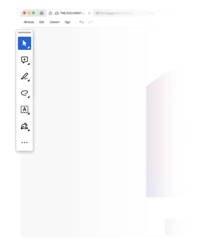
The quick tools panel
- The search field allows you to search for editing tools as well as text content within the document.
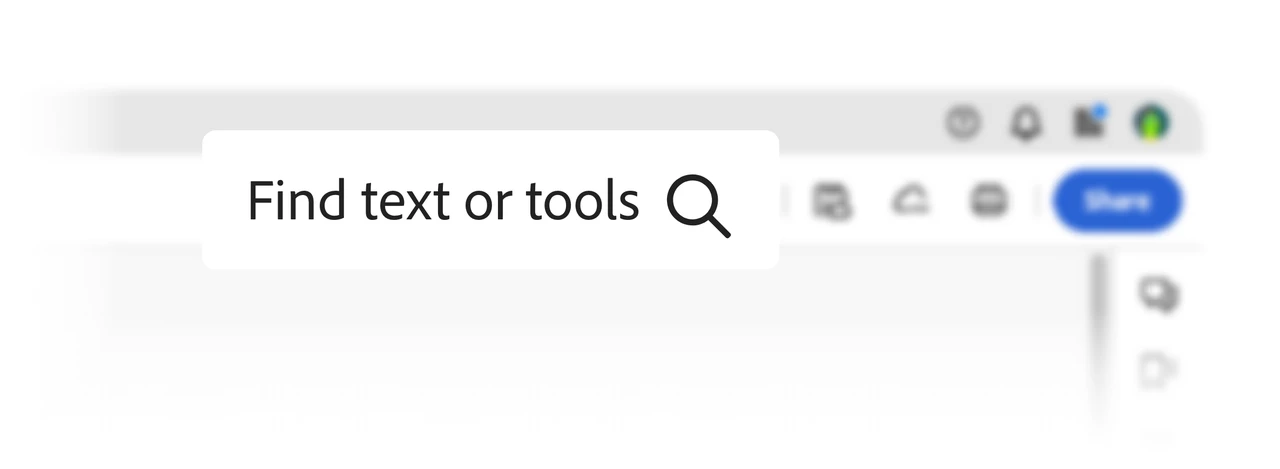
The search field
- The right rail is divided into top and bottom sections. From the top, you can choose to bookmark, view, or navigate pages. From the bottom, you can access zoom settings and viewing options. Both areas are customizable, so you can keep your preferred options persistent.
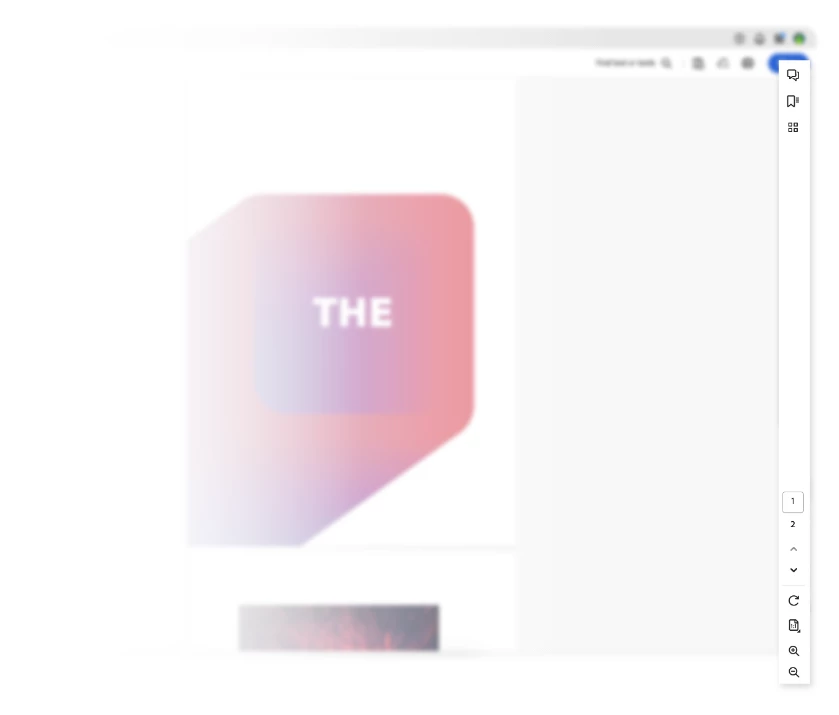
The right rail
- The document pane displays the PDF page in the center at an optimal zoom level. Depending on the interaction with the content type, there will be contextual menus that pop up to quickly allow you to perform actions without having to search for the right tool.
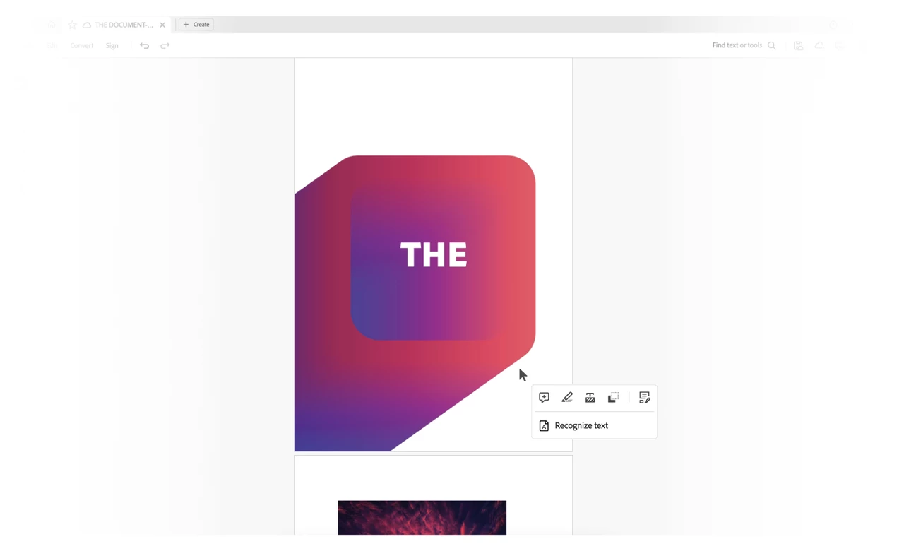
The document pane
What’s next
While working towards improving the user experience, we continue to listen to all the feedback we are receiving from our community. Some of the improvements you’ll see in our upcoming releases are:
- Ability to customize the user interface
- Soon, you will be able to drag the floating quick tools bar anywhere within the viewer. This will prevent it from overlapping with the document.
- Ability to pin commonly used tools for easy access.
- Access to the most commonly used actions and tools
- Quick access to undo and redo tools on the top bar.
- Easy access to all page display, navigation, and zoom tools (such as 2-page view, 2 pages with scrolling, marquee, and dynamic zoom) from the bottom right menu.
- Improved discovery of common file-level actions from the menu, such as save as, print, and password-protect.
We are committed to improving the user experience by further simplifying workflows and introducing more customization options for our users. We greatly value your feedback and look forward to hearing more about how we can improve the experience.
Opting out of the new design
The new experience is an exciting step forward for Acrobat's future. But if it doesn’t suit your needs, you can still revert to the previous experience.
- Windows: Select the hamburger menu, and then choose Disable new Acrobat.
- macOS: Go to View > Disable new Acrobat.
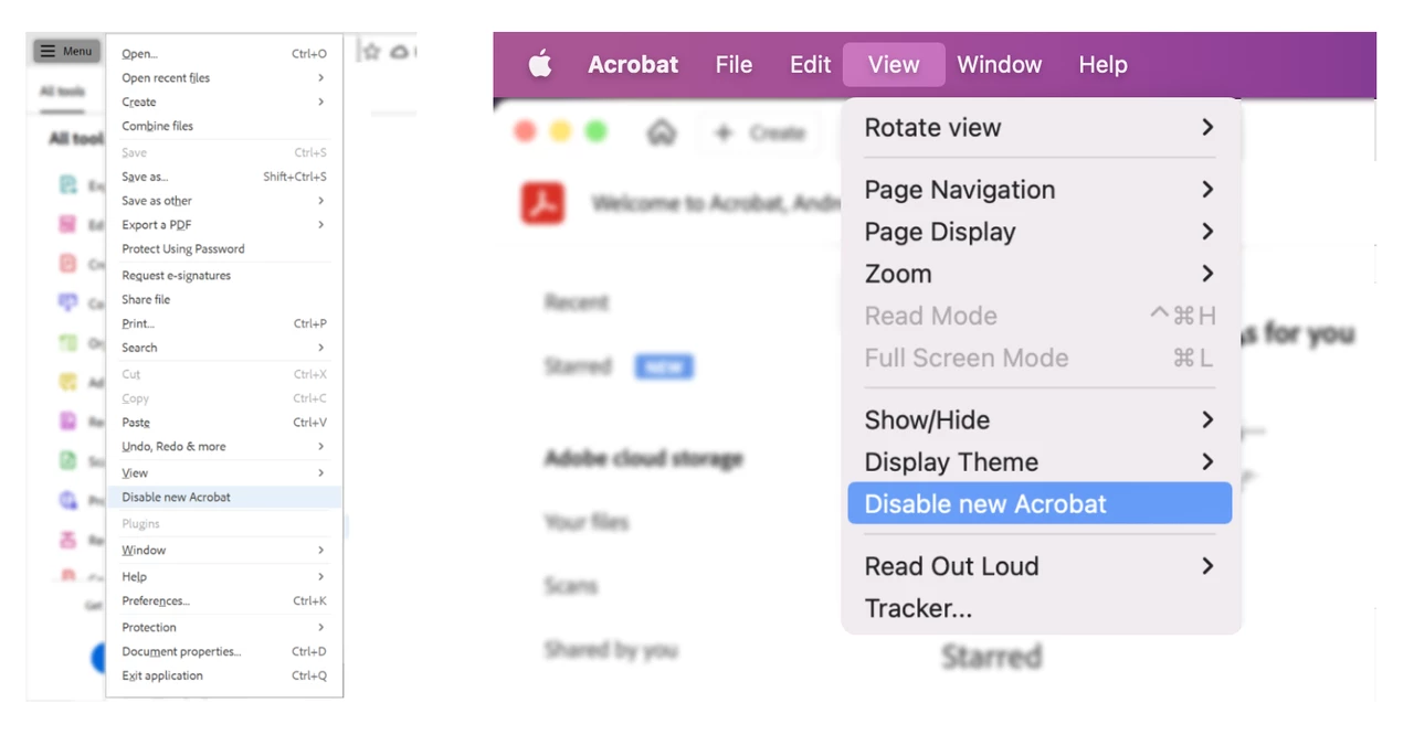
How to disable the new Acrobat
If you later decide you’d like to opt back into the new experience, you can toggle it back at any time.
- Windows: Select the hamburger menu, and then choose Enable New Acrobat.
- macOS: Go to View > Enable new Acrobat.
