- Home
- Acrobat
- Discussions
- Re: Font looking jagged in certain areas, and with...
- Re: Font looking jagged in certain areas, and with...
Font looking jagged in certain areas, and with certain versions of Acrobat
Copy link to clipboard
Copied
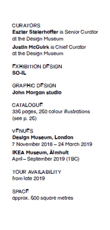
We have a PDF brochure that we'd like to send out, however the font used in the PDF looks very bad/jagged in certain areas. Here's a screenshot:

It looks perfectly fine in Apple Preview. It also looks fine in the Pro version of Acrobat (on a 5k iMac). However, it looks like it does in the attached screenshot in free versions of Acrobat. The screenshot was taken on a Windows PC.
We've tried almost everything – exporting the PDF in various resolutions, checking the Page Display settings in Acrobat (optimised for laptop/LCD screens), etc.
If anyone has a solution out there, please do let me know!!
Copy link to clipboard
Copied
My first guess is that you didn't embed the font into the document and that the Mac has a font that the PC does not have and Acrobat is doing the best it can to create what it can.
What is the application that created this document?
How are you creating the PDF?
Copy link to clipboard
Copied
Hi gary_sc, thank you very much for your reply. The PDF was created using InDesign and was exported for screens (though even a hi-res version optimised for print likewise looks bad).
Regarding fonts, I checked the preferences on a free version of Acrobat on a Windows PC and it says the fonts are embedded (Embedded Subset).
What else do you think the problem could be? Is it just the case that it's fated to look terrible on certain (namely free) versions of Acrobat, which would be such a shame?
Thanks again.
Copy link to clipboard
Copied
Hi Murmurous,
Whew, I'd not want to accept that as my brochure to be sent out. I'm really struggling here to figure out why it doesn't appear proper on Adobe Reader but fine in Acrobat Pro.
One of the things that particularly stands out is the non-uniform alignment of the fonts. They jump high, low and in-between.
The fact that you are starting in InDesign means that it's not a resolution issue that one might encounter if you scanned the document at too low a resolution.
Things to try (and yes I'm swinging at fast balls here): try exporting the document as an Interactive PDF (even though there's nothing interactive within the document).
Also, I do not know if there are any images in your document, but keep the resolution at nothing less than 300ppi. There should be no reason for this but just trying to look for loose ends.
Let me know,
Copy link to clipboard
Copied
To be very clear, there is no difference in how Adobe Reader and Acrobat display PDF in general or text within same.
This type of yucky text almost looks like the result of transparency flattening. Perhaps this text is interacting with non-opaque (i.e. transparent) content?
We really can't assist unless we can analyze the PDF file in question. If you can post the PDF file (or even just the page in question), we might be able to give you a definitive response.
- Dov
Copy link to clipboard
Copied
Thanks a lot both for your replies. Please find linked below a page from the PDF in question:
And no, the text is merely in a text box with no other elements – transparent or otherwise – interfering with it.
Thanks again!
Copy link to clipboard
Copied
Thanks for providing the file.
In examining the file itself, I have found nothing structurally wrong with the PDF file or the fonts used. The fonts are all properly embedded in the PDF file. (That kills one possibility as to the cause of the problem!)
Nor is there any transparency used that could cause artifacts looking anything like what you have shown in your screen shot. (That kills another good guess at the cause of the problem.)
I've tried viewing the PDF file on a number of systems that I have access to including not only MacOS, but Windows and iOS (using our Adobe Acrobat Reader for iOS) and at various magnifications. I cannot duplicate the yuckiness that your screen shot displays.
In closely examining the text, both in the area shown to have issues on your screen where both fonts (regular and bold) are at 7.5 point as well as in the text to the right of that area in 12 point (same two fonts), it does appear that the baseline of all the glyphs do not exactly match – that is part of the design – but that should not cause the symptoms you are seeing.
And as I said, there is absolutely no difference between the text rendering of Acrobat Pro and Acrobat Reader.
Exactly what version of Adobe Acrobat Reader are you using on the systems on which you are seeing this anomaly? And what is the screen resolution of those systems?
Bottom line is that we have eliminated some potential issues, but not the root cause … yet!
- Dov
Find more inspiration, events, and resources on the new Adobe Community
Explore Now