 Adobe Community
Turn on suggestions
Auto-suggest helps you quickly narrow down your search results by suggesting possible matches as you type.
Exit
- Home
- Adobe Fonts
- Discussions
- Font strange - the Fenway Park JF Designed by Jaso...
- Font strange - the Fenway Park JF Designed by Jaso...
0
Font strange - the Fenway Park JF Designed by Jason Walcott. From Jukebox.
Community Beginner
,
/t5/adobe-fonts-discussions/font-strange-the-fenway-park-jf-designed-by-jason-walcott-from-jukebox/td-p/10648537
Oct 03, 2019
Oct 03, 2019
Copy link to clipboard
Copied
Community guidelines
Be kind and respectful, give credit to the original source of content, and search for duplicates before posting.
Learn more
LEGEND
,
LATEST
/t5/adobe-fonts-discussions/font-strange-the-fenway-park-jf-designed-by-jason-walcott-from-jukebox/m-p/10654948#M1219
Oct 07, 2019
Oct 07, 2019
Copy link to clipboard
Copied
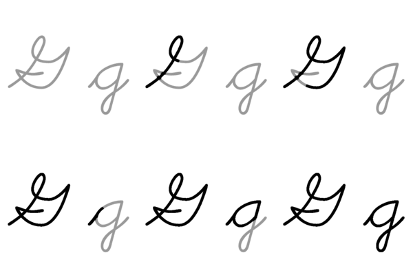
That is the font as designed, you can see it on https://fonts.adobe.com/fonts/fenway-park-jf - change the sample text to compare "G" and "J". The graphic below is interesting, it's from https://en.wikipedia.org/wiki/G and shows a handwritten form of G. Seems like the font has a stylisation of this.
Community guidelines
Be kind and respectful, give credit to the original source of content, and search for duplicates before posting.
Learn more
Resources
Troubleshooting
Helpful links
Fonts Licensing
Copyright © 2023 Adobe. All rights reserved.
