- Home
- Adobe Learning Manager
- Discussions
- Mobile view (Prime) - supposed to look like this?
- Mobile view (Prime) - supposed to look like this?
Mobile view (Prime) - supposed to look like this?
Copy link to clipboard
Copied
Hi, all
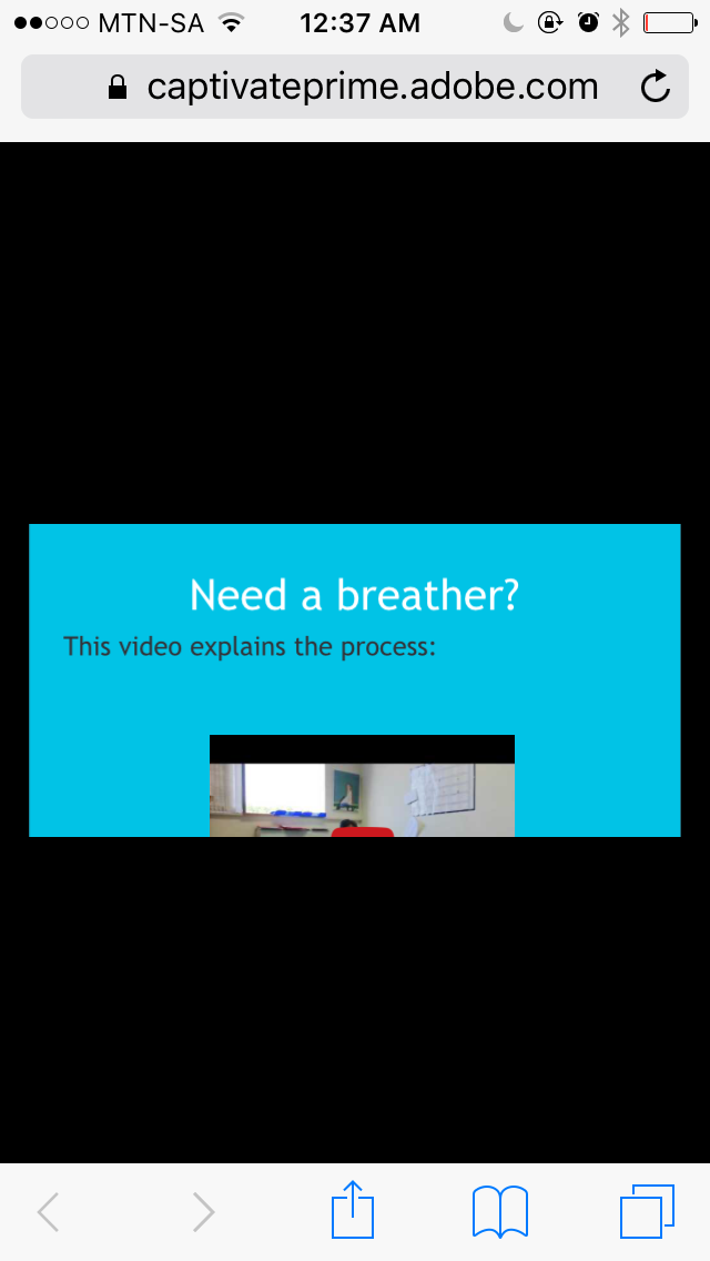
I have designed a responsive module in Captivate 9, with four mobile breaking points (tablet portrait and landscape; the same for phones). All previews look normal (everything fits onto the slide in all orientations) but when I publish in Prime and view on an iPhone, the portrait view looks like this. Is the content window supposed to be that small (it means the user has to scroll up and down to see all the content)?
Thanks in advance for your help,
Liesl

Copy link to clipboard
Copied
Hi Liesl,
It think may be Fluidic payer in Prime is not responsive and hence you see scroll in mobile portrait view. Can you try creating a blank project and make it SCORM compliant > Publish to HTML5 and check Scalable HTML Content while publishing and then manually upload it to prime and check on Mobile and see if you still see the scroll?
Regards,
Mayank
Copy link to clipboard
Copied
Hi Liesl,
Prime's fluidic player itself is adaptive, rather than responsive. This is largely because the mobile apps supported for iOS and Android are designed to be run as horizontal (landscape) iPad and Android tablet apps. In June we are adding support for playback (and download) in mobile phones - with support for mobile phone screen profiles. Think of the fluidic player like a kind of wrapper - it supercedes the layout changes of responsive project designs because it has expectations about how your learners will encounter the courses.
This will - as i mentioned above - change somewhat in June as the mobile phone / device options expand to support the smaller screens. It may also help to understand that Prime's fluidic player also adapts to create a custom menu control set, and additional tools based on the type of content. pdf / word docs and powerpoints include scaling, page layouts and scroll bars.
All that said, we'd like to hear about the speciific projects that you are rolling out. What kinds of things are you building? What kind of consumption patterns do you expect on mobile phones etc. We appreciate your ideas and feedback.
--Allen