 Adobe Community
- Home
- Adobe XD
- Discussions
- Controlling scaling, spacing and alignment on chil...
- Controlling scaling, spacing and alignment on chil...
Controlling scaling, spacing and alignment on child elements within components
Copy link to clipboard
Copied
Hi all,
I have a few general questions about a few UI elements I've designs and the best way to control them in components. I'll attach some screenshots so you can see how the UI looks which might help you understand my explanation/what I'm asking (if it's possible).
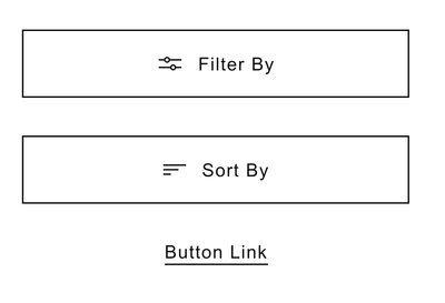
1. If I have an icon + text within a button (both grouped in a folder within component) is it possible so that when you edit the text, the group automatically remain centred? Or is it just a case of changing the text to what is needed and then manually realigning again? - See Filter/Sort Button screenshot
2. I have a piece of text with a line drawn underneath it, is it possible so that when the text is changes the line increased/decreases in size to match the width of the text. So it essentially always spans the width of the component. - See Filter/Sort Button screenshot
3. I have a 'tag' element which is setup so that when the text is editted background stretches with the text, keeping the padding I've set (which works great). However I display the tags in a row like the example screenshot. So I was wondering is it possible to also have the group of tags maintain the space inbetween when the text length is changed, rather than changing the labels and then needing to nudge the components around again so spacing is consistent?- See Tags "All Artciles" screenshot.
4. My typography assets use colours set in the colour assets. When I updated the colours, the font colours didn't automatically update. I needed to do that manually - is that right?
5. On the buttons (shown in screenshots) the width of theses various from having 15px, 30px, 60px horizontal padding - as well as 100% width of it's container. What do people think about the best way to manage this. As having components for each seems a bit OTT and could be difficult to manage/find stuff if you're adding components for every little thing due to you not being able to create sub-folders to organise assets?
I know these seem like pretty mundane questions but I'm trying to setup a Design System for the first time and want to see what is possible. I can't find away to do the above (the first 4 questions anyways) so I just thought I'd check with the community incase I'm missing something!
I do have a final query actually. I'd created layouts from components in a master Cloud doc - but now I've opened my XDs and all the components have converted to folders ...how could that have happened?! I don't suppose there's a way to automatically add a component you've created locally to the master Cloud doc - or is it just a matter of copy/pasting it into the Cloud doc, saving, going back to your local doc, updating assets and then dragging it back out to replace the original element?
Sorry - a lot to unpack here but thanks in advance for any help!
Thanks,
Steve
Copy link to clipboard
Copied
After a bit more playing around a believe I've maybe solved 2 of the issues (2 + 3)
3. I've realised then when the length of text is changed within a block (tag), the blocks to the right will automatically move to the along if I use the new Stack feature. However you can't control how the group is aligned (centred for example). You need to edit all the content then drag to realign manually.
2. Now this is a funny one, I've got this to work but I think it's a bit of a hack...
If you have a component with a line + text, the line will now scale with the text. You need to resize it manually. However if you draw a rectangle and place text over it. Then make it a component and resize the rectangle so it has 1px height - that works! I feel like if I use this it may stop working in future though as I doubt this is intentional behaviour?
The reason I say that is if you have a text element and a 1px tall rectangle, THEN make it a component ...the above won't work. It only works if it's a block the height of the text before making it a component - weird?
1. In regards to keeping icon + text centred in a button when text length is changed. I don't think this is possible unless you set fixed padding to the element. I can live with that.

