 Adobe Community
- Home
- Adobe XD
- Discussions
- Re: A pinned footer can easily be constructed in a...
- Re: A pinned footer can easily be constructed in a...
Copy link to clipboard
Copied
My client has many stakeholders, with a mix of Android and Apple phones. My prototype looks fine on Samsung S7 but has white padding on both sides when viewed on iPhone 7. My XD version is 24.4.22.1. My current artboard width is 360. I noticed that the tutorial, which looked fine on both phones, is 375. So I'll try changing to that width. But I hoped that since I have Responsive Resize enabled, the iPhone's screen would have been automatically filled. What am I missing please? Appreciate the help.
 1 Correct answer
Unfortunately XD prototype does not scale responsively so you cannot have one artboard that caters for every possible viewport sizes.
Copy link to clipboard
Copied
Unfortunately XD prototype does not scale responsively so you cannot have one artboard that caters for every possible viewport sizes.
Copy link to clipboard
Copied
Got it, thank you!
Copy link to clipboard
Copied
XD is for creating designs – not builds.
Just whip up some key sizes (depending on the design, not device sizes), and leave the technical part of responsiveness to the front-end developers and their testing.
Copy link to clipboard
Copied
Thanks, can you please clarify "depending on the design, not device sizes?" Would a typical scenario be to find out what phones the key stakeholders are using, and create versions sized for their phones?
Copy link to clipboard
Copied
I once did a karaoke video about this matter...
https://www.youtube.com/watch?v=4r2yVNeAFPc
So you need to rethink the layout of your design when you think increasing or decreasing its size makes it look 'awkward' (too crammed, or too wide, whatever).
Copy link to clipboard
Copied
Ha, cool video thanks. Let me give you an example. My site has a pinned footer, used for a filter panel. I really want all the stakeholders to see that footer pinned at the bottom, not floating in different places. I'm not too worried about breakpoints, as the width is really not an issue.
Copy link to clipboard
Copied
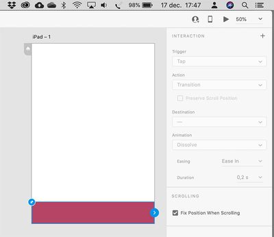
A pinned footer can easily be constructed in an XD mock-up. Simply select the element you want to stay at its position, switch to Prototype mode, and set it to be fixed. I know, it's strange that you have to go to Prototype mode, but the reasoning behind it is that it has to to with interacting with a design – not the layout of the design...
Copy link to clipboard
Copied
Yes I've been using the prototyping options as you describe. The problem is where do I pin the footer when the client stakeholders each have different phones, with different viewport sizes. Since the XD "user testing" preview is not responsive, I think the only solution is I need to find out what phones they're using and create previews that are sized for each phone. Or just tell them the preview I'm sending is only for Android model x and the rest need to watch my video preview.
Copy link to clipboard
Copied
"Or just tell them the preview I'm sending is only for Android model x and the rest need to watch my video preview."
That's the way to go ! And if your client still thinks that's not good enough, just whisper in their ear how much time and money it would costs to put up a website or app as if it's the real thing, with all the bells and whistles, features and gizmos, working as intended. I bet they'll quickly find your alternative very sufficient...
The design is a different stage – not a kind of live proof version, yet.


