 Adobe Community
- Home
- Adobe XD
- Discussions
- Prototypes should not change size depending on bro...
- Prototypes should not change size depending on bro...
Prototypes should not change size depending on browser dimensions
Copy link to clipboard
Copied
Hey guys,
This is actually quite ridiculous. If I create a web page of 1920x5000px for example, and I am exporting it so that my client can see its interactions, if he's viewing the thing on his notebook on an 1366x768 resolution, the whole website will be shrunk. It's outrageous, there should be scrollbars, yes, even horizontally, my clients always ask me why everything is so small, and I have to explain to them that Adobe XD fits the width of the website based on the browser's website if it's smaller, so I have to re-export for their resolution.
Please fix this, it's a total nightmare.
Thanks,
Chris
Copy link to clipboard
Copied
You can make your suggestions to:
Copy link to clipboard
Copied
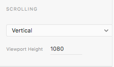
Are you using a proper Viewport size ?
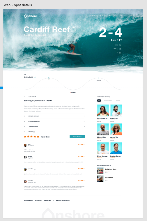
Your page can be very long, but the preview needs to remain restricted to a certain height, called the Viewport. It corresponds with that dashed blue line in your design.
Copy link to clipboard
Copied
Hi Peter,
It doesn't matter what viewport I use, if the design width is larger than my client's browser width, the design will be shrunk to fit the resolution of whoever is viewing the prototype. Try making a screen that exceeds your browser resolution width by 1000px, and make the viewport as small as you want, you'll notice that all the elements are way smaller in the browser than they are in the actual design. That stinks.
Copy link to clipboard
Copied
Anyone else having this problem, please upvote this.


