 Adobe Community
- Home
- Adobe XD
- Discussions
- Responsive menu dashboard design without multiple ...
- Responsive menu dashboard design without multiple ...
Copy link to clipboard
Copied
Hi all,
I'm trying to figure out if there's a more efficient way to create responsive (collapsing) menus without having to reorganize screen content to accommodate for extra space every time?
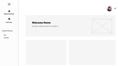
Ex. This is the default state with the menu open
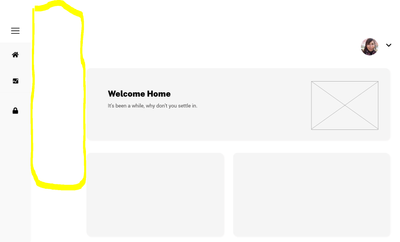
When the menu is collapsed it leaves this chunk of whitespace that makes the layout feel uncentered.
To solve for this I've been manually duplicating all screens and redesigning the content to fill the space. So essentially every screen has an open menu version and collapsed menu version. I'm wondering if there's a more efficient way to do this? I've been using auto-animate to do all the transitions between open/collapsed states because with components I can't emulate the content expanding with the menu.
Thanks in advance!
 1 Correct answer
There isn't a way to do this currently. I'm assuming you want it to work as YouTube currently works on a desktop.
As italosan pointed out, an overlay would be a solution, but it will be overlapping your other elements, instead of pushing them to the side, which is not what you need if I understand correctly.
With the way prototypes work you can't have such dynamic functionality like with html/css.
For such situations I showcase the functionality on one screen and the rest are with either an open
...Copy link to clipboard
Copied
Hi, in this case I recommend you to use the overlay. I'll leave you a link that will come in handy for prototyping on Adobe XD. https://letsxd.com/prototyping
Copy link to clipboard
Copied
There isn't a way to do this currently. I'm assuming you want it to work as YouTube currently works on a desktop.
As italosan pointed out, an overlay would be a solution, but it will be overlapping your other elements, instead of pushing them to the side, which is not what you need if I understand correctly.
With the way prototypes work you can't have such dynamic functionality like with html/css.
For such situations I showcase the functionality on one screen and the rest are with either an open menu or a closed one. If you want it to work on all screens, you need 2 versions for each screen with auto-animate. The other option would be a big component with 2 states that holds everything on the page, but that's obviously a bad solution.


