 Adobe Community
Copy link to clipboard
Copied
Hello community,
I'm working on a Covervideo for my Facebook Fanpage (in AE). When I render it, the text is slightly blurred - which looks a bit embarrassingly unprofessional in public.
Is there a way to do better?
This is how the text looks like in AE:
This how it looks like after rendering:
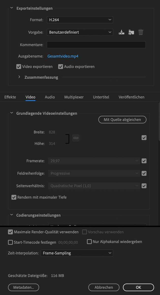
And these are the settings I use :
Any help highly appreciated!
 2 Correct answers
There is nearly just one importent information when it comes to video encoding and you didn't screenshot it: MBit/s.
I guess the final video just have to less MBit/s, therefore a bad quality.
Generally, H264 is a codec with high compression. The result will always be a bit blurry compared to the source footage.
There are other codecs with less compression, but they are not likely to be accepted by facebook, or the internet in general.
The best you can do is to meet the technical requirements from f
...828 x 315 is is not a frame size that works for any kind of video compression, especially H.264. I hope that is a typo and not a recommendation from anyone.
Color is compressed in blocks of at least 4 pixels so the frame size must be an even number. Just that frame size by its self will cause a bunch of compression artifacts because the video will be resized to an even number of pixels. If you want to stick with that frame ratio at least double the size of your comp and make sure that you hav
...Copy link to clipboard
Copied
There is nearly just one importent information when it comes to video encoding and you didn't screenshot it: MBit/s.
I guess the final video just have to less MBit/s, therefore a bad quality.
Generally, H264 is a codec with high compression. The result will always be a bit blurry compared to the source footage.
There are other codecs with less compression, but they are not likely to be accepted by facebook, or the internet in general.
The best you can do is to meet the technical requirements from facebook for header videos.
Plattforms like facebook tend to transcode the uploads by themself. I don't know how facebook in paricular behaves on this, but don't wonder if you crystal clear video looks blurry after upload.
The smaller your font the more it will be blurred because of everything I wrote above. If the result is still unsatisfying after you take care of all this, you may have to overthink your artwork, too.
*Martin
Copy link to clipboard
Copied
Thank you, Martin!
I set the MBit/s rate from 10 to 14 now. And obviously, I have to use less text with a larger font next time.
Best,
Stefan
Copy link to clipboard
Copied
You also have a very odd frame size. I don't know why you used it. There is nothing about your frame size that corresponds to the Facebook recommendations for video. The recommended aspect ratio is 16:9 or 9:16. The frame size is also extremely small. On my laptop it's only about 12% of the screen size in actual pixels. If you don't follow the recommendations your video is going to be compressed with a sledgehammer and it will look terrible. Because the frame size is so small, your video is going to be scaled up on most displays and it is going to look pretty terrible.
I strongly suggest that you carefully study the size and frame ratio recommendations and that you don't put any video on the web that is not at least HD (1920 X 1080 or 1080 X 1920). You can't expect it to look good on any modern device if you use smaller frame sizes. I edited the HTML so that your best AE image is displayed in its real frame size on this forum. It's awfully tiny and impossible to read.
That is your best screenshot at its actual size posted on a web page.
Copy link to clipboard
Copied
Thanks, Rick,
forgive my foreign language understanding - for me it seems that you strongly dislike the format I have shown here. I think I understand where that does come from. So, to ease these feelings a bit - 828 x 315 is actually what I found in several blog posts as recommended for the FB COVER video.
I tested the size on my Mac Retina 27'' full screen now, and I think - besides the blur issue - it works great.
Please, do me the favor and watch it (sound turned on, if you wish) here: https://www.facebook.com/AufatmenMe/ (it's a new page, no content yet).
It's only 1'10'' long, I hope you will rethink your point of view. That doesn't mean I think it's perfect (I know it's not), but still, maybe not so "terrible".
At least on a large screen.
Peace 🙂
- Ah, and of course I don't want to forget to thank you that you made the effort to resize the image etc. I will heed your hints.
Stefan
Copy link to clipboard
Copied
828 x 315 is is not a frame size that works for any kind of video compression, especially H.264. I hope that is a typo and not a recommendation from anyone.
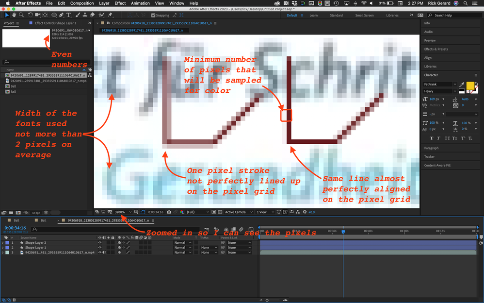
Color is compressed in blocks of at least 4 pixels so the frame size must be an even number. Just that frame size by its self will cause a bunch of compression artifacts because the video will be resized to an even number of pixels. If you want to stick with that frame ratio at least double the size of your comp and make sure that you have an even number of pixels for both height and width. Maybe this screenshot will help explain things. I downloaded your video and created a comp to see what I could see. I added a one-pixel stroked line with horizontal, vertical, and a 45º segment, duplicated the graphic, and got one as close as I could to the pixel grid and the other one about as far off as I could get it.
Here are the design problems that can be solved by doubling the frame size.
- At this frame size, the fonts are so thin that I could not find more than a couple of pixels that I think are the original color for the font because it is almost impossible to line up characters with the pixel grid
- The absolute minimum number of pixels that are going to be used for a color sample is 4 - and as indicated, the color sample for the outlined area includes 2 almost white pixels and two brown ones. The color in that block cannot be accurate and only the luminance value is left to define the line.
- Increasing the data rate will give you a little fewer motion artifacts but it will do almost nothing for the color sampling problem and the misalignment of the text on the pixel grid
Doubling the comp frame size will allow you to use fonts that are twice the size and give the compressor a lot more to work with when trying to reproduce the original colors. When the footage is scaled down the contrast on the edges and the apparent sharpness will be improved, rather than degraded, especially on high-resolution displays because web pages are scaled up to compensate for the tight pixel grid in HR (Retina) displays. In the same way your web graphics should be twice the size that they should be for HR displays, your web video should be twice as big also.
I know these things because years ago I was part of a development team researching and creating the father of video compression as we know it. All Interframe (MPEG) compression finds identical luminance value pixels and predicts their movement so they don't have to store every luminance value for every pixel for every frame then they take at best, a four-pixel block of color information from those matching luminance pixels and average the color and predict the changes over time. Everything is an average, even at high data rates and if the codec does interframe compression the software is calculating the pixel values for luminance and color (chroma) from an average of the data from at least every other frame. At the very best, interframe compression is predicting the pixels of in every other frame so half of the frames you see are just an approximation of what was there in the original. It is getting better, and it's kind of amazing that it works at all, but if you want to look like a professional, and you want to create motion graphics like a professional, you need to perfectly understand how things work and use that knowledge when you design your videos.
Take a couple of minutes, load your comp up in AE and use the Scale Comp script that comes with AE to resize the comp to double the size. This should increase the font size and scale of any vector layers without any loss and if you scaled down images or video in the original comp it will be brought back closer to 100%. Render and post another video and you should see a marked improvement. Folks will wonder how you got your Facebook video to look so good.
Copy link to clipboard
Copied
Hey Rick,
thank you so much!
This is by far the best and most helpful answer I ever got in any forum or support environment... It's more an insightful blog post in its own right. Can I hand you a badge or something for this?
Unfortunately, it's too late for me to redimension and redesign everything, but I will follow your advice and at least double the size as you suggested it.
Thanks again!
---
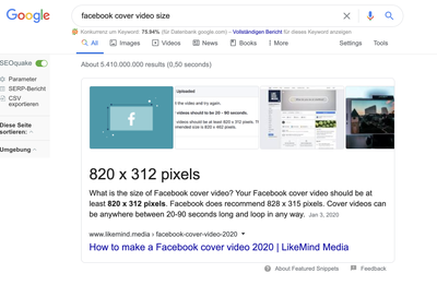
Just FYI Regarding the 828 x 315 (no typo) - I found a handful of sources on the internet with these dimensions: "Facebook does recommend 828 x 315 pixels" (cf. image). Whereas meanwhile, FB itself recommends 820 x 462.
Next time I'll know better. Cheers!


