 Adobe Community
- Home
- Animate
- Discussions
- Best practices for publishing html5 game to differ...
- Best practices for publishing html5 game to differ...
Best practices for publishing html5 game to different devices
Copy link to clipboard
Copied
How does one publish to different device sizes and to the desktop using animate cc and create js?
I have not been successful in my search either here or on stack overflow.
Are there best practices on how one can do this? Is publishing different versions the way to go?
Making it responsive does not solve the problem because of the different height/width ratio. If it fits iPhone 8, it won't scale properly to iPhoneX and Ipad etc.
Would appreciate any help on this matter. Thanks
Copy link to clipboard
Copied
tick the "make responsive" option in the file>publish settings panel.
Copy link to clipboard
Copied
Thank you kglad. I have tried the "make responsive" option but it does not fully solve the problems eg if you start with an iPad size and make it responsive, the aspect ratio makes it unworkable on eg iPhone8.
I came across this yesterday https://felgo.com/doc/felgo-different-screen-sizes/ that provides an approach. I was wondering if Adobe Animate might have something similar. I imagine there are hundreds of developers who work with animate cc + createjs who have to deal with this problem on a daily basis. Yet I can't seem to find anything in the vein of the felgo article. (I put this down to my poor search abilities.) Thanks once again.
Copy link to clipboard
Copied
try the fit in view option.
Copy link to clipboard
Copied
Thank you kglad for taking the time and trouble. I have previously tried the various options available under the publish settings. But didn't get the desired outcome.
Copy link to clipboard
Copied
what scaling are you trying to achieve?
Copy link to clipboard
Copied
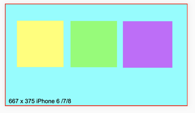
In animate cc, the document size is 667 x 375 (iPhone 6,7,8).
Publish settings are : make responsive & fit in view.
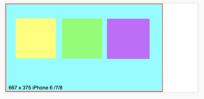
in chrome & firefox, when viewing in iPhone 6/7/8 and iPhone 6/7/8 plus, there is no problem.
but when viewed on iPhoneX and ...
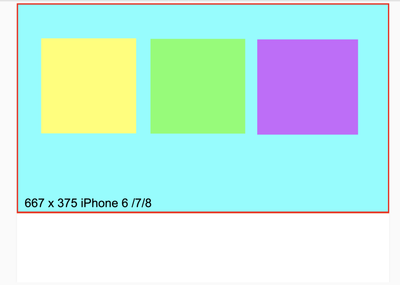
and iPad Pro, it will not scale to the full viewport size of the device and understandably so, because of the different aspect ratio.
How does one deal with this additional space?
One idea that I have is to
1. use javascript to detect the viewport size
2. scale the canvas size accordingly
3. change/scale the size of the elements on stage accordingly to fit the new canvas size.
Am I on the right track? Is there a simpler way to manage this?
Of course, there are many more android devices that have yet to be taken into account.
Thanks


