 Adobe Community
- Home
- Animate
- Discussions
- FLA in an <iframe> is not responsive (in an Ipod)
- FLA in an <iframe> is not responsive (in an Ipod)

Copy link to clipboard
Copied
Hi All,
I'm developing FLAs that will be embedded into responsive html pages inside <iframes>.
As I'm developing on my laptop, I just adjust the browser window's width to approximate the different screen sizes to see how it would look in a phone or ipad. On my laptop, when I shrink the browser window's width the FLA acts responsively (shrinks with it): When the browser is the width of a phone screem, the FLA shrinks to completely fit within the screen. This works in IE or Chrome browsers on my desktop.
However, when I look at that page in an Ipod touch (Safari) that iframe-embeded FLA does not shrink. It's only partly visible on the screen and blocks text below it, etc. (Obviously, shrinking the browser window on my laptop isn't a good method for testing responsiveness.)
Does anyone know how I can force the FLA to act responsively (shrink) in the Ipod? (I haven't tested on an iphone yet but possibly I'll have the same problem.)
Here is the page I'm working on: Master CV/ Portfolio Template Demo
Thanks much!


 1 Correct answer

Paul
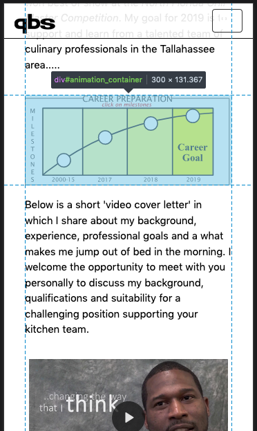
this is what I see on my S7 phone:

Different to your description at first the yellow CAREER PREPARATION animation didn't show up. I had to page up and down a couple of times before it finally appeared.
Of course both animations show problems. The KEY SKILLS anim is too wide and the CAREER anim half covers the title VIDEO COVER LETTER, but is width-wise okay. CAREER is in an iFrame, KEY SKILLS is not. I think your mix of different responsive and javascript methods might be problematic. Bootstra
...
 5
Replies
5
5
Replies
5
Copy link to clipboard
Copied
I just checked on an iphone: same problem. The FLA is not responsive (doesn't shrink).
Any help greatly appreciated
Copy link to clipboard
Copied
Hi Paul
I'm looking at it in Responsive Design Mode in Firefox Developer Edition (FxDE). It shrinks!
In desktop view without Responsive Design view the #animation_container is 644 pixels wide. Hence it's shrinking, it's responsive.
I tried to access it on my S7 smart phone but your monster url seems to be always wrong, no matter how hard I try to type it correctly.
But definately I can't see your problem.
Klaus
Copy link to clipboard
Copied
Klaus,
Thanks for looking at that. I don't have access to Responsive Design Mode in Firefox Developer Edition but I'll look into that soon.
Sorry for that long URL. Try this:
tinyurl.com/demoAnimate
I'm curious what you see in your device.
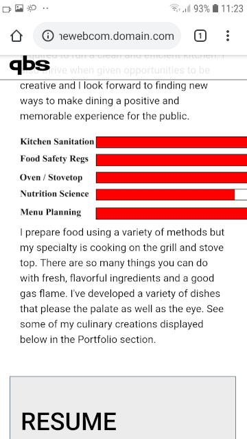
In Iphone (8?), the Career Preparation FLA (in the 'Background' section) did not shrink. Additionally, the first FLA on the page (red progress bars in the 'Key Skills and Professional Strengths' section) didn't load like all the other content... until I paged up and down a couple times. (That Skills Meter FLA is not within an iframe.)
Copy link to clipboard
Copied
Paul
this is what I see on my S7 phone:


Different to your description at first the yellow CAREER PREPARATION animation didn't show up. I had to page up and down a couple of times before it finally appeared.
Of course both animations show problems. The KEY SKILLS anim is too wide and the CAREER anim half covers the title VIDEO COVER LETTER, but is width-wise okay. CAREER is in an iFrame, KEY SKILLS is not. I think your mix of different responsive and javascript methods might be problematic. Bootstrap, Animate, Waypoint.js, Inview.js and an outdated jQuery (version 1.9.1 is too old by now).
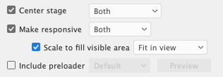
For a start I would put both Animate exports (HTML and JS) in iFrames. And use the responsive Publish Settings:
And I would in the hostpage integrate a small javascript which calculates and sets proportionally width and height of the iFrame element (in pixels), according to either window.innerWidth (CAREER) or the class="AOS_parent" (KEY SKILLS).
Further I somehow gather that your tendency to fit too much on one page stands in your own way.
Klaus
Copy link to clipboard
Copied
Thanks again, Klaus.
Excellent recommendations. I'll work on implementing them.
(BTW: I've tested with other devices now: The ipod, iphone 7, iphone 6s and the Samsung J3 show the CAREER FLA as too big and cut off. Your S7 shows it as correct width but shows other problems. All mobile devices have a problem with both FLAs not showing up upon initial page load...and none of these problems show up on my desktop when the browser window's adjusted small.)
"Further I somehow gather that your tendency to fit too much on one page stands in your own way."
Yes, it's a lot to fit on one page but the goal is to give these career-seekers an interactive CV on level with the better ones out there ...and the current trend is to put everything on one page so employers can either scroll down or jump to with top menu. If using FLAs like this is too much then I'll need to reassess.
I'll update soon.

 AdChoices