• Global community
    • Language:
      • Deutsch
      • English
      • Español
      • Français
      • Português
  • 日本語コミュニティ
    Dedicated community for Japanese speakers
  • 한국 커뮤니티
    Dedicated community for Korean speakers
Exit
0

SCORM Output - Scale Project Resolution

New Here ,
Aug 09, 2021 Aug 09, 2021

Copy link to clipboard

Copied

Hi-


What are the best practices for content to scale properly within any browser size? I don't see a dynamic (100%) setting.

Views

130

Translate

Translate

Report

Report
Community guidelines
Be kind and respectful, give credit to the original source of content, and search for duplicates before posting. Learn more
community guidelines
Community Expert ,
Aug 09, 2021 Aug 09, 2021

Copy link to clipboard

Copied

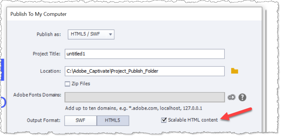
If this is a normal HTML5 project, not a responsive project, then you can just publish with the checkbox on for Scalable HTML Content.

PublishToScalableHTMLContent.png

Then the content will attempt to fit into the available browser window space while still maintaining the original aspect ratio.

Votes

Translate

Translate

Report

Report
Community guidelines
Be kind and respectful, give credit to the original source of content, and search for duplicates before posting. Learn more
community guidelines
Community Expert ,
Aug 09, 2021 Aug 09, 2021

Copy link to clipboard

Copied

I also start with a larger project so that most of the time the scaling is occurring down to smaller sizes rather than stretching a smaller project to a larger size. Stetched slides tend to look blurry and of lower quality. Lately I have been building projects that are 1470 x 900 instead of the 1024 x 627.

Paul Wilson, CTDP

Votes

Translate

Translate

Report

Report
Community guidelines
Be kind and respectful, give credit to the original source of content, and search for duplicates before posting. Learn more
community guidelines
Community Expert ,
Aug 10, 2021 Aug 10, 2021

Copy link to clipboard

Copied

LATEST

You don't want to distort a project. When using Scalable HTML either the width or the height will be filled completely. All starts with setting up the correct width/height ratio for the original project. That takes into account which space will be taken horizontally and vertically by the browser or the LMS.

For responsive projects use the Position Properties. Some items cannot be put in a fluid box, like an interactive video. In that case Position Properties will be helpful.
Votes

Translate

Translate

Report

Report
Community guidelines
Be kind and respectful, give credit to the original source of content, and search for duplicates before posting. Learn more
community guidelines
Resources
Help resources