• Global community
    • Language:
      • Deutsch
      • English
      • Español
      • Français
      • Português
  • 日本語コミュニティ
    Dedicated community for Japanese speakers
  • 한국 커뮤니티
    Dedicated community for Korean speakers
Exit
0

Captivate 2019 Responsiveness in breakpoint mode

New Here ,
Dec 21, 2018 Dec 21, 2018

Copy link to clipboard

Copied

We are testing converting our projects from Captivate 8 & 2017 to Captivate 2019. We currently use Breakpoint mode for all our modules, this is our preferred method. We know the settings for responsive text need to be set at auto, % in order to "be responsive." We have no problem with our other versions, however in Captivate 2019. the feature of auto, % for text just does not seem to be working. Simply put, the text is not shrinking see images below. I also tested creating a brand new project with Captivate 2019 and got the same results. Does the text responsiveness no longer work in Captivate 2019 Breakpoint mode? Or is this simply a bug that can/will be fixed? We want to move our projects to an upgraded version of Captivate but we cannot proceed unless we know it will work responsively in all views.

Converting Older versions to CP 2019:

CAP issues.JPG

New project in CP 2019:

CAP issues 2.JPG

Views

201

Translate

Translate

Report

Report
Community guidelines
Be kind and respectful, give credit to the original source of content, and search for duplicates before posting. Learn more
community guidelines
Community Expert ,
Dec 21, 2018 Dec 21, 2018

Copy link to clipboard

Copied

LATEST

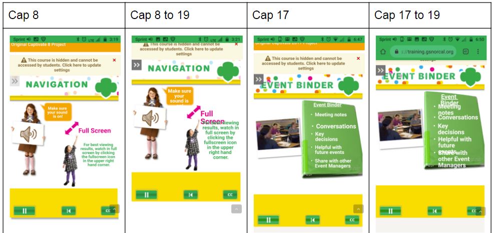
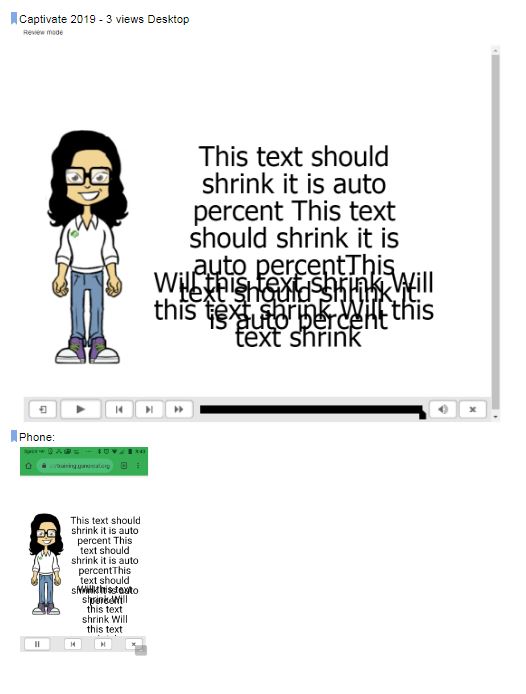
In Breakpoint Views, text is not responsive in between breakpoints (has never been the case). You have to define the object style for any text object, which means that you have to define the font size in each of the breakpoint views. In between the breakpoints the font size of the higher breakpoint is used.

Object with a width and height can be responsive, that is the case for the text caption or the shape set as tect container, but not the text.

If you used Fluid Boxes, font size will be fully responsive, that is an advantage of that workflow. I have a full comparsion on my blog.

Votes

Translate

Translate

Report

Report
Community guidelines
Be kind and respectful, give credit to the original source of content, and search for duplicates before posting. Learn more
community guidelines
Resources
Help resources