 Adobe Community
Fluid Box Dimensions Not Correct

Copy link to clipboard
Copied
Hi there,
I'm creating fluid boxes in Adobe Captivate 2019 and the dimensions don't seem to add up correctly.
I may have an incorrect setting somewhere or i may not be aware of additional padding or margin that is added in the background, but any help would be appreciated.
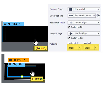
As seen below i have a fluid box setup in a master slide at 140x65px with 20px horizontal padding and 10px vertical padding. Then i have another fluid box inside this (not in the master slide) which is set to static so i can add an image. I assume the padding settings creates 20px padding to the left and 20px to the right, therefore the internal box should be a width of 100px but it is actually 116px wide. Similarly the height doesn't add up either (65 - 2 x 10 = 45, not 40).
Another issue that i noticed is that additional space in between the height is added when the static option is ticked. If i un-tick static, the height becomes 49px but this still doesn't add to the correct size.
Please let me know if you have any solution to this
Kind Regards,
Shaun


 2
Replies
2
2
Replies
2
Copy link to clipboard
Copied
I haven't been doing the maths yet. I may be wrong, but my feeling about a responsive project is that I would never define sizes of anything in absolute units but in pixels. I am used to set up master slides in the previous version, using rulers and guides which i will localize using %, never in px. Even with the - designwise - more controllable Breakpoint views i wil use px only in very exceptional situations. Any reasons why you want to do it in pixels, which is the normal way for a non-responsive project?
Just FYI: I am even wondering why the team allows to set up fluid boxes in pixels?
Copy link to clipboard
Copied
There are many reasons why you would want to restrict the height of a row in a responsive layout. In my case, i want to have a navigation bar at the bottom of the slide that is split into 3 columns. The back and next buttons would be on the left and right, and then a progress bar would be in the center column. It is common knowledge that a button target size should be around 45px for touch devices (Mobile, tablet) therefore i want the bar height to be 45px + a bit of padding = 65px. The navigation bar is still responsive in the width direction but the restricted height allows for maximum content area above the navigation bar.
Despite your personal preference of using %, there is still an error here that doesn't make sense.
But if you want to talk in % then there is the same problem as explained above. Simply add a vertical fluid box with 2 rows then look at the properties of each box height. You will find both of them have a height of 50.1% therefore a total of 100.2% which is impossible. This is a simplified case but when you have multiple fluid boxes inside each other this error is multiplied.
Please let me know if you know the cause of this issue

 AdChoices