 Adobe Community
Font Issue - New to Captivate
Copy link to clipboard
Copied
Hi Captivate Friends!
I started a job a month ago and am trying to ramp up asap on Captivate.
The latest issue I'm running into is having the Fonts show up accurately once published. My company has provided me with font to use (it's just Arial though and everyone has that). I had everything set in project form and then when it previews and/or publishes the font changes, sometimes slightly on just one word to bold or a letter doesn't seem to be aligned. It's very wonky looking and my projects educate nationally so I really need them to look professional.
Any ideas? Any help is sooo appreciated. I'm new so please be patient if I'm asking obvious questions.
Thank you!
Copy link to clipboard
Copied
That is very weird because Arial is a websafe font.
Which exact version are you using on which OS? Look under Help, About Captivate for the full number.
Can you insert some screenshots to show the problem? Is this a responsive project?
Copy link to clipboard
Copied
Thank you!! So I am using 11.5.5.678 on MacOS Big Sur. They sent me the download. This is a responsibe project b3ecause I am pushing for our users to be able to study on the go.
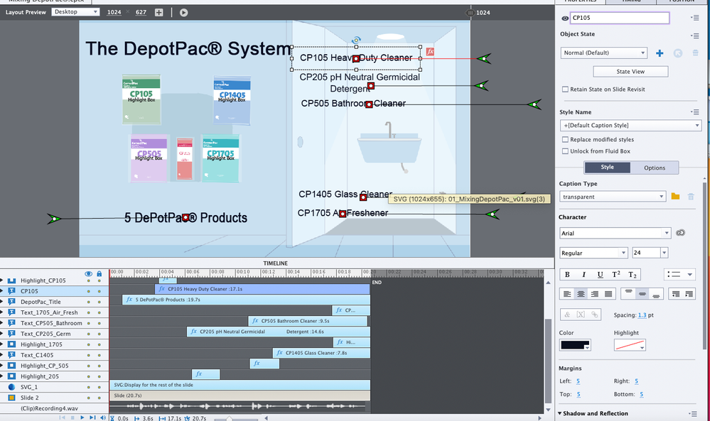
I took screenshots of the timeline and then the project preview. I made a few adjustments earlier that seem to have fixed some of it, but is it just me or does CP205 look different in thickness from the rest of the font? Maybe i've been looking at it too long. What do you think?
Copy link to clipboard
Copied
I don't see a difference, but can be due to the quality of the screenshots as well.


