 Adobe Community
- Home
- Captivate
- Discussions
- Maintain Aspect Ratio When Showing Slide for Rest ...
- Maintain Aspect Ratio When Showing Slide for Rest ...

Copy link to clipboard
Copied
Hi All,
I'm building a responsive course, and I'm trying to create a menu overlay slide that will show for the rest of the course. I have 5 buttons stacked vertically at the bottom of the slide.
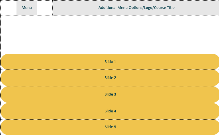
The menu button toggles the buttons off and on, so that people can view the main content area and not have the navigation interfere. Easy-peasy, right?
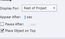
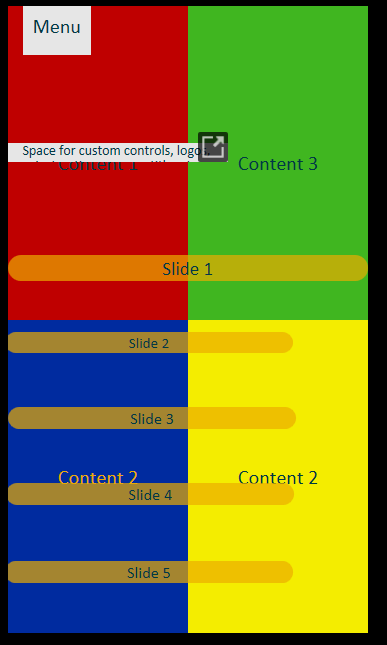
So originally, I had the buttons set to maintain aspect ratio, so they would stay big and easy to tap, no matter the size of the screen. However, when I set the button to display for rest of project:
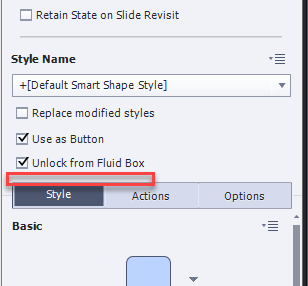
Now, the maintain aspect ratio box disappears,
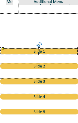
and when I go to resize the project, this happens. My beautiful aspect ratio is destroyed!
Why is Captivate so determined to prevent me from doing anything nice with it? Does anyone have any tips on how to make this work again? Is this supposed to work this way, or is it a bug? I'm trying to wrap my head around why this functionality would be disabled when the slide is set to show for project? It makes no sense to me.
UPDATE:
I tried rebuilding this slide in the master slides, with even more horrendous results:
Now, for some reason, the menu button just advances to the next slide, even though there are NO instructions for it to do so, and the buttons are all over the place and all random sizes. Is this a bug, or is Captivate seriously just not equipped for this kind of stuff?
UPDATE TO MY UPDATE: By the way, once you make the maintain aspect ratio box disappear, reversing my directions does not bring it back. If you make it go away, it is gone forever. That must be a bug, right?
Message was edited by: Martin Lemieux


 1 Correct answer
Maybe you could read my blog post, where I compare th 3 workflows to have a project display on all devices:
Fluid Boxes Or Breakpoint Views? - Captivate blog
The only real full responsive workflow in the most strict sense" of the word (as used in websites) are the Breakpoint Views. Fluid Boxes is somewhere between a rescalable project (by some concurrent tools wrongly labeled as responsive) and Breakpoint views where you have total control over possible totally different layouts for smaller scree
...
 6
Replies
6
6
Replies
6
Copy link to clipboard
Copied
Which type of workflow do you use: Fluid Boxes or Beakpoint Views?
Copy link to clipboard
Copied
Fluid Boxes - for a project like this, do you think I'd be better off with breakpoints? Does 2019 support both types? I thought they'd moved completely over to fluid boxes?
Copy link to clipboard
Copied
Maybe you could read my blog post, where I compare th 3 workflows to have a project display on all devices:
Fluid Boxes Or Breakpoint Views? - Captivate blog
The only real full responsive workflow in the most strict sense" of the word (as used in websites) are the Breakpoint Views. Fluid Boxes is somewhere between a rescalable project (by some concurrent tools wrongly labeled as responsive) and Breakpoint views where you have total control over possible totally different layouts for smaller screens. Although Adobe marketing only talks about Fluid Boxes, the Breakpoint Views workflow is still available (and I hope it never will be abandoned). You have to convert the project to that workflow using the Project, Switch to Breakpoint Views option.
It is not only because of the full control which you want, but also because of the many limitations in the Fluid Boxes. The most important is the impossibility of stacking objects in the same location, which is really a handicap in your case. You could time the menu for the rest of the project in CP2019, but only if it is in a fluid box that is the same on all slides, which means you have to use one master slide for all your slides. Overlay is impossible, unless you turn that fluid box in a static fluid box. In that case you'll have the possibility to stack, all objects will keep ony the width/height ratio, but it will look weird when testing on different devices. I don't like the static fluid boxes, because of that, you lose lot of the real 'fluiditiy'.
Hence my suggestion of switching to Breakpoint views
Copy link to clipboard
Copied
Sorry, I had been testing on CP2019 and thought that the Timing for the rest of the project worked now (was not possible in CP2017) for a normal fluid box. However it is NOT the case. Although the objects 'seem' to be in the fluid box, you can drag them out of it, which means they are not really linked to it. Find it a bit confusing in CP2019.
Copy link to clipboard
Copied
Thank you so much for all the help! I've seen the light about fluid boxes. 
Copy link to clipboard
Copied
No problem, many users are confused because marketing only talks about the Fluid Boxes, as if that is the best way to create a responsive project, but they rarely mention the limitations.

 AdChoices