

Colour difference dilemma

Copy link to clipboard
Copied
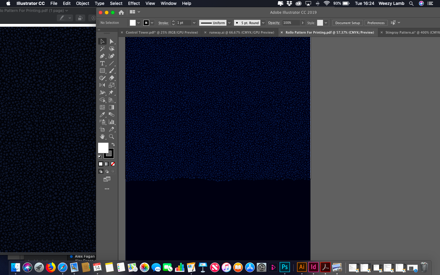
Hoping someone has a quick fix for me - On the left you see the PDF I have created opened with Preview, this is also the colour which the document prints in and matches the RGB/CMKY/Pantone colour codes correctly. On the right you see how I see the colours in Illustrator (Photoshop is the same) which is way off - I obviously need to be working with the correct output colours displaying and nothing I do seems to rectify this issue...
Thanks in advance!
PS - working on a MacBook Air


 61
Replies
61
61
Replies
61

Copy link to clipboard
Copied
I've been successfully exporting pdfs for print for about 20 years and it's never been so convoluted.
If you are creating documents using one of the InDesign default Color Settings, and exporting using a client’s custom PDF job options, that could easily cause problems.
If the document was created with the default US Web SWOP Coated as the CMYK assignment and Preserve Embedded as the CMYK Policy, you would likely get CMYK-to-CMYK conversions when exporting using a client’s custom job options.
A conflicting Export Destination profile might cause problems like 4-color blacks and grays and contaminated primary CMYK colors. In a complex workflow where the exports are to variable print destinations, you normally want to place RGB images so there is only one conversion to the final CMYK space either at export or output.
Because profile assignments and policies get saved with the document, changing an existing document’s color management settings can be tricky. The profiles can easily be changed via Edit>Assign Profiles..., but the policies are harder to change.
If you are using OSX try this Applescript, which displays a dialog where you can change all of the settings at once for the active document:
http://www.zenodesign.com/forum/ChangeDocCM.zip


Copy link to clipboard
Copied
>>> I've been successfully exporting pdfs for print for about 20 years and it's never been so convoluted.
amen to that, brother!
I, too, have managed to squeak by with a degree of consistency in my closed work flows, but I see how a shop dealing with numerous 3rd party documents a day has an impossible task with all the ****** up (my edit) color coming in, the fact that a lot of them don't have a clue even how to deal with proper document only makes it worse
Copy link to clipboard
Copied
I might be wrong, but it sounds to me like the issue isn't dealing with documents from outside sources—it's preparing InDesign (not Photoshop) documents in-house that will ultimately be exported to a variety of client defined destinations.
In that case one can't create everything using a single house CSF, because that has the potential of introducing multiple CMYK conversions, which will often cause problems on press. The initial Color Settings used for any InDesign document creation has to be matched to the final export destination.
Copy link to clipboard
Copied
yes, you are on point (consistently) ... Photoshop colors and profiles I see crystal clear, it's logical and intuitive and simplistic, but maybe I just have more daily experience with it and Photoshop is certainly a lot less complicated than what Acrobat deals with
maybe I'm just getting old ... I recently upgraded M$ Entourage 2008 to Outlook 2016 (Mac mail apps) wow it lost some critical features and got more unintuitive ... then there is the recent move I made from OS-X 10.6 to macOS 10.12 and 10.14 ... technology and commonsense certainly are not standing still for me
Copy link to clipboard
Copied
Although the color management for both document setup and export hasn't changed for at least the last 15 years. InDesign is the only CC print app that lets you work with multiple color spaces on the same page, so its CM is more challenging in an offset CMYK separation workflow than Photoshop or Illustrator—especially when there's more than one output destination.
Copy link to clipboard
Copied
What preset did you use to make the PDF?
The common PDF/X-4 and PDF/X-1a press presets export CMYK objects that use the document’s CMYK profile as DeviceCMYK—the CMYK objects have no profile assigned in the exported PDF. If you view in AcrobatPro, or Acrobat Reader, the PDF/X Output Intent profile (which is the same as the original document's CMYK profile) is used to color manage the soft proof display of DeviceCMYK objects.
Preview does color manage, but does not read Output Intent profiles, so DeviceCMYK objects will not necessarily soft proof correctly in the Preview app even though the output numbers are correct.

Copy link to clipboard
Copied
As Rob has mentioned, all documents should have embedded profiles, this allows applications to "know" the originators intent for colour and tone..
Bob,
Although I believe that It's right that ICC profiles should be embedded I don't believe that they must all match, in my understanding, the beauty of device independent colourmanagement is that images, or any "documents" with embedded ICC profiles are interpreted correctly within the colourmanagement process.
It's not bad practice, though, to make sure ICC profiles match during the production process - as long as the conversion from one colourspace to another is handled with care.
It's worth pointing out that [although offered] there is no "Perceptual" rendering when converting between working spaces (unlike when converting from working space to a CMYK ICC). Some users rely heavily on Perceptual rendering's (much misunderstood, but that’s for another post) characteristics - not realising they are not available in this scenario.
Example:
If you have a Pro Photo RGB file to place it may be better strategy to place it 'as is' and allow the later CMYK conversion to deal with the compression rather than to convert in advance, to, say, Adobe RGB. That conversion can be damaging unless some care is taken to avoid the almost inevitable clipping in that conversion.
All conversions working space to working space are relative colorimetric with the inevitable clipping if the original had colours close to gamut boundary - that’s why those conversions need a lot of care. Maybe some manual de-saturation so that detail in edge of gamut areas is not destroyed.
Or even approach this by using Joseph Holmes special "nested" workingspaces https://www.josephholmes.com/profiles/rgb-working-spaces but again that’s another subject
I hope this helps
if so, please do mark my reply as "helpful"
thanks
neil barstow, colourmanagement
Copy link to clipboard
Copied
Although I believe that It's right that ICC profiles should be embedded I don't believe that they must all match, in my understanding, the beauty of device independent colourmanagement is that images, or any "documents" with embedded ICC profiles are interpreted correctly within the colourmanagement process.
That may be the case with RGB objects, but mixing CMYK profiles would likely cause problems in a separated offset workflow. There can only be one final CMYK destination space, so if a page layout document had a mix of CMYK objects with different profile assignments there would have to be at least some CMYK-to-CMYK conversions at export or output to the single output destination. There are a number of problems with CMYK-to-CMYK conversions when the output is to offset, that's why illustrator and InDesign offer the Preserve Numbers (Ignore Embedded Profiles) policy.
With conflicting CMYK profiles black only text and grays would get converted to 4-color causing registration problems on press, custom CMYK builds would be lost, and primary CMYK colors like 100% cyan, or yellow would likely get contaminated.
Mixing RGB profiles would be less of a problem because in the end the profiled objects would all be converted directly into the final CMYK destination without additional conversions. But still, if you have control over the editing, there would be no benefit to mixing RGB spaces. The advantage of Prophoto is almost all CMYK spaces are inside of it, so it doesn't clip parts of the CMYK gamut the way sRGB does—sRGB clips a large chunk of the cyan green gamut.
All conversions working space to working space are relative colorimetric
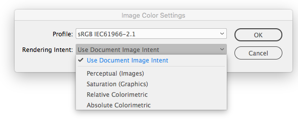
When you make a conversion to CMYK you can control the Intent from the Photoshop Convert to Profile dialog. If you use the Image>Mode menu, the current Color Settings Intent is used. With InDesign its Color Settings Intent is used on export, or you can set individual images’ Intents via Image Color Settings:
Copy link to clipboard
Copied
Sorry I just realized the first part of my last post is a rehash of my #11.

Copy link to clipboard
Copied
I don't believe in having icc profiles "all match" either Rob. Apparantly for the same reasons you do.
ICC programmer and developer, Photographer, artist and color management expert, Print standards and process expert.
Copy link to clipboard
Copied
I do think they should match.

Copy link to clipboard
Copied
Images don't need to match. Graphics should match, for the reasons Rob explains. Different purposes and different requirements.
Which is why synchronizing color settings may not be a good idea. Photoshop has one set of requirements, Illustrator/InDesign another - in a typical workflow.
Copy link to clipboard
Copied
Images don't need to match
If the task is to simply output RGB images with no corrections then yes. But if you are asking me to color correct and edit, I don't think there is any reason not to convert the images into a common preferred editing space. If you send me an sRGB image, I can convert it into ProPhoto, and the conversion as is into the final CMYK space will be identical to the one I would have gotten leaving the image as sRGB. But now if I color correct in the larger space I will not have the clipping problems associated with sRGB.
If you send me a SWOP CMYK file, and the output destination is GRACol, there's no way I’m going to attempt to color correct or edit in the SWOP CMYK space. I’m going to move it into my preferred RGB editing space, color correct, and then send it to the final GRACol CMYK space.
Copy link to clipboard
Copied
https://forums.adobe.com/people/rob+day wrote
If you send me an sRGB image, I can convert it into ProPhoto, and the conversion as is into the final CMYK space will be identical to the one I would have gotten leaving the image as sRGB
Absolutely pointless to convert sRGB data into ProPhoto RGB. You waste your time and your bits doing so. Both RGB working spaces are just empty containers of differing sizes without an encoded pixel. You convert sRGB into ProPhoto RGB, you gain nothing but a bigger container.
Now IF (big if) you're doing say a composite in ProPhoto RGB and I send you an sRGB image to included into that, you of course must convert to ProPhoto RGB (Preserve Color not Color Numbers). Otherwise, it is rather pointless.
Here's a useful 'though experiment' taking a MacBeth Color Checker in sRGB and converting to ProPhoto RGB, then examining the Lab values for four colors. Yes the conversion from sRGB to ProPhoto RGB produces new and differing RGB values as expected as the two color spaces are different scales and we are not preserving numbers but colors. Yet look at the Lab values! You've gained nothing doing this unless again, you needed to paste the sRGB MacBeth into a composite where the RGB working space was ProPhoto RGB.
Copy link to clipboard
Copied
Yes the conversion from sRGB to ProPhoto RGB produces new and differing RGB values as expected as the two color spaces are different scales and we are not preserving numbers but colors. Yet look at the Lab values!
Yes, but I think you missed my point. I want to color correct and edit the provided file—I want to do more than simply pass the file on for output. The advantage of moving the sRGB file to ProPhoto is I now have access to the full GRACol CMYK space and could color correct into the larger gamut and get to a saturated value like 100%cyan or 100%yellow which would be unavailable in the smaller sRGB editing space.
Same goes for SWOP. A device link profile would be useful if I simply want to get the image output, but there are all sorts of potential problems editing in a CMYK space. Re: Adjustment layers not working in CMYK MODE?
Copy link to clipboard
Copied
Rob, I think the assumption your making is that somehow the sRGB image gamut increases when converting to ProPhoto. That is not accurate. If you assign Prophoto RGB to an sRGB image and do not convert it to ProPhoto then, yes the gamut is expaneded but at the cost of any realistic color in the previous sRGB image. Converting sRGB to Prophoto does nothing to change the color of the image, which is the gamut expansion I believe your looking for. After clipping a file to the sRGB space that damage is permanent.
Nothing is lost, but also and importantly nothing is gained. Gamut is not increased. The image still won't cover GraCol after the transform. The most obvious way to see this is when converting to ProPhoto, if the gamut isn't increased, that increase will be visual. As you said, color doesn't change...so nothing is gained.
ICC programmer and developer, Photographer, artist and color management expert, Print standards and process expert.
Copy link to clipboard
Copied
I think the assumption your making is that somehow the sRGB image gamut increases when converting to ProPhoto.
But the available gamut increases—remember I need to color correct, you are making the assumption that I’m not going to make any changes
If I stay in sRGB I can not color correct the saturation of these colors. You can see I’ve maxed out the saturation and still get a dismally contaminated 75/22/0/0 cyan—I can't get close to GRACol’s 100% cyan and yellow—the output colors don‘t budge.

If I convert to ProPhoto I can color correct to 100% cyan and Yellow and all of the colors in between:

Copy link to clipboard
Copied
"you are making the assumption that I’m not going to make any changes"
Yes that is correct. I'm also making the assumption that the goal of going to ProPhoto over say Adobe 1998 is that there is some belief that "bigger is better". It is not in this case.
So if in fact you do want to increase the gamut Adobe 1998 is the better choice for the offset print profile. Best case gamut mapping to any destination CMYK Profile is to keep that transform small and as accurate as possible.
ProPhoto is best used with Wide Gamut inkjet printing, where the printers Gamut is very close to the ProPhoto Color Space in Volume, and is larger than Adobe 1998.
ICC programmer and developer, Photographer, artist and color management expert, Print standards and process expert.
Copy link to clipboard
Copied
Adobe RGB certainly would be better than sRGB, although it still clips offset CMYK spaces a bit. In either case you can turn on Proof Colors to Working CMYK and color correct to the destination CMYK gamut and check the numbers while you are editing in the RGB space. There‘s no reason to allow color that is excessively out-of-gamut even with a big space like ProPhoto.

Copy link to clipboard
Copied
There‘s also eciRGBV2, which is smaller than ProPhoto and doesn’t clip the primary colors Downloads [ECI.ORG] :

Copy link to clipboard
Copied
The small area of Cyan gamut that is clipped by Adobe 1998 is only important if the image has detail between colid Cyan and 92% That is rarely the case, but when it is then decisions to move to another container space are required. ECI RGB Clips a lot of saturated shadow detail that I would suggest is a more dangerous standard RGB Space. The key take away here is to be aware of the limitations of gamut mapping and don't go for the largest available. Image based decisions are somtimes required, but only for one color in Adobe 1998 and for many in ECI RGB. That is why I would stick with Adobe 1998. It's easier to work with.
ICC programmer and developer, Photographer, artist and color management expert, Print standards and process expert.
Copy link to clipboard
Copied
The small area of Cyan gamut that is clipped by Adobe 1998 is only important if the image has detail between colid Cyan and 92% That is rarely the case, but when it is then decisions to move to another container space are required.
I think an 8% clip is significant—we can’t be fussy about bit depths and gamut mapping distances, but then be careless about a chunk of missing cyan
AdobeRGB has the same problem in the saturated blacks:

Copy link to clipboard
Copied
An 8% clip is significant but it's only in a rare color, that's why it's easy to manage. If your not shooting and processing South Seas blues it rarely shows up as a pixel. Adobe RGB does not clip anywhere else

ICC programmer and developer, Photographer, artist and color management expert, Print standards and process expert.
Copy link to clipboard
Copied
but it's only in a rare color
It might be for you, but I use 100% cyan a fair amount. No image includes all color—that's like saying yellow ochre isn't a common color so it would be ok for it to be unavailable on a conversion into the CMYK space.
I think ProPhoto gets a bad reputation because it gets sent out and mishandled. If its source profile is stripped inadvertently or on purpose downstream, the bad result would be very noticeable to even an untrained eye.
I don‘t have any problems with it in my press work because I make the conversion to the correct destination space on export from ID—I don‘t send it out. If you really do want to fret over gamut mapping distance, it’s quite easy to solve that problem by color correcting the RGB color into the destination’s gamut via Proof Colors before the final print conversion.
Copy link to clipboard
Copied
This is rather easy to test; provide an image in ProPhoto RGB or even Adobe RGB (1998) where one suspects cyan or any color falls outside the gamut of any specified color space. Take it into ColorThink Pro, extract the colors as device values, in Lab. Plot those values against any color space; CMYK or otherwise. Now and only now do we know if it's out of gamut and by how much.
Get ready! An upgraded Adobe Community experience is coming in January.
Learn more
 AdChoices