- Home
- Color Management
- Discussions
- Re: how do I match Pantone Swatch colours on my sc...
- Re: how do I match Pantone Swatch colours on my sc...
how do I match Pantone Swatch colours on my screen
Copy link to clipboard
Copied
Hi there,
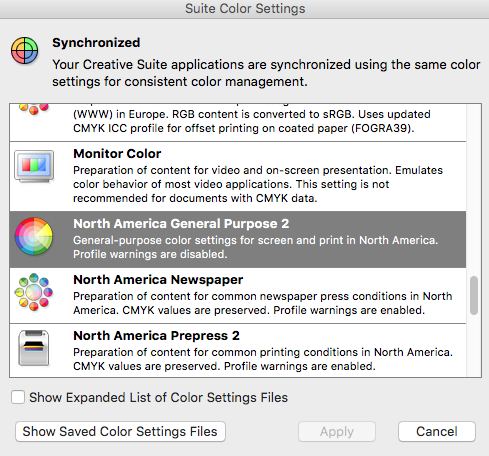
I am having colour profile troubles. The swatches in my PANTONE book do not match what I am seeing on screen. I am running Illustrator CS6. My colour synchronisation in Bridge is set to North American General Purpose 2 across all my Adobe Creative Suite programs (Photoshop, Indesign, Illustrator). Not sure if this is correct colour profile?? Just need to know how to fix colour settings so that my PANTONE swatches on screen reflect what is in the PANTON book. Can someone please help me????
Copy link to clipboard
Copied
What you see on-screen has a lot to do with your monitor. The profile you mention is more an output profile. What I would recommend is calibrating your monitor ( if you have not already ). What system are you running? What type of monitor do you have? How far off are the colors? Can you give an example? Maybe show a screen grab of a particular Pantone swatch via Illustrator? Keep in mind that the printed Pantone book is reflective color and your screen is transmissive. They may never match.
Copy link to clipboard
Copied
Hi, and thank you for your reply! I am running OS X El Capitan ver. 10.11.3 and Adobe Creative Suite CS6.
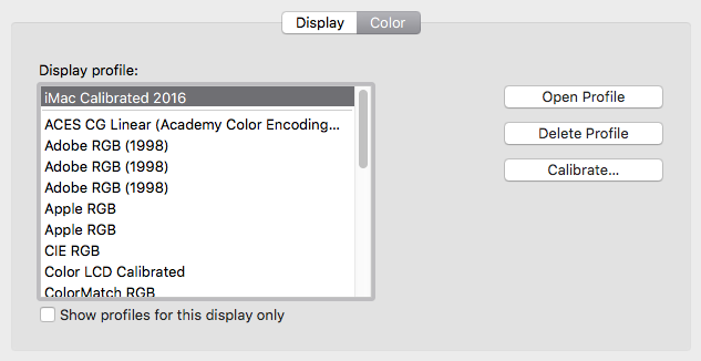
My display profile has been calibrated but not sure if I should be selecting another option from the dialogue box....???
See screen shots attached for colour profiles in both system settings and Bridge suite colour settings.
Is it a case of having the wrong profiles selected for both??
Copy link to clipboard
Copied


Copy link to clipboard
Copied
Can you show your Illustrator Color Settings? Did you have the same problem before going to El Capitan?
Copy link to clipboard
Copied
Hi, and thank you for your reply! I am running OS X El Capitan ver. 10.11.3 and Adobe Creative Suite CS6.
My display profile has been calibrated but not sure if I should be selecting another option from the dialogue box....???
See screen shots attached for colour profiles in both system settings and Bridge suite colour settings.
Is it a case of having the wrong profiles selected for both??


Copy link to clipboard
Copied
soft_pilot,
if all of your your swatches are looking considerably wrong, then please
refer to jdanek`s advice.
If only some of them (the most vibrant swatches) are affected, then you
may read these explanations:
Nowadays Pantone Swatches have to be defined by Lab. Any discussion
about Swatches in RGB or CMYK would be quite misleading.
Let's start with this doc:
http://docs-hoffmann.de/swatch16032005.pdf
p.4 – p.14 show a set of more than 1100 swatches. All are defined by Lab.
Any page can be placed (opened) in Photoshop in mode Lab (or any other,
which would be quite wrong for following discussion).
Each swatch contains besides Lab values two triples of numbers, indicated
by (s) for sRGB and by (a) for aRGB=Adobe RGB(1998).
If any of these numbers is either clipped at 0 or at 255, then the color
will be out-of-gamut for either sRGB or aRGB. Please let us ignore the
rare case of colors exactly at the gamut boundary.
If the monitor profile is near to sRGB, then aRGB colors will be further
clipped, if in-gamut for aRGB but out-of-gamut for sRGB.
A wide-gamut monitor is mostly near to aRGB. Then only those swatch
colors will be clipped which show in the column (a) numbers 0 or 255.
So far it is assumed, that the placing or opening in Photoshop happens
as Lab page.
We can see immediately from these first 11 pages, that many swatches
are out-of-gamut for sRGB or aRGB, thus showing a wrong appearance
on monitors.
The following pages in the doc demonstrate this by other presentations,
which can be explained on request.
Which role play the global color settings, like North American General
Purpose 2 ? This combination contains sRGB as RGB-working space.
As long as the source and the Photoshop document are still in Lab,
these global settings are meaningless.
Best regards --Gernot Hoffmann
Find more inspiration, events, and resources on the new Adobe Community
Explore Now