- Home
- Color Management
- Discussions
- Which Pantone Shade Card to use for packaging indu...
- Which Pantone Shade Card to use for packaging indu...
Which Pantone Shade Card to use for packaging industry?
Copy link to clipboard
Copied
I have been using pantone guides for inks and inks manufacturing - which is the most common pantone formula guide, however, when it comes down to packaging with corrugated paper and cardboard type paper, the dynamics seem to change and normal pantone shade cards seem to give different and inaccurate results. For example when I used pantone process blue C from the coated formula guide book, on cardboard paper I got a completely different product. It would be great to get some advice on which pantone color shade card to buy for such kind of brown packaging paper and how to match colors on different material surfaces. There is a list of pantone shade cards which was suggested to me by my designer.
Copy link to clipboard
Copied
Hi,
Are you using actual Pantone inks? Spot colors? If so, Pantone should help you.
If you are making the "Pantones"/spot colours out of CMYK process inks, then, calculation of the ink mixes required to get good matching on your substrate would be based on
1: a good ICC profile of your print process
and
2: Lab values for the actual Pantone you wish to match.
Next, using software to calculate between the Lab value and the ICC profile, Photoshop can do that.
Of course, printing on brown card / paper will have a limited gamut (color range) that’s attainable, so many Pantone colors [for example those attainable on a bright white stock] are not going to be attainable.
I hope this helps
if so, please do mark my reply as "helpful"
thanks
neil barstow, colourmanagement
Copy link to clipboard
Copied
It would be great to get some advice on which pantone color shade card to buy for such kind of brown packaging paper and how to match colors on different material surfaces.
Tha Pantone solid color swatch books are printed on either coated or uncoated white paper.
If the package printing is a solid ink color (a spot color, not a 4-color process simulation of the solid ink color) printed on brown paper, the swatch books will not be useful at all as a reference, because most offset inks, including Pantone solid inks, are somewhat transparent. The brown paper is going to have a significant affect on the appearance of the transparent Pantone Process Blue C ink. You could print a hit of white ink under the Pantone Process Blue C to get a better blue, but it still isn't going to match the swatch books.
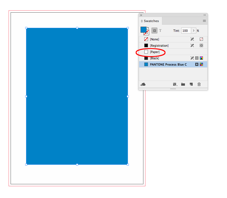
InDesign lets you simulate a paper color, but it would be a crude representation of a solid spot color overprinting a colored paper, and wouldn't necessarily be a reliable preview. Here's the default white [Paper] swatch (the [Paper] swatch does not output):

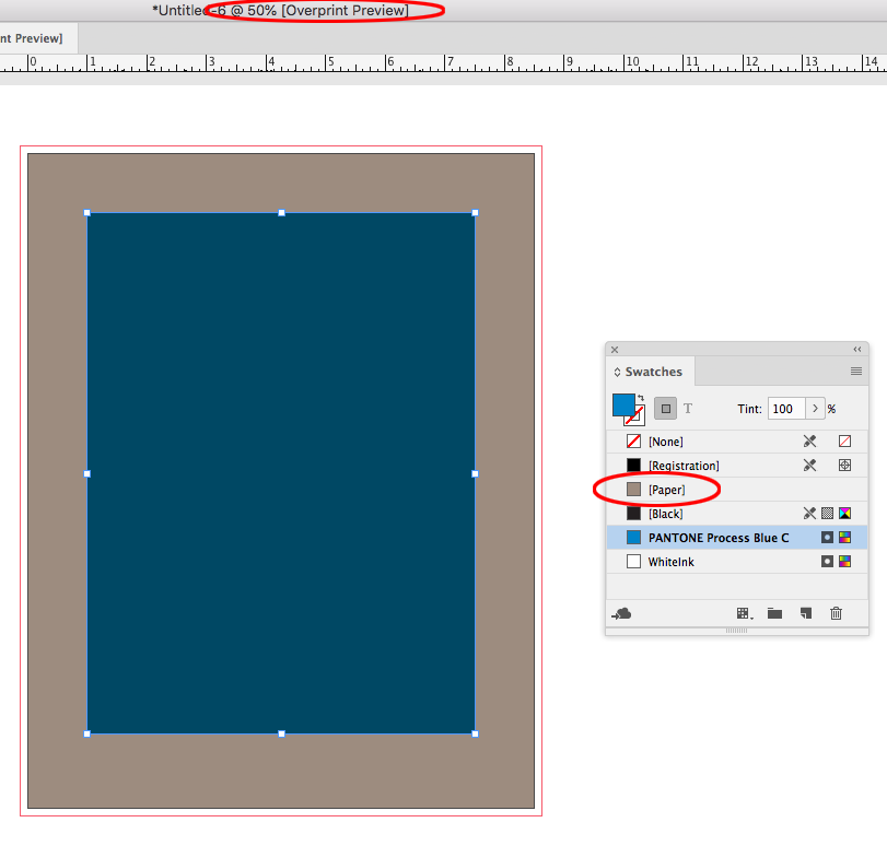
Here I’ve set it to a brown lab color and turned on Overprint Preview and InDesign attmpts to show me the affect of a transparent ink printing on the colored paper

Copy link to clipboard
Copied
Hi
I had a similar trouble with a newspaper printed in salmon coloured paper and I got away with it by measuring the colour of the paper with a ColorMunki Design (a quite reasonably-priced spectrophotometer) and the setting the Lab values as the colour of the paper in InDesign (as recommended above).
As the cardboard has a texture, you might use a picture and the set/tweak in Photoshop the main colour values using the data obtained as I said above (I had to average a set of papers, by the way because the colour was quite inconsistent from one batch to another). As this is a picture and not "the colour of the [paper] swatch", you would have to use a layer for this. In this case, you might get a better result by using "Darken" blend mode instead of "multiply" for the layer
That said, it is as good as it gets an inhouse solution McGyver Style. Don't expect awesome accuracy.
Best regards
Ps. corrected because of typos.


