

After profiling display color way out from what I see on printed materials on desk...

Copy link to clipboard
Copied
Hi
I have new xrite i1display Pro Plus device. Monitor spec Gamma 2.2, 160cd target...
what i see in indesign is way off what i see on desk. now i use pantone printed palette for color matching.
how to calibrate monitor to what i see on desk?
today i will receive i1studio if this can help.


 7
Replies
7
7
Replies
7
Copy link to clipboard
Copied
Why are my prints too dark?
A video update to a written piece on subject from 2013
In this 24 minute video, I'll cover:
Are your prints really too dark?
Display calibration and WYSIWYG
Proper print viewing conditions
Trouble shooting to get a match
Avoiding kludges that don't solve the problem
High resolution: http://digitaldog.net/files/Why_are_my_prints_too_dark.mp4
Low resolution: https://youtu.be/iS6sjZmxjY4
Copy link to clipboard
Copied
thanks..will read it all
Copy link to clipboard
Copied
Can you clarify a bit when you say "way off what i see on desk" Does that mean that you have standard lighting or a desktop light booth on your desk? Is your room light supplemented by window light? What about the displayed image is "Way Off" Too bright? Too Dark? Too Saturated? Not saturated enough? Can you add some more information so this group can address the problem directly? Thanks!
Copy link to clipboard
Copied
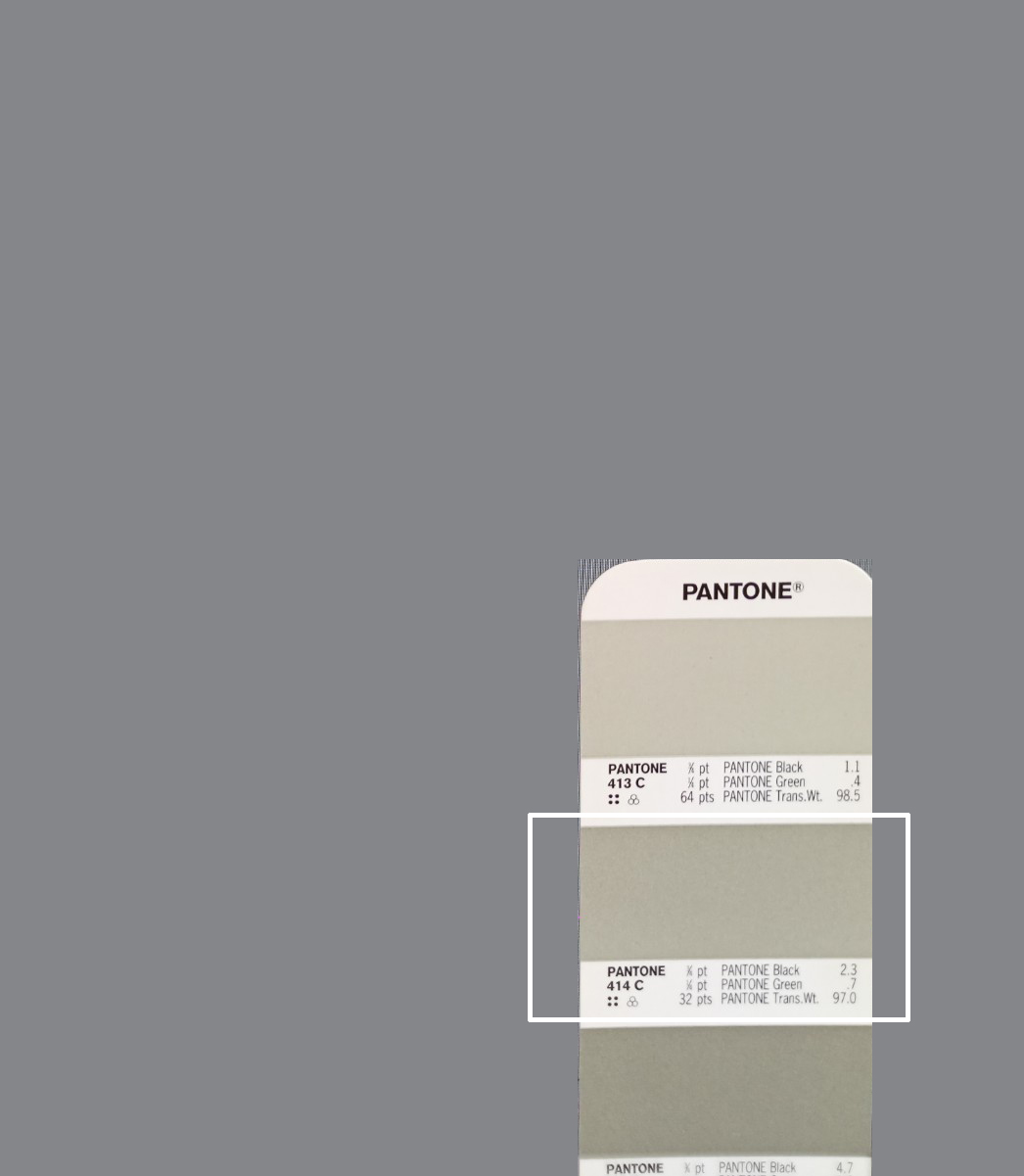
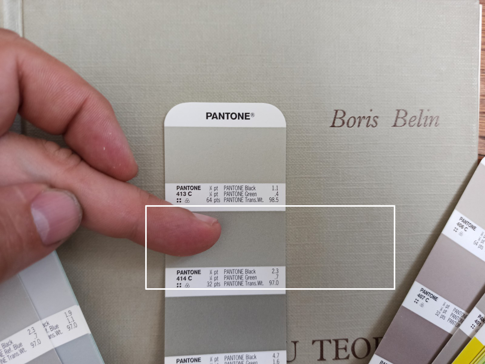
daylight, window, sun...
here is two pictures..its hard to shoot display with cell phone
Copy link to clipboard
Copied
I see these photos. It appears you are matching a Pantone color. How do they relate to the problem of the monitor being way off?

Copy link to clipboard
Copied
Your 414C swatch is a solid ink spot color printed on coated paper. Was the print output to an offset press running the same solid ink spot color on a coated sheet, or was the spot color converted to process CMYK? If the color was converted, the problem could easily be with the destination CMYK profile, which would affect the output color.

Copy link to clipboard
Copied
In adddition to what the others have written I'll add this expansion
IF the room light is at the right level for viewign printed mattter then its too bright for screen viewing.
The display screen must be viewed in subdued light, think of a cinema when the film is playing.
This means that unless you have a lightbooth nearby your screen you cannot view printed matter or swatchbooks near the screen
I hope that makes sense
I hope this helps
neil barstow, colourmanagement net :: adobe forum volunteer
google me "neil barstow colourmanagement" for lots of free articles on colour management
[please only use the blue reply button at the top of the page, this maintains the original thread title and chronological order of posts]
 AdChoices