 Adobe Community
- Home
- Color Management
- Discussions
- Re: Best Modern Method to Convert PMS to CMYK
- Re: Best Modern Method to Convert PMS to CMYK

Copy link to clipboard
Copied
Hi. I was searching for insight on best methods for converting PMS spot colors to CMYK and the most thorough discussion I found was here, and ironically it was started be ME (see: https://community.adobe.com/t5/color-management/safest-way-to-convert-pms-cmyk/m-p/2668304?page=1#M2...).
But that was 10 years ago. And I know there have been a lot of advances in Pantone sytems, color management, and all of the CC apps.
So just wondering if there is a preferred method for determing CMYK values for PMS spot colors if either A) you have a specific profile from the printer who will be running job; or B) you don't, so you assume GRACoL or SWOP based on experience?
The files are being created in Illustrator CC 2020, with all art currently setup as process + 3-4 PMS spot colors. But the client wants to narrow this down to process + 2 PMS only, so we have to convert 1 or 2 spot colors to CMYK and hope for the best.
- Is there any way in Illustrator (or PS I suppose), to easily see which spot colors would be out-of-gamut for CMYK (or MOST out-of-gamut)? This might help us determine which spots to convert.
I quickly tried a test in Illustrator of swithing spots to CMYK, checking Pantone Bridge values, and setting up a PS doc in LAB with spots, then doing a 'convert to profile'. All methods give pretty big differences in final results.
- In Illustrator CC, with Overprint Preview turned on, and proof colors set to our output device, how far should I trust my screen preview? I have an NEC MultiSync PA 242 (wide gamut) monitor that is calibrated with a i1 Display Pro to D50 specs, so it should be a pretty good display.
Thanks for any tips/tricks!!!


 1 Correct answer

Converting in Illustrator by ensuring that 'Use Lab Values...' is checked in the spot color options first, and then changing the color space to CMYK in the Color pallete on a box filled with a PMS color, 'should' get us the same results as creating a Photoshop file in LAB color space, then doing a 'Convert to Profile', correct?
In Illustrator the Document Color Mode would have to be CMYK, and the Swatch conversion would be to the document’s assigned profile (Edit>Assign Profile...). If the doc
... 10
Replies
10
10
Replies
10

Copy link to clipboard
Copied
Hi
Just my 2C, but wouldn't it be best to simply use Lab values for the PMS coloursand allow Adobe to map to CMYK.
Colorthink (Or perhaps Colorthink Pro is needed) would confrirm out of gamut status.
X-Rites discontinued color picker used to do that too.
Golour guru Steve Upton explained to me that Photoshop's gamut warning represents something different to what we might expect, which would be to reveal all colour values which fall outside the destination colourspace.
He explained that Photoshop's gamut warning highlights colours which will be remappped (in the proposed conversion) by a value over a certain threshold.
I hope this helps
thanks
neil barstow, colourmanagement.net :: adobe forum volunteer
[please do not use the reply button on a message in the thread, only use the one at the top of the page, to maintain chronological order]
Copy link to clipboard
Copied
The Pantone Lab values are instrument based readings from printed solid ink swatches, so the accuracy of the CMYK simulation relative to the printed solid ink is dependent on how closely the press is running to the destination CMYK profile used for the conversion. If your printer tells you that the destination profile should be SWOP, but their press isn’t really running to the SWOP standard, then a SWOP conversion would be somewhat off.
Pantone offers the device dependent PANTONE + Bridge libraries, which are process CMYK (and would change in appearance depending on the document’s assigned CMYK profile). However they don’t publish what the expected press conditions are and there are some glaring inconsistencies within the library.
When the color is a tint, there are also problems with using Ink Manager to make the conversion, so it is better to change the swatch to process Lab, and then to destination CMYK, rather than use Ink Manager.
To be useful, Pantone conversion charts would have to be specify the destination, so most online conversion applications and charts (like the Adobe Color web app https://color.adobe.com), are not reliable.
This Indesign thread I posted might help. It includes a Pantone chart specifically for GRACol Coated, GRACol Uncoated, sRGB, and sRGB HEX; with gamut info for the coated conversion:
https://community.adobe.com/t5/indesign/branding-color-guide/td-p/10818696?page=1
Copy link to clipboard
Copied
- Is there any way in Illustrator (or PS I suppose), to easily see which spot colors would be out-of-gamut for CMYK (or MOST out-of-gamut)? This might help us determine which spots to convert.
Using Photoshop’s Color Picker>Color Libraries is the easiest way to check whether a solid ink is in gamut. If you close all documents the current Color Settings’ CMYK space is used for the gamut. So, a color on the gamut edge might show as in-gamut to a coated profile, but out-of-gamut to an uncoated profile. Here with my Color Settings set to US Web Coated SWOP Pantone 3559C shows as in gamut:

But if I change the profile to US Web Uncoated SWOP it is out-of-gamut:

The other way to check gamut is by making the round trip from the measured Pantone Lab value, to the destination CMYK profile, and back to Lab. If there is a significant difference between the starting Pantone Lab values and the converted Lab values, the color is out-of-gamut. For my scripted branding guide I got the gamut info by making the round trip conversion with AppleScript. In the guide there are a fair number of colors listed as out-of-gamut, but are close to the edge.
Copy link to clipboard
Copied
Hi, thanks for all the helpful replies! Much appreciated.
-Just my 2C, but wouldn't it be best to simply use Lab values for the PMS coloursand allow Adobe to map to CMYK.
That was my initial thought and plan as well. I know it relies on the printer being calibrated to the profile they say to use (or the one we guess on), but that is beyond our control. We have to start somewhere. If we use Pantone's recommendation (i.e., Bridge colors), that's just one other conversion to a specific output condition as well, right?!?
Converting in Illustrator by ensuring that 'Use Lab Values...' is checked in the spot color options first, and then changing the color space to CMYK in the Color pallete on a box filled with a PMS color, 'should' get us the same results as creating a Photoshop file in LAB color space, then doing a 'Convert to Profile', correct?
Any input on how much we can trust our cailbrated display when looking at the original spots and the conversions next to each other?
THANKS!
Copy link to clipboard
Copied
Converting in Illustrator by ensuring that 'Use Lab Values...' is checked in the spot color options first, and then changing the color space to CMYK in the Color pallete on a box filled with a PMS color, 'should' get us the same results as creating a Photoshop file in LAB color space, then doing a 'Convert to Profile', correct?
In Illustrator the Document Color Mode would have to be CMYK, and the Swatch conversion would be to the document’s assigned profile (Edit>Assign Profile...). If the document has an assigned profile, the Color Settings’ CMYK Working space is not used, but the Color Settings’ Conversion Options (Intent, Engine, and BPC) do have an affect on the conversion numbers.
Photoshop’s Convert to Profile folds the destination profile and conversion options into a single dialog.
I think it is worth keeping in mind that the Pantone Lab values are instrument read from printed swatches—a CMYK conversion is directly from instrument read Lab color to the CMYK destination—so if the color is in gamut, the Pantone printed swatches might be the most accurate reference.
If you want to use your display as the final color reference, the conversion of the Lab Color is directly to your monitor profile. The display of Lab color should be accurate, but only if your monitor profile is an accurate profile of the display, and the solid ink color isn’t outside of the display’s gamut. If you make the conversion from Lab to CMYK then the accuracy of the CMYK color depends on both the monitor profile and the assigned CMYK profile.
Copy link to clipboard
Copied
Ok, that makes sense.
For our conversion options, we've generally set this to 'Relative Colorimetric' and 'Use Black Point Compensation'. But we are generally just converting RGB images into the final CMYK working space when making PDFs. Are these good setting for this application?
And my monitor is a high-quality, wide gamut display that uses NEC's color management software with an i1 Display Pro plugged directly into the monitor to calbrate to typical press standards (e.g,. D50, 90cd/m2 lighting, etc.). Hopefully this works well. We understand that we need to have 'Overprint Preview' turned on to get Illustrator to use the LAB values for the spot colors, correct? Those definitely look different with it turned on. I guess we're wondering about making any pretty minor corrections based on what we're seeing (with a possible skew towards more pure color values or values that may have less tendancy to shift if we did).
We probably won't get to see proofs from the printer on this, so just hoping for the best. The client is trying to aquire a profie from the printer right now. We'll see how in tune with color management they appear to be...
Thanks!
Copy link to clipboard
Copied
Relative with BPC turned on usually produces the least amount of color shift when a color is on the edge of the gamut.
And my monitor is a high-quality, wide gamut display that uses NEC's color management software with an i1 Display Pro plugged directly into the monitor to calbrate to typical press standards (e.g,. D50, 90cd/m2 lighting, etc.). Hopefully this works well. We understand that we need to have 'Overprint Preview' turned on to get Illustrator to use the LAB values for the spot colors, correct?
The accuracy of the .icc monitor profile (which is created during a hardware or software calibration), is as important as the quality of the display. The device independent Lab values get converted directly into the monitor profile, so if the soft proof of the Pantone Lab swatches are significantly off, there’s probably a problem with the monitor profile.
Both InDesign and Illustrator treat spot colors the same way. With Overprint turned on you see a soft proof of the solid ink Spot color, with it turned off you see how it would convert into the document’s CMYK profile. If you make the conversion to CMYK, OP On or off would show the same color soft proof, and On would also show an Attribute panel overprint effect.
Copy link to clipboard
Copied
Hi, thanks again for the helpful tips & confirmations here. One additional wrinkle that may be coming up, and I wanted clarification on:
- Would anything change if the final output device ended up being a digital press of some kind, specifically an inkjet possibly?
One of these jobs will be on a label printer, and we're trying gain clarification if it is an Epson commercial label printer vs a more traditional offset press. If it is indeed, do we approach this differently since these printers sometimes have 6-8 ink colors instead of just CMYK (e.g., extra orange, greeen, etc., thrown in for 'flavor')?
Or do we just get an appropriate output profile for this device (if they have one) and plug that in as we would SWOP, GRACoL, etc.?
OR, with these devices specifically, is it better to leave PMS spots as spots and let the EPSON's RIP do the conversion at time of printing? If so, what profile would we assign to our working documents if it's a mix of CMYK + Spot colors?
Thanks in advance!
Copy link to clipboard
Copied
Jethro,
IF you can get a device/media profile then I would use it.
But to find out what's best (converting/ sending spots etc) you'll have to test.
I hope this helps
neil barstow, colourmanagement.net :: adobe forum volunteer
[please do not use the reply button on a message in the thread, only use the one at the top of the page, to maintain chronological order]
Copy link to clipboard
Copied
Nothing has changed in 1o years. PMS colors are still specified using CIE Lab values. CIE Lab is the profile connection space (for version 2 and version 4 profiles) and that is the best starting point for CMYK conversion. Having the exact device profile or print standard profile. I wish I had a dollar for every job I receive that used the "North American Pre-press Defaults" in Photoshop or InDesign for CMYK conversions because the designer never bothered to ask the printer what standard will be used on their job in the print process. So for a high-end Sheetfed offset job US Web Coated SWOP ( Web printing) is substandard and a small gamut) Sadly if files are received that way details are gone...
So convert to the proper destination profile. That is the best method, and in the case of Pantone Colors, do not trust how your monitor displays them. Even if you have the super high end, high bit depth big gamut display. Even if the CMYK profile you are converting too fits inside of the display gamut if the PMS colors overprint CMYK or each other. There is no established math that is used in Adobe software to display PMS overprints. There is no public data that works universally for Ink trapping and opacity for PMS colors and no wat to display them accurately if they overprint.
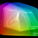
In the case of multiple destinations. Leave the files in an RGB colorspace that is large enough to cover the largest gamut printing process. So in the case of high-end inkjet prints that are more than likely ProPhoto RGB. No do not attempt to take other RGB images and convert them to ProPhoto, get there from raw files. Once the file is converted to pixels it is limited to the gamut of the container RGB color space.
So start with the end in mind and the results will be as you expect.
 AdChoices