 Adobe Community
- Home
- Color Management
- Discussions
- Re: The on-line guide to Pantone Bridge mentions '...
- Re: The on-line guide to Pantone Bridge mentions '...
Colour values not matching up
Copy link to clipboard
Copied
Do anyone know why my colour information doesn't match up with eyedropper info? I created the colour in illustrator cmyk color space, using Pantone color bridge swatch book.
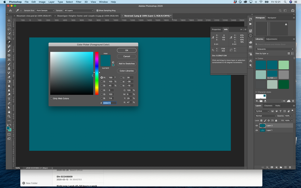
The color is Pantone 3155C c100 m9 y29 k47 is meant to have R0 G98 B114 HEX #006272. I have no idea what I am doing wrong. If you can help, you would truly make my year.
Copy link to clipboard
Copied
Pantone spot colors are not defined as CMYK or RGB, but rather as device-independent LaB colors. What RGB or CMYK colors result from ICC color management conversion of LaB or a particular RGB or CMYK color space may be out-of-gammut.
Spot colors are supposed to be used for specific colors typically realized via spot color inks, not as a shorthand for particular RGB or CMYK colors in some color space.
Copy link to clipboard
Copied
Also, keep in mind Pantone now provides two different versions of their libraries. As Dov notes the PANTONE + Solid libraries are defined as Lab, but there are also the PANTONE+ Color Bridge libraries, which are defined as process CMYK. I think you are referring to the Bridge library, although the suffix for Coated Bridge colors would be CP.

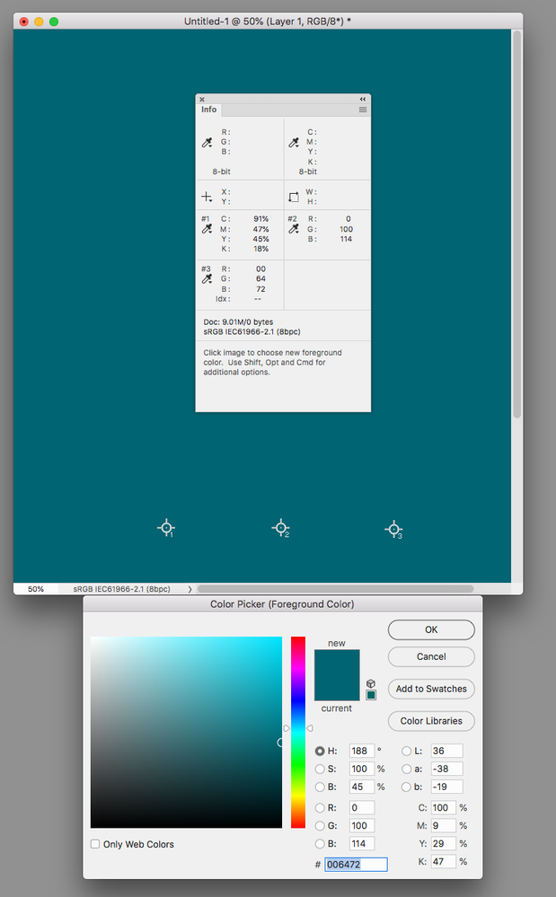
Your capture is showing Photoshop’s color picker with the Bridge CMYK definition for 3155, but your document’s color mode is RGB, so the RGB value showing in the Picker is the color managed conversion from your current Color Settings’ Working CMYK Space profile to your document’s assigned RGB profile—sRGB in your case. And, because your document is in RGB mode, the Info panel shows the conversion back to CMYK from your document’s RGB space:
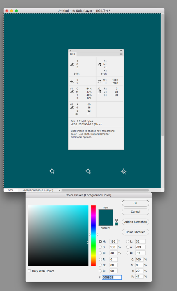
If I change my CMYK Working Space to US Sheetfed Coated from the default US Web Coated SWOP, and refill with the Bridge color, the RGB appearance of CMYK 100|9|29|47 changes because of the new profile, and I get a new conversion to RGB:
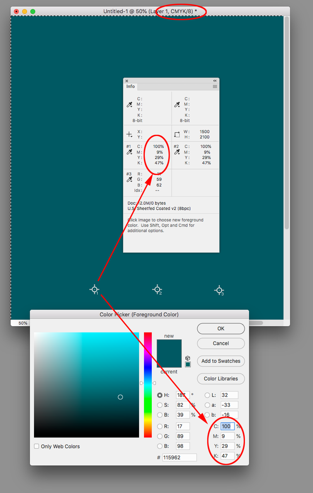
If I wanted the Info Panel’s CMYK value to match the Pantone Bridge value, the color mode of my document would have to be CMYK:
Copy link to clipboard
Copied
Hi
Dov Isaacs is right of course that Pantone solid libraries are defined as L*a*b* (Lab for short) colours.
"Spot colors are supposed to be used for specific colors typically realized via spot color inks, not as a shorthand for particular RGB or CMYK colors in some color space." hits the nail right on the head:
The original Pantone system is, essentially, a system of specially mixed "Pantone" inks added to a colour print run as "special" ink colours using an additional unit on the press.
I wonder what your job is for?
Rob Day mentioned here that you're working in Illustrator's RGB mode and you mention HEX colour - maybe it's for Web? Pantone colours, and especially CMYK values are pretty much irrelevant in those circumstances
It looks like you are actually using a Pantone Bridge Library where the colours are listed in CMYK
Maybe as a first step, you'd be better off with the Pantone Solid library [rather than B ridge] as it's defined as Lab colour rather than CMYK (which I believe is where your confusion springs from)
I'll try explain a little about how colour management works with Lab, CMYK and RGB, as well as Pantone.
As a basis to all this, it's important to understand that the same numerical RGB or CMYK colour values set in different RGB and CMYK colour spaces produce different visual results.
[in colour management we use the Lab colour model as a reference to how colour will appear visually.
Note that Lab is a colour model (not a colour space), RGB or CMYK are also colour models.
BUT Lab differs inasmuch as whereas Lab colour numbers unequivocally define colour-
RGB or CMYK values must be associated with a colour space to define colour, with CMYK or RGB we have to include an ICC profile to define the colour space,
for example: "Adobe RGB" or Coated GRACoL 2006 (ISO 12647-2:2004) CMYK].
You seem to be expecting certain RGB/ HEX values from a Pantone reference, BUT the RGB/ HEX (or CMYK) values needed to produce the same "reference" colour will differ between colour spaces.
I we enter a Lab value (or Pantone Solid colour) in Adobe's imaging software, the resulting RGB or CMYK values are produced by a conversion and will differ depending on the RGB or CMKY colours pace you're working in.
If using Pantone CMYK values from Bridge Libraries we need to know what CMYK colour space Pantone intended. The on-line guide to Pantone Bridge mentions 'coated paper' and 'G7 technology', so we could perhaps expect Coated GRACoL 2006 (ISO 12647-2:2004).icc to produce similar numbers.
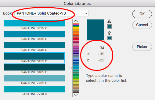
Here's an example Pantone+ solid coated 3155C and sRGB
Lab 34 -39 -23 =
C 100!, M 36!, Y 42!, K 21!** in Coated GRACoL 2006 (ISO 12647-2:2004)
which = R 0, G 96, B 116 sRGB.icc
** the ! mark here means that specific Pantone colour is beyond the capability of Coated GRACoL 2006 (ISO 12647-2:2004) printing, its out of gamut
Different RGB colour spaces (e.g. sRGB /Adobe RGB) will translate those CMYK colours differently.
For example Pantone+ solid coated 3155C and Adobe RGB
34 -39 -23 = C 100!, M 36!, Y 42!, K 21!
in Coated GRACoL 2006 (ISO 12647-2:2004)
which = R 0, G 96, B 115 AdobeRGB.icc***
***Do note that other original colours will exhibit far greater shifts in RGB values.
All this means you cannot expect certain RGB (or HEX) values when looking at a Pantone swatch unless you KNOW the RGB colour space Pantone intended.
For web, you'd be better off defining colour for exchange between users as, say sRGB.icc values or if it's a print job and you're in Europe, say, CoatedFOGRA39.icc CMYK (or ideally THE CORRECT icc profile for the printing process).
Or maybe if you need swatchbooks, use Pantone + Coated Lab for this, because as I described above, Lab unequivocally defines colour.
Are you actually printing? If you do work in RGB then when your document goes to print, of course, a CMYK conversion takes place and that has to use THE CORRECT icc profile for the printing process
a little background reading I hope might help: https://www.colourmanagement.net/advice/about-icc-colour-profiles/
I hope this helps
if so, please "like" my reply
thanks
neil barstow, colourmanagement.net :: adobe forum volunteer
[please do not use the reply button on a message within the thread, only use the blue reply button at the top of the page, this maintains chronological order]
Copy link to clipboard
Copied
The on-line guide to Pantone Bridge mentions 'coated paper' and 'G7 technology', so we could perhaps expect Coated GRACoL 2006 (ISO 12647-2:2004).icc to produce similar numbers.
If you look carefully at the Bridge CMYK numbers it is pretty clear they are not color manged conversions from the Solid ink Lab values—it’s evident in the Warm and Cool Gray swatches. In the end I don’t think the Bridge values are particularly useful if you are trying to get a process CMYK simulation to match a solid Pantone ink swatch.
https://community.adobe.com/t5/indesign/branding-color-guide/td-p/10818696?page=1
Copy link to clipboard
Copied
I agree Rob,
When it comes to Pantone and this forum you are the man I would ask since your knowledge seems extensive and your replies helpful and considered.
IMO Pantone colours are only truly useful when 'extra printing press units with "special" colour inks' are used.
My earlier text was what one might perhaps call charitable in the light of your comment - but what the hell were Pantone thinking with these Bridge Libraries!
Now that the solid libraries provide Lab numbers that’s has to be the way to go, enter the solid - allow the software to convert to process CMYK using the relevant press CMYK profile.
In thius case, I think the OP might be working for the web given the mention of both RGB and HEX references.
Colour management can be such a morass for the uninitiated, this is especially so when an industry "colour expert" like Pantone seems on the surface of it to have overlooked the need to
1: use a good press CMYK ICC profile to convert solid to provide process CMYK values
and
2: to tell users what the ICC profile used to produce the Bridge process values is.
I should perhaps amend my earlier comment to
"The on-line guide to Pantone Bridge mentions 'coated paper' and 'G7 technology', so we could perhaps reasonably expect a colour managed conversion [from (Pantone+ solid) Lab values to Coated GRACoL 2006 (ISO 12647-2:2004).icc] to produce similar process CMYK numbers to those provided by the Pantone Bridge Library. Since it doesn't, we are rather in the dark as to just how valid the numbers in Bridge Libraries might be when it comes to printing."
Does that seem like a reasonable summary of the situation to you Rob?
this help from Adobe doesn’t seem to make it any easier for users?:
https://helpx.adobe.com/uk/illustrator/kb/pantone-plus.html
"When workflows demand that Pantone colors use CMYK values, Adobe recommends that you use the Pantone Plus Series® global colors instead of spot colors. If you must use Pantone spot colors that use CMYK values, see the following workarounds.
- - -
Workaround 1: Replace Pantone Plus with older Pantone color books
- - -
Workaround 2: Make older Pantone libraries available for missing colors"
"
thanks
neil barstow, colourmanagement.net
Copy link to clipboard
Copied
IMO Pantone colours are only truly useful when 'extra printing press units with "special" colour inks' are used.
There could be a case like corporate branding where the color needs to be printed as both solid ink or process CMYK simulation depending on the use, i.e. a business card vs. a magazine ad. Twenty years ago two-color printing was common, but now it’s less expensive to print process CMYK.
The Pantone libraries were introduced in the early versions of Illustrator when there was no formal color management system. The legacy libraries were all defined as spot colors, but with CMYK values, which were clearly handmade builds, and not conversions. There were coated, uncoated, and process libraries, but they all had the same CMYK values! The libraries remained unchanged until CS6 introduced the Lab defined solid ink swatches, before that the conventional wisdom was solid ink spot colors could not be accurately displayed.
The Bridge libraries exist because there is still a demand for a single, but accurate CMYK definition, which obviously can’t be met. It probably would have been better to have simply kept the old legacy CMYK builds rather than imply the new Bridge values are now more accurate. Everyone wants definitive Pantone, CMYK, RGB, Hex equivalents, which is naive but understandable—even Adobe is guilty of meeting that demand with color.adobe.com.
Copy link to clipboard
Copied
Here’s an example of the Bridge inconsistencies—the center column has the lab solid ink swatches, the left column is a conversion to GRACol 2013, and to the right the Bridge swatch. The document’s assigned CMYK profile is also Coated GRACol 2013:
https://shared-assets.adobe.com/link/ad9f32f4-6fb3-49c6-7722-b1e732f98015
Copy link to clipboard
Copied
Hello,
Wow, Thank you all for your help and responses. Tons of great, in-depth feedback.
So yes, I actually was needing this for web and print. The reason I was wanting the values was to create a brand style guide originaly using the values from the Pantone Colour Bridge Coated swatch book (because there will be printed products)
So please correct me if Im wrong, but basically you would suggest that I choose a solid spot colour from Pantone Solid Libraries, add it to my CC libraries using LAB and then it will adjust accordingly for closest results, depending on my document colour space?
So say I am designing in Illustrator. I create a new document in RGB, and design using the brand colours I created in my CC Libraries using LAB, when I save out/convert to profile the SRGB the colour values will convert to whatever it needs to, in order to get the most accurate results that specific colour space can offer?
And then for CMYK would I need to do the same, except starting with e CMYK colour space?
Am I getting warmer? My brain hurts haha.
Copy link to clipboard
Copied
The reason I was wanting the values was to create a brand style guide originaly using the values from the Pantone Colour Bridge Coated swatch book (because there will be printed products)
Also, Illustrator and Photoshop documents have a single document color mode—InDesign does not, and allows you to mix CMYK, RGB, and Lab objects on the same page, which makes it a bit more flexible for color management.
In Illustrator your document could be CMYK, and if the color is a Pantone+ Solid ink swatch you would have the option to export Lab to sRGB via Save For Web, or export to PDF for print either keeping the swatch as a spot color, or setting it to process if you wanted to make a conversion directly into your document’s CMYK profile on export.
So, for the brand’s web RGB value there is not much ambiguity—you would have to start with a Pantone + Solid swatch, and make the conversion to sRGB in order to get the correct #hex value. You can not start with the Bridge swatches because they are defined as CMYK and the color’s display appearance will change depending on the assigned CMYK space. Profile assignments do not affect the appearance of the Lab values, so a conversion directly from a +Solid color to sRGB will give the best web hex value and appearance.
Copy link to clipboard
Copied
Hi Kelly M,
Rob Day is your man to help withstep by step day to day Pantone usage detail.
Using the PANTONE +Solid values is more sensible IMO, because the CMYK values Pantone give in Bridge libraries relate to who knows what CMYK print condition!
You should see the PANTONE+ Solid Coated swatches listed in the Color Picker in Adobe apps as standard I believe.
When selecting a colour swatch in the Adobe Color Picker you'll see the relevant CMYK and RGB values too, as calculated by Adobe [based on your "color settings" RGB and CMYK default profiles - I mention that because you'll perhaps see a "!" at the end of the numbers, that "!" signifies that the original colour values are outside the gamut (colour range) of the destination colour space. Nothing you can do about that other than choose a Pantone swatch that’s within gamut.
I hope this helps
neil barstow, colourmanagement.net :: adobe forum volunteer
[please do not use the reply button on a message within the thread, only use the blue reply button at the top of the page, this maintains the original thread title and chronological order of posts]

