 Adobe Community
- Home
- Color Management
- Discussions
- Re: Photos look different on my phone compared to ...
- Re: Photos look different on my phone compared to ...

Copy link to clipboard
Copied
Hi Guys,
I edit my photos in either Lightroom or Photoshop. The photos look vibrant and colourful on my PC, as per the editing I had done. But when I save these photos in my S9-Plus, they look colourless and weird.
Can someone please help me here? Do I have to save the files differently once I edit the photo in Photoshop or Lightroom?
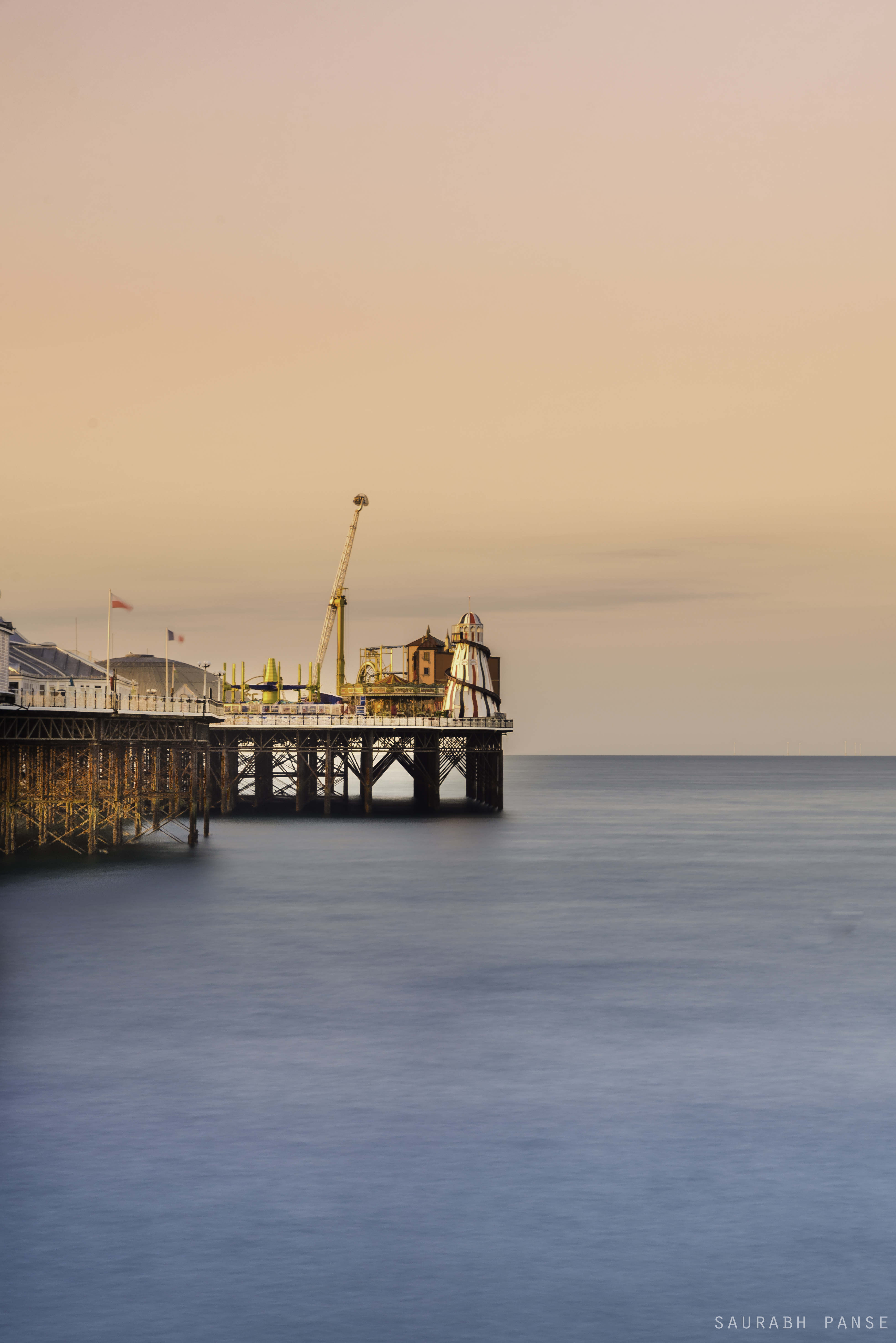
Example 1 -
The photo on PC -
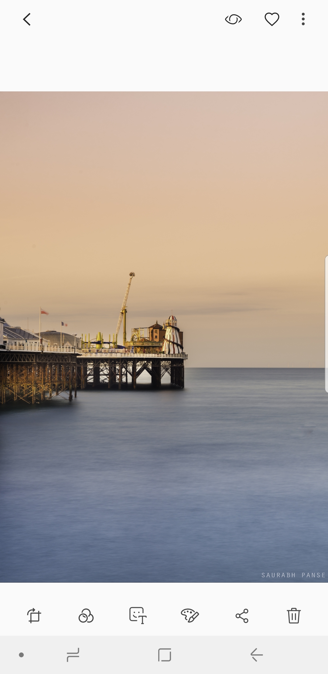
Photo/Screenshot from my Samsung S9Plus -
---------------------------------------------------------------------------------------------------------------------------------------------------------------------------
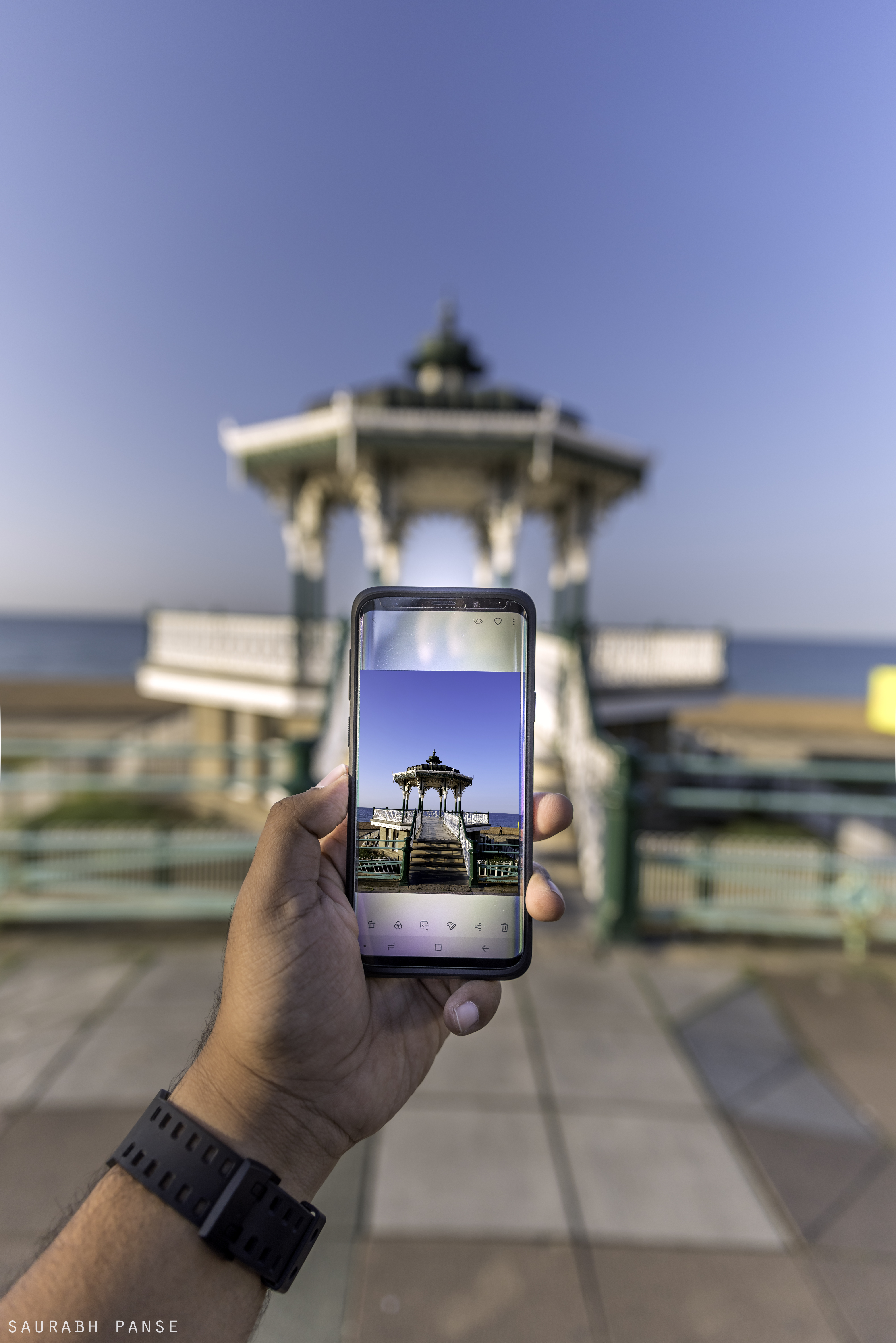
Example 2 -
The photo on my PC -
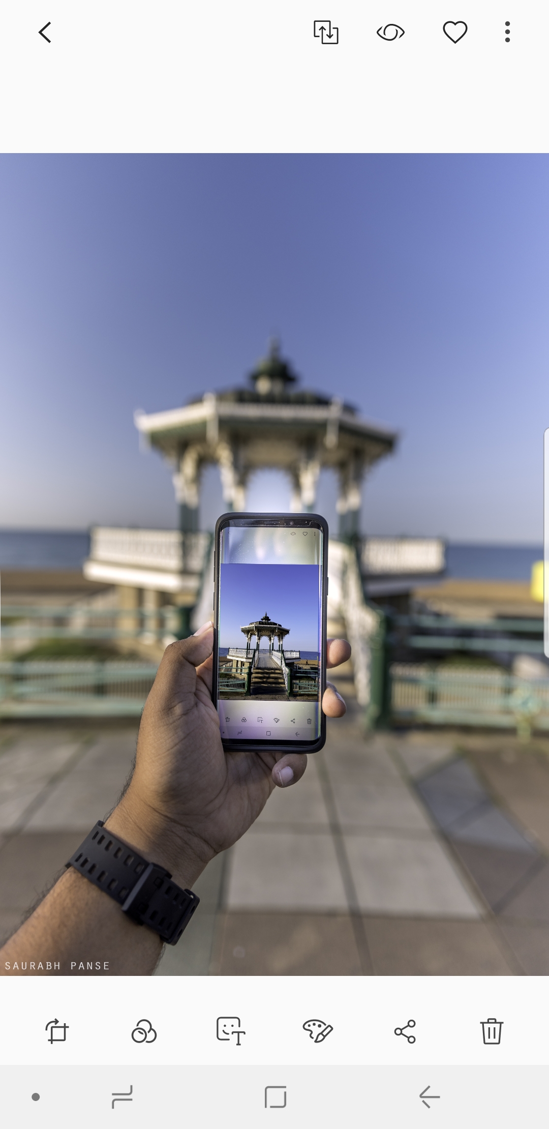
Screenshot from my Samsung S9Plus-


 1 Correct answer

Hi
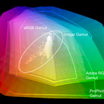
The explanation is in the way colours are stored in the image. Each pixel stores the colour as three numbers representing Red, Blue and Green. However what actual colour is represented by each number depends on the colour profile. Your original document is using a profile called ProPhoto.
Photoshop is colour managed. It uses the color profile embedded in the document to tell it how to use the RGB numbers that make up each pixel and correctly display it on your monitor (using the monitor color p
... 64
Replies
64
64
Replies
64
Copy link to clipboard
Copied
The issue isn't managed images, Dave. If the file views properly in an indoor display that is calibrated with a static environment lighting, and it is similarly displayed on a phone then moved to any other environment the variables are no longer controlled and the color is not going to match. Images can not be managed for such variables as direct sunlight or say mercury vapor lighting.

Copy link to clipboard
Copied
This is all apples and oranges. You're actually talking about two different things, and you're both right.
Calibration - white point, black point - is not color management. It sets the environment for color management to work within, but it's separate from the color management chain.
The profile conversion from document to monitor just maps white to white. Whichever way, the numbers are still 255-255-255. That's color management. And BTW, the process knows nothing of how accurate the profiles are.
But how that white looks, and by extension how the image looks, is down to how you set up your calibration parameters. And for most of us, the reference will be paper white. That's about the only reference we all have in common. That's white.
And this is where phones fail, because they have no way to accommodate the viewing conditions - which, as we all know, is a crucial component in this mix. Your perception depends entirely on the viewing conditions. This is what we take into consideration when setting up the calibration targets.
You both know all this, of course 😉
Copy link to clipboard
Copied
"And this is where phones fail, because they have no way to accommodate the viewing conditions -"
Well Apple can argue that some iPhone's using True Tone accommodate viewing conditions:
How does True Tone work?
Devices featuring True Tone technology feature sensors that measure the ambient light colour and brightness.
I don't use it.
I dont' edit images on my iPhone or iPad.
I'm glad most of us are pretty good at white adaptation.

Copy link to clipboard
Copied
Hi Dave, i did as you recommended (save for web, convert and embed color) and still have different colors between computer and phone. I am a bit confused as i tried all solutions mentioned out there. Any other reason why this might happen?

Copy link to clipboard
Copied
(1/2)How other people's photos such as many famous photographer's photos look the same through all devices.
(2/2) If i uploaded the photo to Instagram which is edited in Lightroom classic and then transferred to phone which is oversaturated will it still look oversaturated or it will differ ?
Copy link to clipboard
Copied
(1/2)How other people's photos such as many famous photographer's photos look the same through all devices.
By @rishav320534278y6m
I don’t think that is true. Where is the proof that a famous photographer’s photos look the same through all devices? Does this mean when you look at a famous photographer’s photo on Instagram, you have also seen at it on another service like Facebook, and you have also seen the original? And so you are able to do a direct side-by-side comparison of all three?
Because it is extremely likely that what you are actually thinking is that their photo looks really good, but if you were to actually see the original, you would probably be surprised to find that the original looks different or better.

Copy link to clipboard
Copied
The difference in how photos appear on your phone compared to your computer can be attributed to various factors. Here are some common reasons for such discrepancies:
Display Calibration: Phones and computers often have different display technologies and color profiles. The color accuracy and calibration settings on your phone and computer may not match, leading to variations in how images are displayed.
Color Temperature: Devices may have different color temperatures. Some screens might lean towards warmer tones, while others may have cooler tones. This can affect how colors are perceived in images.
Brightness Settings: The brightness level on your phone and computer can impact how images are perceived. A well-lit or dim environment can also contribute to differences in the visual experience.
Color Profiles: Photos may have embedded color profiles that are interpreted differently by various devices and applications. Make sure your devices are set to use standard color profiles for consistency.
Device Age and Quality: Older devices or those with lower-quality displays may not render colors as accurately as newer or higher-end devices.
Software Enhancements: Some devices come with software enhancements that automatically adjust colors or contrast to improve visual appeal. These enhancements may vary between devices.
To address these differences and ensure a more consistent viewing experience, you can consider the following steps:
Calibrate Displays: On your computer, you can use built-in calibration tools or third-party software to adjust the display settings for better accuracy. Some phones also have display calibration options in their settings.
Check Color Profiles: Ensure that both your phone and computer are using standard color profiles. This helps maintain consistency in color representation across devices.
Use Professional Editing Software: If you are editing photos, consider using professional editing software with advanced color management options. Adobe Photoshop, for example, allows you to work with color profiles to maintain consistency.
Compare in Neutral Environment: When assessing the differences, try to do so in a neutral environment with consistent lighting conditions to minimize external factors.
By addressing these factors, you can reduce the disparities in how photos appear on your phone and computer. Keep in mind that achieving a perfect match between devices may be challenging due to variations in hardware and software configurations.
Copy link to clipboard
Copied
Another example of why having ProPhoto as default for Lightroom's "Edit In Photoshop" is a monumentally bad idea. Why can't it be sRGB, so that newcomers don't get into this trouble time and time again?
Those who need or want ProPhoto will know how to get it. They are experienced users who waste no time in changing most of the default settings anyway.
Copy link to clipboard
Copied
The default setting of ProPhoto for Lightroom's "Edit In Photoshop" has proven to be a problematic choice, exemplifying the challenges that newcomers often face. It would be more practical to have sRGB as the default, minimizing issues for those less experienced with the intricacies of color spaces. Users who specifically require ProPhoto are typically seasoned and adept at adjusting settings according to their needs, making it unnecessary for ProPhoto to be the default setting. Choosing sRGB as the default would promote a smoother workflow for beginners and reduce the likelihood of recurring problems.

Copy link to clipboard
Copied
Hi,
it's safe to assume that mobile devices are close to the sRGB colorspace.
So that’s what we need to give them - they do not have the facility to read the embedded profile so it's important to bear that in mind.
EDIT
quailty handhelds e.g. iPhone since 7 and many recent Android devices are now capable of showing DISPLAY P3 data - that’s quite a large colourspace.
neil
Copy link to clipboard
Copied
Hi Neil,
Absolutely, it's a reasonable assumption that mobile devices generally align closely with the sRGB color space. Considering that these devices often lack the capability to interpret embedded profiles, it becomes crucial to deliver content in the sRGB colorspace for optimal display accuracy.
It's worth noting that high-quality handhelds like the iPhone since the 7 and numerous recent Android devices have advanced capabilities, such as showcasing DISPLAY P3 data, which encompasses a considerably larger color space. This expanded capability is a significant development in the mobile device landscape.
Best regards
John

Copy link to clipboard
Copied
I should ask if 8 bit or 16 bit is best for external editing and do all apps recognize it?
(Not a frequent Lr user, but I should know what's best practice.)
Copy link to clipboard
Copied
For editing, I would always recommend 16 bit over 8 bit. There is far less chance of visible banding being introduced. As for whether all apps support it, I don't know.
Dave
Copy link to clipboard
Copied
Thanks, Dave. 8 vs 16 used be quite the religious arguement years ago.
Copy link to clipboard
Copied
Display in a different light will appear differently most of that is due to the viewer's environment. How bright, and what color the light is and the viewing angle. So no one's phones will display color properly, even if the display was somehow profiled and the software supported color management, if the environment is different the colors will not appear the same. IOS has an automatic color temperature adjustment that compares the color of the ambient light and makes an attempt to adjust the display on the user's phone, but it’s not very good yet.

Copy link to clipboard
Copied
Hi!
I have same problem whit colors what Dave but I can see the diffrent at the stage of saving the photo in Photoshop. Mayby somone can help me here. I use first LR and aftre edit photo in PS. Everythink work good untill the photo is saved. I can see a big difference on my computer especially color on skin is more gray and this is big problm for me! I dont know what to do or change. I seve photo by using save as web(legacy) i have selected convert to sRGB. In LR also my settings are sRGB. Please help me!


Copy link to clipboard
Copied
What application are you viewing your saved image in? Some applications are not color managed so will display differently.
Dave
Copy link to clipboard
Copied
Also, you have Preview in SFW set to "Monitor Color". That's wrong and shows the image without any color management.
Set it to "Use Document Profile". That's the color managed version and it will now match Photoshop.
As Dave points out, it will still be wrong if viewed in a photo viewer without color management.
Copy link to clipboard
Copied
An sRGB file should display quite close to correct appearance on a handheld device, but there's an other possible issue here, IF your computer screen is un-calibrated - or maybe it's using a broken ICC profile, then it's appearance will be "wrong" - (so any image you edit is now skewed) - if that's the case maybe the phone is displaying the image more accurately than your computer's screen.
Reasonably recent handheld devices are pretty consitstent one to the other.
If you suspect an issue like that - then please read on:
Display profile issues on Windows
At least once a week on this forum we read about this, or very similar issues of appearance differing between applications.
Unfortunately, with Microsoft hardware: Windows updates, Graphics Card updates and Display manufacturers have a frustratingly growing reputation for installing useless (corrupted) monitor display profiles.
I CAN happen with Macs but with far less likelyhood, it seems.
The issue can affect different applications in different ways, some not at all, some very badly.
The poor monitor display profile issue is hidden by some applications, specifically those that do not use colour management, such as Microsoft Windows "Photos".
Photoshop is correct, it’s the industry standard for viewing images, in my experience it's revealing an issue with the Monitor Display profile rather that causing it. Whatever you do, don't ignore it. As the issue isn’t caused by Photoshop, don’t change your Photoshop ‘color settings’ to try fix it.
If you want to rule out pretty much the only issue we ever see with Photoshop, you can reset preferences, I never read of a preferences issue causing this problem though:
To reset the preferences in Photoshop:
https://helpx.adobe.com/photoshop/using/preferences.html
Note: Make sure that you back up all your custom presets, brushes & actions before restoring Photoshop's preferences. Migrate presets, actions, and settings
To find out if the monitor display profile is the issue, I recommend you to try setting the monitor profile for your own monitor display under “Device” in your Windows ‘color management’ control panel to sRGB temporarily. You can ADD sRGB if its not already listed.
And be sure to check “Use my settings for this device”.
(OR, if you have a wide gamut monitor display (check the spec online) it’s better to try Adobe RGB here instead).
Quit and relaunch Photoshop after the control panel change, to ensure the new settings are applied.

If this change fixes the issue, it is recommended that you should now calibrate and profile the monitor properly using a calibration sensor like i1display pro, which will create and install it's own custom monitor profile. The software should install it’s profile correctly so there should be no need to manual set the control panel once you are doing this right.
Depending on the characteristics of your monitor display and your requirements, using sRGB or Adobe RGB here may be good enough - but custom calibration is a superior approach.
I hope this helps
thanks
neil barstow, colourmanagement.net :: adobe forum volunteer
[please do not use the reply button on a message in the thread, only use the one at the top of the page, to maintain chronological order]

Copy link to clipboard
Copied
Whatever I do my "blacks" always look washout when I move them to my galaxy 9, and they don't look that good on Instagram. Any way to fix it?

Copy link to clipboard
Copied
"Whatever I do" ... What is the whatever? Please list in detail the things you tried to do, including the settings chosen.
Copy link to clipboard
Copied
All possible color output settings available in the lightroom.
Exportin to cloud in Lightroom desktop, so I can import on mobile.
Always the same, looks really bad when I preview it on mobile. I guess something is wrong with the phone if I view it on Instagram on phone looks worst than when I preview it on a desktop.
Copy link to clipboard
Copied
There's nothing wrong with the phone unless it was sold as a color managed device. Color management doesn't magically make things right on random screens. But your question is IMPOSSIBLE to answer. If you've done everything it stands to reason that anything we suggest you have already done, and we'd just be wasting your time.
Copy link to clipboard
Copied
So why black shows up so badly?
Copy link to clipboard
Copied
That is what I am asking about, it could be something about adjusting shadows maybe.
 AdChoices