 Adobe Community
- Home
- Color Management
- Discussions
- Go check these 2 items (sorry french UI ). Photosh...
- Go check these 2 items (sorry french UI ). Photosh...
Why is my color different when in print preview compared to document?
Copy link to clipboard
Copied
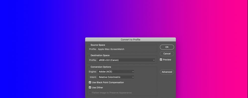
I've noticed that when I go to print images in Photoshop, the print preview is less vibrant and more washed out than the actual document. Here is an example. The vibrant gradient below is the basic document:

Here is the profile dialog, to confirm that its in sRGB v3.0:

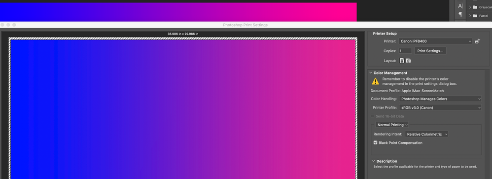
When I open the print option, you can see the difference (mostly in the upper right corner). The pink looks...I dunno...washed out?

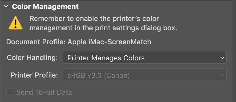
Here is the full print dialog, with the color management options:


The images are printing sort of washed out, which I worked with the Canon rep to confirm that the printer is correctly reproducing colors. We tested the color on other colleagues' computers and they were able to reproduce accurate color.
I'm not if its something off with my Photoshop settings or the printer settings? Can anyone help my diagnose this discrepancy? Thanks!
Copy link to clipboard
Copied
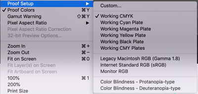
Go check these 2 items (sorry french UI ). Photoshop then will display the doc to emulate and show what the print will be…
Copy link to clipboard
Copied
Merci, didiermazier, but I'm not seeing any difference. Here is what it was set as:
I did change it to Monitor RGB and it became even more apparent that the print preview and final product would be "washed out" comparatively. Should I set that as custom and select the sRGB 3.0? Or match it to the monitor profile?
Copy link to clipboard
Copied
So your settings are good…
but when printing you can also est a bunch of parameters according to your printing system… you should explore this trail…
What I did when having such problem was instead of printing, generating a high quality PDF file. If the PDF is OK then the rpoblems are porbably about the las printing settings or worst, the printer itself…
Copy link to clipboard
Copied
see below
Copy link to clipboard
Copied
Always keep your document in a standard color space. I don't know what "Apple iMac screenmatch" is, but it's certainly not a standard profile. It's probably related to/identical to your monitor profile, which should never be used at document level. It breaks the whole color management chain.
The same goes for "sRGB 3.0 (Canon)". There's a lot of strange sRGB varieties out there, from many different sources. Most of them cause problems because they're not written to icc specification.
Use sRGB IEC61966-2.1, Adobe RGB, ProPhoto or, in a pinch, DCI-P3. The latter is not yet an accepted standard, but seems to be on the way to become one.
Copy link to clipboard
Copied
Proofing to CMYK is no point here. This is not an offset press, but an inkjet printer. You need to proof to the print profile. In any case that's moot when set to "printer manages color". Then all of this is hidden to Photoshop and there's nothing to proof to.
Proofing to Monitor RGB is even more futile. That just turns off all display color management, leaving you completely in the dark.
Again, don't use these profiles named "Apple iMac screenmatch" and "sRGB 3.0 (Canon)". They have no place here, if anywhere. You need to be in standard color spaces.
For print, you cean certainly not use any of these as print profile. You need to find the profile specific to that printer/ink/paper. And then you need to set Photoshop to manage color in the print dialog. Not the printer.
Then you can proof, to the correct print profile.


