 Adobe Community
- Home
- Color Management
- Discussions
- Re: Wide Gamut Monitor and the path to Sanity
- Re: Wide Gamut Monitor and the path to Sanity
Wide Gamut Monitor and the path to Sanity
Copy link to clipboard
Copied
Yes... this again.
I promise that when I figure this out I am going to make a killer video tutorial
about this and help everybody who is still struggling with this.
I have read dozens of articles about this and still it alludes me.
read this insane thing (you'd think that a super expert,
when talking about color management, would have mercy on our eyes...)
read this very good thing
and read posts here and everywhere. still don't get all of it.
really, what's the point of working in a color managed environment
if you can only see it "right" in some specific color managed apps
while the majority of people will see it "wrong"?
Me
I do Compositing design for video.
My Workstation:
Windows 7
DELL 2408WFP Monitor. calibrated using x-rite i1displaypro.
Software:
Photoshop CC2015
After Effects CC2015
Chrome Browser
Vlc player
My Workflow:
- in Photoshop I work in sRGB as a working space color space: the colors look less saturated - Like I want them.
- when I save for web and embed the color profile: the photo looks fine in Windows photo viewer - since it's color managed.
- Browse the files in my Os Windows explorer: saturated - since it's not color managed.
- Watch it in my Chrome browser: saturated - since it's not color managed.
- Import it to After effects for Compositing the image: it looks saturated - unless I change the color management project settings to sRGB - then it looks fine. o.k I get it - color management.... I can do this!
- Export a movie from After effects and watch it in the ever popular VLC player: saturated - since it's not color managed. ARRGGGG
Why Bother?
it is supposed to be on the web so people are going to watch it in Chrome since the vast majority of people watch browse in chrome
if I send it to a client he is going to see it in Chrome. the movie is going to be watched in VLC Player since it's the most popular.
so basically everybody who's anybody is going to watch that stuff as too saturated. so why bother to work in a color managed environments? for geeks who only use firefox value 1? or use designated color managed apps??? (I am a geek no offense)
and if he watches it in sRGB Monitor or an sRGBcolor space profile in his OS - it is going to be saturated.
the only way I can keep my sanity for now is to set my color management profile in windows to sRGB
now everything is consistent - too saturated. but at least it's consistent.
what do you guys think?
and another thing:
btw is there a way to use x-rite to calibrate my monitor for at least to be a decent sRGB color space?
can't see how to do that...
thanks in advance


 91
Replies
91
91
Replies
91

Copy link to clipboard
Copied
Yes, it all boils down to a simple essence:
A wide gamut monitor can only be used with color managed software, an you must have a valid monitor profile for that color managed software to use. That wraps the whole thing up, it really is as simple as that.
It's not that it "only benefits" color managed apps. It's that you get into serious trouble with apps that are not. If everything is set up correctly, you can pick out non-color managed apps instantly: they display way off the charts and very obviously wrong.
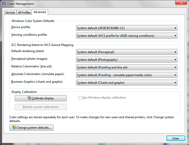
BTW, sukail, don't ever! change anything in the "Advanced" tab in Windows color management. Don't touch it, set it back to defaults. There's nothing there that ever needs to be changed. The profile is changed in the "Devices" tab, if you need to do that. If you have a calibrator (which you must have with a wide gamut monitor) you don't, the software will set everything up.

Copy link to clipboard
Copied
Reasons to buy a wide gamut monitor
* You can see richer colours in your design apps
* You can prepare for very high end colour workflows with great accuracy
Reasons not to buy a wide gamut monitor
* The colour will be off in almost all apps
* It's harder to get accurate colour for the 99% of people without a fancy monitor
* You can't do anything without a good understanding of colour management
* It's cool
Copy link to clipboard
Copied
Or, even briefer: a wide gamut monitor isn't a better monitor it's a highly specialist monitor for professionals with very specific needs who can put up with all the downsides.
Copy link to clipboard
Copied
I agree TestScreenName 
Copy link to clipboard
Copied
BTW, sukail, don't ever! change anything in the "Advanced" tab in Windows color management. Don't touch it, set it back to defaults. There's nothing there that ever needs to be changed. The profile is changed in the "Devices" tab, if you need to do that. If you have a calibrator (which you must have with a wide gamut monitor) you don't, the software will set everything up.
I am sorry to say that I have not seen this advice to be helpful in practice. in my workplace, the Dell 27" WG monitors were set by default in the advanced tab to have to profile of the monitor itself. I don't think there was an option to add it in the devices tab, unless it was added in the advanced. the reason we had to change it is that we got yellow tinted grays in photoshop. so we used advanced->change system defaults->add an sRGB profile and set it to be the default other than the monitor itself. this was the only remedy for this I have found. now the grays are grays. and the result is viewed as expected in our client's monitors and televisions. we broadcast news for million TV sets and also share our work for many clients over the web and digital media. we are fine.
at my home I have the same 24" Dell which I have done the same after messing with i1display pro calibrator which still did not give me consistent profile that will produce same results across managed vs un-managed apps. guess I preferred to leave this topic behind just to keep working and not be bothered by the color shifts. what I believe I am doing is limit my monitor to sRGB color space and essentially not color manage anything.
Thank you digitaldog (will check those videos. I have seen plenty by now and none are easy to understand or adhere in my common practice) and D Fosse for both of you continuing to try to demystify this heavy topic (for me and some other users)
Copy link to clipboard
Copied
https://forums.adobe.com/people/Roei+Tzoref wrote
I am sorry to say that I have not seen this advice to be helpful in practice. in my workplace, the Dell 27" WG monitors were set by default in the advanced tab to have to profile of the monitor itself. I don't think there was an option to add it in the devices tab
That's just wrong and you should set it back. This is how the Advanced tab should look, even if you are using a wide gamut display (as I am).
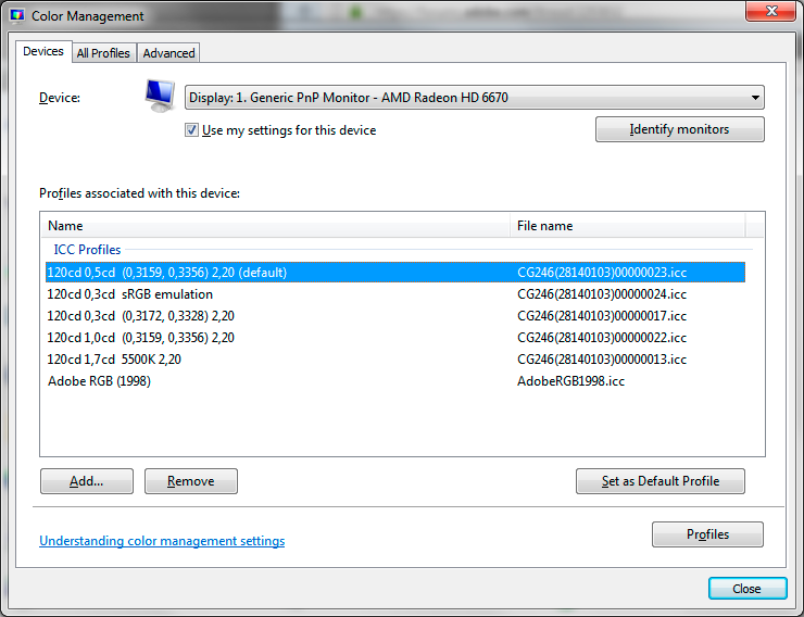
The profile is set under the Devices tab (if your calibration software hasn't already done it):
Generally, you're all overcomplicating this. There's no problem using a wide gamut monitor, as long as it's properly color managed. You cannot use applications without color management. Throw them out. There are color managed alternatives for almost anything these days. If you have to use them, ignore what you see.
Copy link to clipboard
Copied
That's just wrong and you should set it back. This is how the Advanced tab should look, even if you are using a wide gamut display (as I am).
I think we are talking about the same thing. sorry for the confusing. I change my profile in the devices tab but the only way I have access to adding and replace the default profile is when I click advanced and add a profile through what appears to be the same devices tab. in my workplace we have Windows 10 and I remember I could not add a profile in the root devices tab but will take another look. in my home I have windows 7 it appears that I can. probably an administrator restriction of some kind at my workplace.
this is my windows 7 main Color management window. here I can add (in my workplace I could not)

in my workplace after going to advanced and choose change system defaults

I got this window where I could add an sRGB profile and set it to default.

Copy link to clipboard
Copied
OK, but again, there's something there that shouldn't be there: the WCS "virtual device" profile. I suppose it does no harm, but don't set it as default. It's not an icc-specification profile at all and applications don't know what to do with it.
Yes, Microsoft made this whole dialog rather confusing. The thing is that they developed their own full color management framework, Windows Color System - something parallel to Mac OS ColorSync - but it's sort of dead in the water and nobody knows what became of it. The applications don't need it, they just use standard icc profiles happily.
Copy link to clipboard
Copied
OK, but again, there's something there that shouldn't be there: the WCS "virtual device" profile. I suppose it does no harm, but don't set it as default. It's not an icc-specification profile at all and applications don't know what to do with it.
ok so this now:

looks the same when restarting photoshop, but better be on the safe side and listen to users who actually know about this stuff thank you D Fosse.
Copy link to clipboard
Copied
Click the Dell profile and "set as default profile", and you're good to go - in color managed applications that will actually use the profile. The others you can ignore.
It's currently set to sRGB, which is wrong unless the monitor itself has been set to emulate sRGB. The profile needs to be an accurate description of the monitor's actual response.
Whenever you need to change a profile here it's important that the application is closed and relaunched. All color managed apps need to load the profile at startup, and they will continue to use that profile until next relaunch. But a Windows reboot is not necessary.
Copy link to clipboard
Copied
Click the Dell profile and "set as default profile", and you're good to go - in color managed applications that will actually use the profile. The others you can ignore.
that's what cause the mess to begin with. if I set my monitor here or at work to the dell as default, I am seeing yellow tint in color managed apps (photoshop) at work or I am seeing faded saturation images at home. I know about restarting photoshop when I change a profile (trust me I have struggled with this for a while). I know this contradicts what you are suggesting, but the only way to get my screens to give me the results I need are to set it as sRGB in the software (color management on windows), not the hardware (the monitor). this may be different from the whole color management workflow, but it works for me for the past few years and I see consistent results in my costumers screen whether they are Mac displays or tv screens. maybe it's just my old Dell monitors....
Copy link to clipboard
Copied
OK, then either the calibrator makes corrupt profiles / the sensor is broken - or you're not setting the proper white point target. It doesn't have to be 6500K.
Notice the long list of profiles in my screenshot above? These reflect different calibration targets, and the biggest difference between them is the white point setting. I use this to match different paper stock.
There's a very simple base line for this too: Monitor white should be a visual match to paper white. You should "see" paper white on screen.
Now, this is obviously dependent on the whole environment, ambient light, print viewing light, even the application interface. So there's no way to operate with any fixed values or numbers here. The question is: Are you able to match monitor white to paper white? Do this first. Use the OSD controls. Then run the calibration, and set the calibrator to "native" white point so it doesn't try to change it again.
If it still looks wrong, something's up with the software and/or sensor.
Copy link to clipboard
Copied
You're not using canned Dell profiles anywhere, are you? In that case, throw them out. You have to use a calibrator. Dell profiles are notoriously bad.
https://forums.adobe.com/people/Roei+Tzoref wrote
messing with i1display pro calibrator which still did not give me consistent profile that will produce same results across managed vs un-managed apps.
Just picking up on the obvious misunderstandings above, so that we can get them permanently out of the way. This one for instance. Non-color managed applications will never display correctly, end of story. It will never be consistent, and it's not supposed to.
Copy link to clipboard
Copied
Just picking up on the obvious misunderstandings above, so that we can get them permanently out of the way. This one for instance. Non-color managed applications will never display correctly, end of story. It will never be consistent, and it's not supposed to.
on sRGB (monitor or profile for the WG monitor), non color management-apps and color management apps will look somewhat the same, wont they? because in my system they rather do. I am aware I am putting blindfolds on the whole color management process but this was the only way to get the results to not drive me insane (as the header suggests). this could be the fault of my faulty monitors as they are more than a decade old.
thank you for your patience all of you. I know this stuff may seem "simple" to all of you since you are using that word a lot. at this stuff I am completely ignorant and the more I go deeper down that rabbit hole, the more I get confused. I need a break. 
Copy link to clipboard
Copied
I think a lot of the perceived complexity is that people think they have to do something to make it work. And so they do, and end up making a complete mess of it. And then it really does get complicated. It's a self-fulfilling prophecy.
This stuff "just works", if people would just leave it alone. Run the calibration, done. It will basically work at default settings. Photoshop will handle it correctly at default settings. Windows color management will handle it correctly at default settings.
As you get more advanced, you may want to tune the calibration targets for white point and black point, in order to get a good visual match from screen to print. But that's irrespective of monitor gamut.
For some reason people tend to trust a basic/consumer photo viewer in the operating system more than a professional-grade image editor. And even more incredible - when the two don't match, they say Photoshop must be wrong. What the basic psychology behind that is, is anyone's guess.
Copy link to clipboard
Copied
That's another useful approach (throw out all your non-colour managed apps) but does a web designer have a choice?
Copy link to clipboard
Copied
The it is simple: you have a double fake. Two mistakes or faults cancelling each other out. That's fine for the situation you started with, but you must expect the consequences of the errors to make everything else wildly unpredictable. The correct profile for a correctly set up monitor; accurate colour and tagging in the image; use only colour managed apps; export with correct settings. Your fault might lie in the monitor profile in fact, I've heard of bad ones giving an incorrect cast in Photoshop.
Copy link to clipboard
Copied
There isn't an easy way to know which apps are colour managed, and Microsoft even change it beteween releases. My recommendation is to use only Photoshop, none of the others can do you any good at all. If you want to see what other people see, use a different computer and normal monitor, nothing on your screen will tell you that.
Copy link to clipboard
Copied
It’s rather easy to know which applications are color managed: They match the color from applications you know are color managed like Photoshop, Lightroom C1 and (not to rub it in) a slew that come free on Mac’s.
Copy link to clipboard
Copied
On an sRGB monitor yes. But you said you had a wide gamut monitor. Has anyone said you can turn that off and make it behave like a normal monitor to both managed and non-managed apps?
Copy link to clipboard
Copied
https://forums.adobe.com/people/Test+Screen+Name On an sRGB monitor yes. But you said you had a wide gamut monitor. Has anyone said you can turn that off and make it behave like a normal monitor to both managed and non-managed apps?
Test Screen Name you do know you can edit your comments to add all in one right? I mean if you are referring to one post, it's just more easy to follow. just making sure. appreciate your input all the same of course. just seems irregular way of posting to me. be yourself of course.
I know some monitors allow sRGB mode in the hardware. it made sense to me that the software could limit the color range as well. in any who, this was the way I saw it was implemented in my news channel studio so I picked it up from there. that is, the sRGB fake/bad/inconceivably wrong profile in color management for WG Dell monitors. I don't mean to step on any toes here, just stating the visual result where photoshop and my screen and other screens produce more or less consistent results once I change/ruin/work completely wrong the the monitor to sRGB. when doing so, seeing the result in my home computer dell monitor was visually the same as seeing it in iMac displays which were sRGB. I figured this madness would be over when I buy my new sRGB monitor but hadn't felt it was the time yet. waiting for my screen to crack open or something... thank you all for all your dedicated posts.
https://forums.adobe.com/people/D%20Fosse This stuff "just works", if people would just leave it alone. Run the calibration, done. It will basically work at default settings. Photoshop will handle it correctly at default settings. Windows color management will handle it correctly at default settings.
you should understand by now that I did not mess with my settings because I get a kick out of it. a kick in the gut maybe... I wish this was true for my situation. as I said, I guess the monitors that I have been using are so screwed that only sRGB faux profile could actually work. no one will calibrate these professionally in my work studio, and in my home I tried to work with the i1display pro and set a profile and it was still not clear to me what image should I trust more since photoshop was way off anything else. in my home and everywhere else.
Copy link to clipboard
Copied
On an sRGB displays NO ! sRGB alone doesn’t guarantee a match without color managed applications! Watch the video. Non ICC aware applications have NO IDEA what sRGB is. It has no idea about the condition of the display. It sends the RGB numbers, as is, to the display. There is no Display Using Monitor Compensation which is part of an ICC aware preview path. The way you get a match on your system, with or without sRGB is to use color management! Color management knows the scale the RGB numbers in sRGB. It knows the condition of the display via it’s display profile. It produces a match between all ICC aware applications while non ICC aware applications done none of this. We haven’t seen a true sRGB display (based on it’s specific spec’s) since last century. So sRGB alone doesn’t guarantee anything.
The idea that sRGB alone is an answer to color matching is an urban legend (like all displays are 72PPI, all output devices require 300PPI of data), it needs to go away. The only way sRGB or ANY other tagged image will appear correctly and match other applications is to use color management! Period.
Copy link to clipboard
Copied
And you CERTAINLY can't make any monitor behave like a different monitor by using the profile for that other monitor. It doesn't work that way, any more than writing a different model number on the label would.
Copy link to clipboard
Copied
https://forums.adobe.com/people/Test+Screen+Name wrote
And you CERTAINLY can't make any monitor behave like a different monitor by using the profile for that other monitor. It doesn't work that way, any more than writing a different model number on the label would.
Yeah. Let's just sum that up too, in, er...very simple terms:
A monitor profile needs to be an accurate description of the monitor's actual, current behavior.
That's the one, basic requirement that needs to be met. It's just like any other profile: adobeRGB1998.icc has to be an accurate description of the Adobe RGB (1998) color space, as defined.
Copy link to clipboard
Copied
I think the reasoning goes like this: (1) I want to see how other people will see this (2) they won't have my fancy monitor or software (3) they will have system default photo viewers (4) so if I use the system default photo viewer I will see what other people see. (5) it looks different from Photoshop on my computer (6) yet I want everyone to see the same thing (7) and Photoshop is supposed to be professional software (8) but it can't even do this simple thing. Photoshop is therefore junk. It is quite hard to accept that almost all other software, computers, systems and monitors are junk (from a colour point of view) especially if your starting world view is that clearly a professional tool can make a good image that everyone will see correctly.
 AdChoices