 Adobe Community
- Home
- Creative Cloud Services
- Discussions
- Re: Adobe Portfolio: responsive video size?
- Re: Adobe Portfolio: responsive video size?
Adobe Portfolio: responsive video size?
Copy link to clipboard
Copied
Hello,
I have embedded some Vimeo videos on my Portfolio site, but I cannot find a way to make the videos fit to the page height. The embed code from Vimeo is:
<iframe src="https://player.vimeo.com/video/........" width="640" height="1138" frameborder="0" allow="autoplay; fullscreen; picture-in-picture" allowfullscreen></iframe>
I've tried changing the width and height to 100%:
<iframe src="https://player.vimeo.com/video/....." width="100%" height="100%" frameborder="0" allow="autoplay; picture-in-picture" allowfullscreen></iframe>
...but this just makes the whole frame in Portfolio really tiny, and not responsive at all.
I'm guessing that the issue is within Portfolio, not Vimoe (and its embed code). I assuem the embed code just tells Portfolio to fill the iframe with the video, but I need to tell Portfolio to size the iframe to the height of the screen. Is there any way to do this?
Here are a couple of examples on my site:
and
https://paulroper.com/social-media
...you'll see that the videos are only responsive to the width of the screen, not the height, so the lower portion of the videos often get cut off.
Thanks in advance for nay help or suggestions!
~ Paul
Copy link to clipboard
Copied
Hi Paul,
Welcome to our Community Forum. Thank you for writing to us. To help you with video-related queries in Portfolio, we have an article explaining it, Please refer to below:
https://help.myportfolio.com/hc/en-us/articles/360036483413-Video-module
Please let us know if this helps. We are here to help you.
Regards,
Neelam
Copy link to clipboard
Copied
Thanks for your suggestion - I just tried using the Video Module, but it still does not scale the video to fit to the screen (vertically) - i.e. the lower section of the video is cropped off the screen if the viewer's screen is not sized larger than the video's height - just like embedding a Vimeo video. This is especially noticeable when viewing a portrait video (eg. 1080x1920) on a landscape (eg. desktop monitor) screen.
Copy link to clipboard
Copied
the issue is by uploading a video you lose total contorl of what frame of the vidoe it chooses and cannot repalce the thumbnail - Adobe please fix this feature and or let us size the embeded videos.. super frustrating
Copy link to clipboard
Copied
this is a user-to-user forum.
for applicable apps, you can make (some) suggestions to adobe here, https://helpx.adobe.com/ie/x-productkb/global/how-to-user-voice.html
for others, use https://www.adobe.com/products/wishform.html
Copy link to clipboard
Copied
For a better user experience, upload native video to YouTube and embed the YouTube <iframe> code into your project page with Portfolio's Embed Module.
https://help.myportfolio.com/hc/articles/360036483773-Embed-module
YouTube has a player control button for entering Full Screen Mode if users choose to view media that way. Many users on small devices may not wish to consume that much real estate. As always these choices are best left up to the individual user.
Hope that helps.
Alt-Web Design & Publishing ~ Web : Print : Graphics : Media
Copy link to clipboard
Copied
Hello,
I have started building an adobe portfoiloio website and have a similar issues with the video code embedding.
Neelam, I believe I have followe the instructions on your tutorial for embedding video code, but the result is a very small image.
I am trying to go from Vimeo as a source into a Adobe Portfolio site.
Here's my embed code:
<div style="padding:56.25% 0 0 0;position:relative;"><iframe src="https://player.vimeo.com/video/189200616?badge=0&autopause=0&player_id=0&app_id=58479" frameborder="0" allow="autoplay; fullscreen; picture-in-picture" style="position:absolute;top:0;left:0;width:100%;height:100%;" title="24 to Life Intro"></iframe></div><script src="https://player.vimeo.com/api/player.js"></script>
The result looks super small on the website. See attached screenshot.
Can you suggest something I am doing wrong? Thanks!
Copy link to clipboard
Copied
<iframe> cannot be 100% height. It's meaningless to browsers.
Only the width can be 100%.
Find a sweet spot length in pixels that fits most screen sizes. Unfortunately that's the best you can do with embedded <iframes>. Adobe Portfolio doesn't allow us to work directly with CSS or JavaScript code that would force <iframes> to behave responsively. Sorry.
Another option, transcode your video to same aspect ratio but smaller resolution (height x width) for better viewing on mobile devices.
https://vimeo.com/blog/post/how-to-resize-video/
Hope that helps.
Alt-Web Design & Publishing ~ Web : Print : Graphics : Media
Copy link to clipboard
Copied
Hi Everyone!
I had the same issue with the heigh at 100%. I read Nancy's reply about how the height cannot be 100% and it got me thinking! So I typed in 400% on the embed code height and that seems to be working. Hope this help.
Copy link to clipboard
Copied
I typed in 400% on the embed code height and that seems to be working. Hope this help.
By @RV_rax
=============
Test it in all browsers and web devices before you commit.
% height on <iframe> is NOT VALID code.
https://www.w3schools.com/tags/att_iframe_height.asp
Alt-Web Design & Publishing ~ Web : Print : Graphics : Media
Copy link to clipboard
Copied
That's a shame - I thought we had a solution! 😁
Copy link to clipboard
Copied
Hi! I figured it out! you need to change the top numbers "560" and "315" in my case to the dimensions you want your video to be in
<iframe width="560" height="315" src="https://www.youtube.com/embed/2PcuALG6fzo?si=VWJcfgMU0t_ew8N3&controls=0&start=1" title="YouTube video player" frameborder="0" allow="accelerometer; autoplay; clipboard-write; encrypted-media; gyroscope; picture-in-picture; web-share" allowfullscreen></iframe>
Copy link to clipboard
Copied
Hmmm....but what if the user's screen is, say 3840 wide x 2160 high? Your 560x315 video would be tiny. My issue is that I'd like the video to fill the screen, without being cropped. By default, the "100% width" setting makes the video fill the user's screen width, and the height of the video is determined by the video's aspect ratio. So if they're watching a video that's, say, 1080x1920 (portrait) but they're holding their phone in landscape mode, the video fills the width of the screen and the lower portion of the video is cropped off. Or even if they're watching a portrait video on a desktop PC (which is almost always landscape) they might encounter the same problem.
Look at this example of mine: https://paulroper.com/jameson-whiskey
It's a 9:16 video, which scales to 100% width. If you watch it on a landscape screen, I'd like it to scale to fit 100% height, with white space each side of the video. But that does not happen. Hence me coming here for a solution...
Copy link to clipboard
Copied
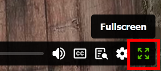
Click or tap the FULLSCREEN icon (far right-side of video controls).
Video aspect ratio is proportionally correct for this display.

Hope that helps.
Alt-Web Design & Publishing ~ Web : Print : Graphics : Media
Copy link to clipboard
Copied
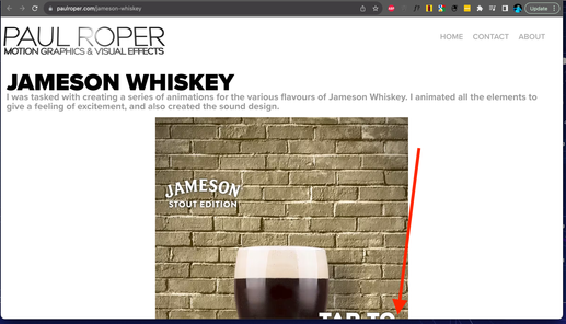
...the 'full screen' icon that is waaay off the bottom of the screen?
The problem is that the video window does not auto-scale to the height of the user's screen, so unless they scroll down to find the full screen icon (and the play control etc) they are stuck looking at this:
Copy link to clipboard
Copied
It's not my choice to use 9:16 aspect ratio. As a web developer, I build with the largest target audience in mind.
That said, you can only do so much with the content you have to work with. Mobile users will have to adapt to your design choices.
For future reference, Widescreen 16:9 is the aspect ratio that's most suitable for the widest range of users. This size works well on modern smartphones, tablets, laptops, desktops & TV screens.
Hope that helps. Good luck with your project.
Alt-Web Design & Publishing ~ Web : Print : Graphics : Media
Copy link to clipboard
Copied
Hello Paul,
Did you solve this? I am having similar issues.
I don't see a soltuion on this thread, but it appears that yuo solved it on your site.
Let me know, and thanks!


