 Adobe Community
- Home
- Download & Install
- Discussions
- I think the logo should be attractive so that it c...
- I think the logo should be attractive so that it c...
New Icons, very bad design decision
Copy link to clipboard
Copied
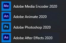
The new icons are smaller on win10 and therefore less readable. i assume that a color of the letters (ps, etc) represents a group of apps - blue for ps, lr etc. - what a dumb idea! color helps people the differentiate things - now its gone. as often in recent years big software firms change their ui to cool looking, but not user friendly ui. it seams people with common sense are dying out .... dear adobe developers, i use your programs to be creative, the ui doesnt help if it is creative by itself, it has to provide help do work easily ... do you get, i dont think so, otherwise you would focus on real improvements and not designing bad ui's ...
Copy link to clipboard
Copied
I think the logo should be attractive so that it can attract user on his webpage. Sometime the color combination makes some bad looks so need to make attractive color in logo.
[commercial link removed by MODERATOR]
Copy link to clipboard
Copied
so you think that adobe wins customer by its "cool" logos?
[Personal remarks removed by moderator. Please be respectful to fellow forum members and product users like yourself.]
Copy link to clipboard
Copied
The Premiere the old Icons was more colorful and was Easy to Difference, the New Icons for me are Meh. 😑
And are Bored and more Simple like the Old,
So Adobe really wants to be Modern are very is very Ugly, and are same Color, It Confuse alot.
Copy link to clipboard
Copied
Copy link to clipboard
Copied
Adobe's Branding dept spent a lot of time organizing new logos to make them easier for customers to associate with product functionality. For example, purple for video editing, blue for image editing, white on red for document services and so on...
Given that this topic is more than 2 years old, it's unlikely that Adobe will change their logo colors now. They are committed to them at this point.
I suppose if all you work with is video editing apps, purple icons look a bit monotonous. But for people who use Photoshop, InDesign, Acrobat and Bridge, the colors are actually helpful.
Alt-Web Design & Publishing ~ Web : Print : Graphics : Media
Copy link to clipboard
Copied
Sometimes I can start the application I want to start. 😞 Extremely bad decision that all icons are blue. 😞
Copy link to clipboard
Copied
There was a recent Adobe blog post. In this entry you'll find more about the icon redesigns:

Copy link to clipboard
Copied
"We are also using color to organize products into categories such as Video & Motion or Photography, to ensure customers can easily find the products they need. Product logo colors have been optimized for accessibility as well."
Oh really? That's how my taskbar looks like now. Very convenient, very easy to find, very optimized! Thank you Adobe!
Copy link to clipboard
Copied
Copy link to clipboard
Copied
Agree. I was thinking to write the same post but I see this topic already risen.
I understand designers to make something new, but this has to be convenient also.
New icons don't look like icons, rather like knocked-out tooth among other teeth. Previous icons with the frame around were much better.
Please return for previous icons, they were better, I'm telling this as a designer.


