 Adobe Community
- Home
- Download & Install
- Discussions
- Adobe Portfolio Mobile Header Help [LOCKED]
- Adobe Portfolio Mobile Header Help [LOCKED]
Adobe Portfolio Mobile Header Help [LOCKED]
Copy link to clipboard
Copied
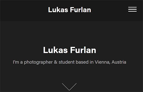
Hi, I'm currently revamping my portfolio site and creating a Homepage of sorts. I'm using the Lukas theme and am having trouble with my headers on mobile. When in desktop view the header is sized perfectly sized to my liking but when I shrink it to mobile It gets super tiny and doesn't look good. Any advice on what I may be doing to cause this or what I can do to fix it?
Copy link to clipboard
Copied
There is no forum for that product here, Portfolio help may be obtained at the links below
https://helpx.adobe.com/creative-cloud/how-to/create-portfolio-website.html
https://help.myportfolio.com/hc/en-us
https://portfolio.adobe.com/themes
https://portfolio.adobe.com/
And Lighrtroom Integrations
https://blogs.adobe.com/jkost/tag/portfolio
https://lightroomkillertips.com/getting-images-lightroom-adobe-portfolio-just-got-lot-easier/
https://digital-photography-school.com/create-beautiful-online-gallery-lightroom-classic-cc-adobe-po...
Copy link to clipboard
Copied
Very helpful article!
Copy link to clipboard
Copied
All Adobe Portfolio Themes are responsive out of the box. That means your masthead must resize to fit smaller devices. That is normal and expected behavior, otherwise your masthead would overlap content and make the page unusable.
The Lukas Theme looks OK to me on mobile.
If you're not satisfied with how your Theme is working, try another Theme. There are 12 Portfolio Themes to choose from. You can test them below.
https://portfolio.adobe.com/themes
Alt-Web Design & Publishing ~ Web : Print : Graphics : Media
Copy link to clipboard
Copied
I feel your pain calebc69998842, I am having the same exact problem. Of course they are responsive design, but the issue you and I are experiencing is the mobile header font is going from normal to way, way too small, and I can't figure out how to correct it. So, the answer is there is a bug.
[abuse removed by mod]
Copy link to clipboard
Copied
This is a user-to-user forum, not Portfolio support. Please file your official bug reports below where the Portfolio team will see them.
Goodbye & good luck!
Alt-Web Design & Publishing ~ Web : Print : Graphics : Media


