 Adobe Community
- Home
- Download & Install
- Discussions
- Adobe Portfolio mobile mode button aligning proble...
- Adobe Portfolio mobile mode button aligning proble...
Adobe Portfolio mobile mode button aligning problem
Copy link to clipboard
Copied
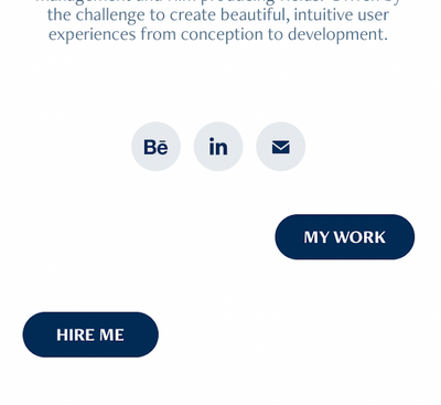
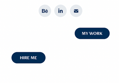
Hi I just published my Adobe portfolio site and connected my domain. The problem is on mobile version (vertical use) the buttons are not aligning as they do in Desktop version. Could you pkease help me about it.
Thank you
Copy link to clipboard
Copied
There is no forum for that product here, Portfolio help may be obtained at the links below
https://helpx.adobe.com/creative-cloud/how-to/create-portfolio-website.html
https://help.myportfolio.com/hc/en-us
https://portfolio.adobe.com/themes
https://portfolio.adobe.com/
And Lighrtroom Integrations
https://blogs.adobe.com/jkost/tag/portfolio
https://lightroomkillertips.com/getting-images-lightroom-adobe-portfolio-just-got-lot-easier/
https://digital-photography-school.com/create-beautiful-online-gallery-lightroom-classic-cc-adobe-po...
Copy link to clipboard
Copied
It goes without saying that mobile devices have less space than desktops. Some things will naturally drop to a 2nd line on smaller devices. I can't tell much from your screenshot. But it seems to me that you should put buttons on their own row above or below social media icons.
Alt-Web Design & Publishing ~ Web : Print : Graphics : Media
Copy link to clipboard
Copied
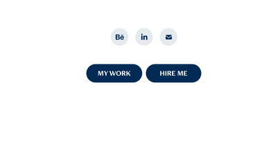
I did put buttons on their own row above or below social media icons. You can see the desktop version attached. And I don't know Nancy. Why should I need to do anything extra? I already pay for Adobe's service and it goes without saying that I would expect a simple responsive layout that don't crash, don't you think?
Copy link to clipboard
Copied
I can't tell much from screenshots.
I suggest putting each button on its own row as I did in this splash page.
https://nancyoshea.myportfolio.com/
Adobe makes the software and for best results, we must endeavor to learn how to use it properly 🙂
Alt-Web Design & Publishing ~ Web : Print : Graphics : Media
Copy link to clipboard
Copied
Yeah I don't think so.
It doesn't look good that way. Besides how do you assume it is 'not learned properly', when putting two buttons next to eachother is a given option, but when the user goes ahead and implements it, the look on mobile version is broken? How is this not a mistake of the provider?
Honestly, I don't think it is about learning 'properly'. I think it is about the software not being functional & intuitive enough.
And judging by the example that you gave, I think it is also about whether or not being OK with an average design.
I am not OK with an average design. Thanks anyway.
Copy link to clipboard
Copied
I haven't seen your site. Maybe your problem has more to do with the theme and not with the software. Try another theme. There are 12 to choose from, each created by different designers.
Alt-Web Design & Publishing ~ Web : Print : Graphics : Media
Copy link to clipboard
Copied
Hi.
I have a similar problem with mine as well. I was looking for possible answers but unfortunately there's none to be found. I hope this could be solved immediately, it's really frustrating to see that it's not properly aligning on the mobile version.
Copy link to clipboard
Copied
With no URL, it's impossible to comment.
Submit a ticket to the Portfolio Support Team.
Alt-Web Design & Publishing ~ Web : Print : Graphics : Media
Copy link to clipboard
Copied
I have the same problem, is there any solution found?
This happens when you place 2 buttons next to eachother and align them so they are close to eachother (so right and left)
This also happens on different themes so this is not an option.
Also putting them above eachoter is not a solution because why else would they make that available for desktop if it doesnt work on mobile.
Would love to hear from adobe.
Copy link to clipboard
Copied
"This happens when you place 2 buttons next [and close] to each other... This also happens on different themes."
That's right. So don't do it that way.
Or to quote Albert Einstein,
Insanity: doing the same thing over and over again and expecting different results.
"Would love to hear from Adobe."
This is not a direct pipeline to Adobe product engineers. This is a user-to-user forum.
Please submit a ticket directly to the Portfolio Support Team.
Alt-Web Design & Publishing ~ Web : Print : Graphics : Media
Copy link to clipboard
Copied
Also having this problem, super frustrating.. I just want my buttons to align! Surprised that there hasn't been a software fix to this issue yet. I submitted a request to Adobe, hopefully it's resolved soon.


