 Adobe Community
- Home
- Dreamweaver
- Discussions
- browser [Issues with images when using zoom in Chr...
- browser [Issues with images when using zoom in Chr...

Copy link to clipboard
Copied
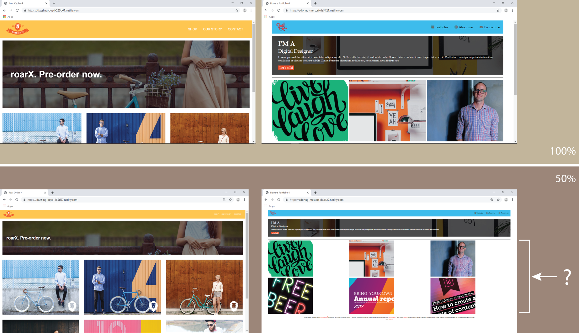
Hi,
Moving the zoom on Chrome from 100% to 50%,
Roar Cycles 4 looks fine.
But 6 images on Hosuns Portfolio 4 looks odd.
Is there any way to fix the problem?
Hosun Kang


 1 Correct answer

Just wrap your complete code in a wrapper <div>
<div class="wrapper">
All your other html code goes here.
</div>
Then use:
.wrapper {
width: 90%;
max-width: 1200px;
margin: 0 auto;
}
I'm not sure this is a great idea simply to keep the 'proportion' of the layout correct and centered in the browsers window when zooming out. I personally don't know anyone that actually zooms out. Most likely they will want to zoom in and retricting the width to 1200px wont allow them to do that.
 3
Replies
3
3
Replies
3
Copy link to clipboard
Copied
Try setting a max-width in px on your containers.
Example:
width: 80%;
max-width: 1200px;
margin: 0 auto;
Copy link to clipboard
Copied
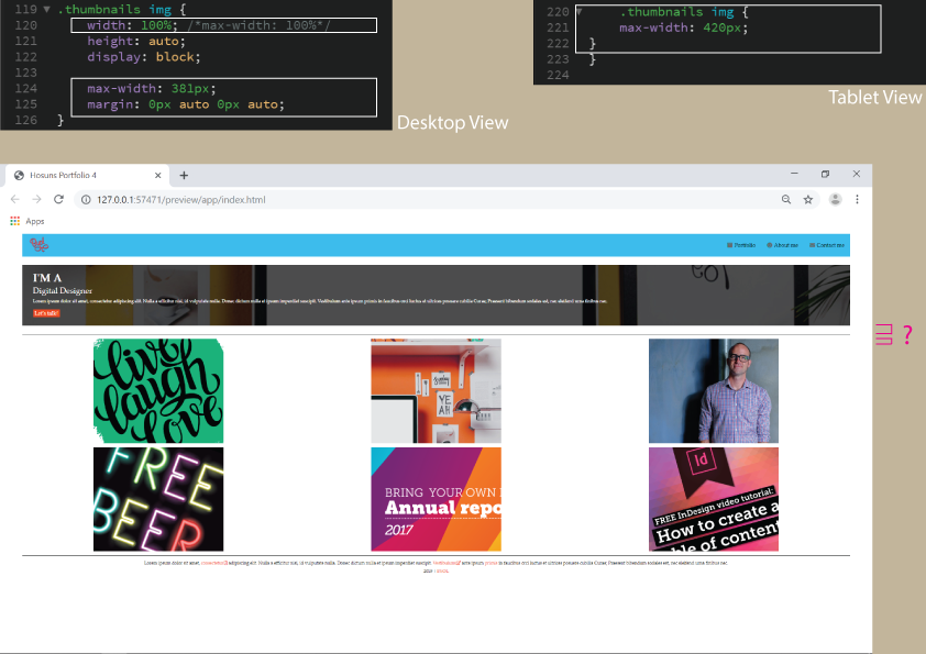
Hi,
I did the follow;
[Desktop View]
change: max-width -> width
added lines 124 & 125
[Tablet View]
added lines 220-222
Q1.
Am I correct?
Q2.
Another issue is the difference in margins.
.box1 {
background-color: palegreen;
padding: 16px 32px 26px 32px;
background-image: url(images/hero-background.jpg);
background-size: cover; /*responsiveness*/
color: white;
margin: 1%;
}
.thumbnails {
display: flex;
flex-wrap: wrap;
justify-content: space-between;
border-top: 1px solid black;
border-bottom: 1px solid black;
padding-top: 12px;
margin: 0px 1% 12px 1%;
}
Is there any way to fix it?
Hosun Kang
Copy link to clipboard
Copied
Just wrap your complete code in a wrapper <div>
<div class="wrapper">
All your other html code goes here.
</div>
Then use:
.wrapper {
width: 90%;
max-width: 1200px;
margin: 0 auto;
}
I'm not sure this is a great idea simply to keep the 'proportion' of the layout correct and centered in the browsers window when zooming out. I personally don't know anyone that actually zooms out. Most likely they will want to zoom in and retricting the width to 1200px wont allow them to do that.
 AdChoices