 Adobe Community
- Home
- Dreamweaver
- Discussions
- Re: Div Containers not coded correctly?
- Re: Div Containers not coded correctly?
Div Containers not coded correctly?
Copy link to clipboard
Copied
I have been trying to set this page up with responsive div containers. While they are responsive, they do not respond to resizing when I change 3/3/3/3 to 6/6. Don't understand what I have missed.
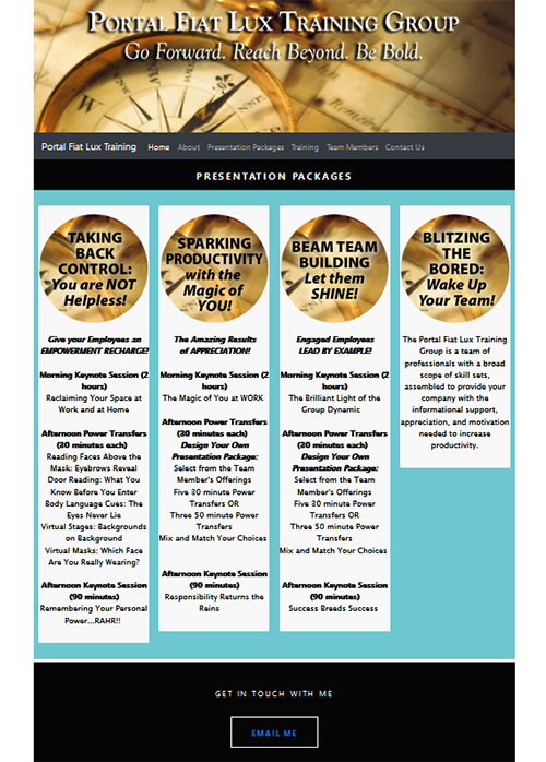
Also, when I put text in the 4th column, the div thumbnails distort. I am attaching a screen shot of the distortion. The columns all become very small and the containers are not lining up. The page is located at https://trishakeel.com/PresentationPackages.html
Thanking in advance as I have been wrestling this ALL DAY!
Copy link to clipboard
Copied
Looks OK to me on desktop Firefox. Try clearing your browser's cache & history. Also test with various browsers and zoom settings.

Incidentally, Bootstrap 4 supports Flexbox which makes equal height columns a breeze. You might want to investigate that.
https://codepen.io/ondrejsvestka/pen/gWPpPo
Alt-Web Design & Publishing ~ Web : Print : Graphics : Media
Copy link to clipboard
Copied
LOVE Flexbox...thanks. that resolved a lot, but I still need to put the flexboxes in a container so they will be the same width as the elements above them. Here is current code. Do I need to add a container to wrap around the flexboxes??
Copy link to clipboard
Copied
Did you look at the screen shot? This is what happens if I put equal amounts of text in the 4th column. also, if I change the div to be 6, the size of the div does not change…
Copy link to clipboard
Copied
I can't reproduce what's in your screenshot, sorry. Try using a different browser.
Alt-Web Design & Publishing ~ Web : Print : Graphics : Media
Copy link to clipboard
Copied
Here is the code from the page that is not displaying properly:
<!doctype html>
<html>
<head>
<meta charset="UTF-8">
<meta http-equiv="X-UA-Compatible" content="IE=edge">
<meta name="viewport" content="width=device-width, initial-scale=1">
<title>TrishaKeel.com</title>
<link href="css/simpleGridTemplate.css" rel="stylesheet" type="text/css">
<!-- <link href="css/bootstrap-3.4.1.css" rel="stylesheet" type="text/css"> -->
<link href="css/bootstrap-4.4.1.css" rel="stylesheet" type="text/css">
<!-- HTML5 shim and Respond.js for IE8 support of HTML5 elements and media queries -->
<!-- WARNING: Respond.js doesn't work if you view the page via file:// -->
<!--[if lt IE 9]>
<script src="https://oss.maxcdn.com/html5shiv/3.7.2/html5shiv.min.js"></script>
<script src="https://oss.maxcdn.com/respond/1.4.2/respond.min.js"></script>
<![endif]-->
</head>
<body>
<!-- Main Container -->
<div class="container">
<a href="images.tk/PFL2020BannerShort.jpg"><img src="images.tk/PFL2020BannerShort.jpg" class="img-fluid" alt="PortLux"></a> <!-- Header -->
<header class="header">
<nav class="navbar navbar-expand-lg navbar-dark bg-dark"> <a class="navbar-brand" href="#">Portal Fiat Lux Training</a>
<button class="navbar-toggler" type="button" data-toggle="collapse" data-target="#navbarSupportedContent1" aria-controls="navbarSupportedContent1" aria-expanded="false" aria-label="Toggle navigation"> <span class="navbar-toggler-icon"></span> </button>
<div class="collapse navbar-collapse" id="navbarSupportedContent1">
<ul class="navbar-nav mr-auto">
<li class="nav-item active"> <a class="nav-link" href="index.html">Home <span class="sr-only">(current)</span></a> </li>
<li class="nav-item"> <a class="nav-link" href="About.html">About</a> </li>
<li class="nav-item"> <a class="nav-link" href="PresentationPackages.html">Presentation Packages</a> </li>
<li class="nav-item"> <a class="nav-link" href="Training.html">Training</a> </li>
<li class="nav-item"> <a class="nav-link" href="TeamMembers.html">Team Members</a> </li>
<li class="nav-item"> <a class="nav-link" href="ContactUs.html">Contact Us</a> </li>
</ul>
</div>
</nav>
<h4 class="logo">PRESENTATION PACKAGES
</h4>
</header>
<!-- Hero Section -->
<section class="intro">
<div class="col-md-3">
  </div>
<div class="thumbnail"><a href="images.tk/TakingBackControl.jpg"><img src="images.tk/TakingBackControl.jpg" alt="Trish Keel" class="img-fluid rounded-circle"></a>
<p style="color: #050505; font-family: 'Lucida Grande', 'Lucida Sans Unicode', 'Lucida Sans', 'DejaVu Sans', Verdana, sans-serif;"> <br>
<strong><em>Give your Employees an <br>
EMPOWERMENT RECHARGE!</em><br>
</strong> <strong><br>
Morning Keynote Session (2 hours) </strong><br>
Reclaiming Your Space at Work and at Home <br>
<strong><br>
Afternoon Power Transfers (30 minutes each) </strong> <br>
Reading Faces Above the Mask: Eyebrows Reveal<br>
Door Reading: What You Know Before You Enter<br>
Body Language Cues: The Eyes Never Lie<br>
Virtual Stages: Backgrounds on Background<br>
Virtual Masks: Which Face Are You Really Wearing?<br>
<br>
<strong>Afternoon Keynote Session (90 minutes)<br>
</strong>Remembering Your Personal Power...RAHR!! <br>
</p>
</div>
<div class="col-md-3">
</div>
<div class="thumbnail"><a href="images.tk/SparkingProductivity.jpg"><img src="images.tk/SparkingProductivity.jpg" alt="Trish Keel" class="img-fluid rounded-circle"></a>
<p style="color: #050505; font-family: 'Lucida Grande', 'Lucida Sans Unicode', 'Lucida Sans', 'DejaVu Sans', Verdana, sans-serif;"> <br>
<strong><em>The Amazing Results<br>
of APPRECIATION!</em><br>
</strong> <strong><br>
Morning Keynote Session (2 hours) </strong><br>
The Magic of You at WORK <br>
<strong><br>
Afternoon Power Transfers (30 minutes each) </strong> <br>
<strong> <em> Design Your Own Presentation Package:</em><br>
</strong> Select from the Team Member's Offerings <br>
Five 30 minute Power Transfers OR<br>
Three 50 minute Power Transfers<br>
Mix and Match Your Choices <br>
<br>
<strong>Afternoon Keynote Session (90 minutes)<br>
</strong>Responsibility Returns the Reins <br>
</p>
</div>
<div class="col-md-3">
</div>
<div class="thumbnail"><a href="images.tk/BeamTeamBuilding.jpg"><img src="images.tk/BeamTeamBuilding.jpg" alt="Trish Keel" class="img-fluid rounded-circle"></a>
<p style="color: #050505; font-family: 'Lucida Grande', 'Lucida Sans Unicode', 'Lucida Sans', 'DejaVu Sans', Verdana, sans-serif;"> <br>
<strong><em>Engaged Employees<br>
LEAD BY EXAMPLE!</em><br>
</strong> <strong><br>
Morning Keynote Session (2 hours) </strong><br>
The Brilliant Light of the Group Dynamic <br>
<strong><br>
Afternoon Power Transfers (30 minutes each) </strong> <br>
<strong> <em> Design Your Own Presentation Package:</em><br>
</strong> Select from the Team Member's Offerings <br>
Five 30 minute Power Transfers OR<br>
Three 50 minute Power Transfers<br>
Mix and Match Your Choices <br>
<br>
<strong>Afternoon Keynote Session (90 minutes)<br>
</strong>Success Breeds Success <br>
</p>
</div>
<div class="col-md-3">
</div>
<div class="thumbnail"><a href="images.tk/BiltzingBored.jpg"><img src="images.tk/BiltzingBored.jpg" alt="Trish Keel" class="img-fluid rounded-circle"></a>
<p style="color: #050505; font-family: 'Lucida Grande', 'Lucida Sans Unicode', 'Lucida Sans', 'DejaVu Sans', Verdana, sans-serif;"><br>
<strong><em>The Amazing Results<br>
of APPRECIATION!</em><br>
</strong> <strong><br>
Morning Keynote Session (2 hours) </strong><br>
The Magic of You at WORK <br>
<strong><br>
Afternoon Power Transfers (30 minutes each) </strong> <br>
<strong> <em> Design Your Own Presentation Package:</em><br>
</strong> Select from the Team Member's Offerings <br>
Five 30 minute Power Transfers OR<br>
Three 50 minute Power Transfers<br>
Mix and Match Your Choices <br>
<br>
<strong>Afternoon Keynote Session (90 minutes)<br>
</strong>Responsibility Returns the Reins <br>
</p>
</div>
</section>
<!-- Footer Section -->
<footer id="contact">
<p class="hero_header">GET IN TOUCH WITH ME</p>
<div class="button"><a href="mailto:email_address_removed">EMAIL ME</a></div>
</footer>
<!-- Copyrights Section -->
<div class="copyright">©2020 - <strong>Portal Fiat Lux Training Group</strong></div>
</div>
<!-- Main Container Ends -->
<script src="js/jquery-3.4.1.min.js"></script>
<script src="js/popper.min.js"></script>
<script src="js/bootstrap-4.4.1.js"></script>
</body>
</html>
[Edited by moderator.]
Copy link to clipboard
Copied
I've already looked at your code online and it looks fine. Did you test in other browsers yet?
BTW, posting an e-mail link online is a bad idea for so many reasons. You should be using a secure & scripted contact form; not mailto links.
Alt-Web Design & Publishing ~ Web : Print : Graphics : Media
Copy link to clipboard
Copied
Looking at your code it is corrupt.
<div class="col-md-3"> </div>
You are closing the columns before anything is in them????
A typical Bootstrap 4 column/6 column set up would be as follows. Bootstrap needs the 'row' <div> around the columns. Maybe using Bootstrap Cards would be a better option in this situation.
<div class="row">
<div class="col-md-3 col-sm-6">
Content goes here
</div>

<div class="col-md-3 col-sm-6">
Content goes here
</div>

<div class="col-md-3 col-sm-6">
Content goes here
</div>

<div class="col-md-3 col-sm-6">
Content goes here
</div>
</div>
<!-- end row -->
Copy link to clipboard
Copied
Thanks so much! I will try that!
Copy link to clipboard
Copied
This is what your code shows:
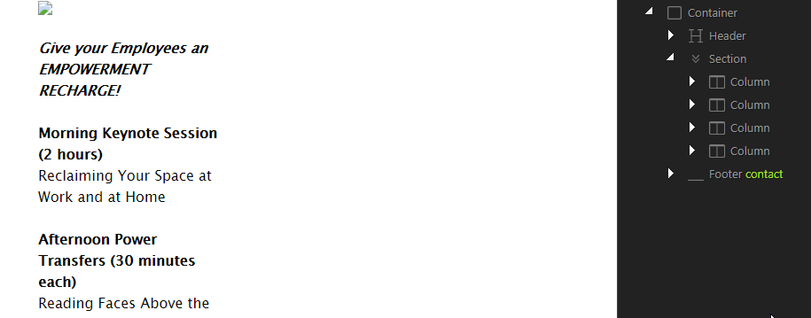
When I add a row, as suggested by osgood_, I get
Copy link to clipboard
Copied
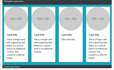
In this example, 4 cols on large, 2 on small ,breaking to 1 on x-sm. No other CSS was used here, just Bootstrap's built in classes.

<!doctype html>
<html lang="en">
<head>
<meta charset="utf-8">
<meta http-equiv="X-UA-Compatible" content="IE=edge">
<meta name="viewport" content="width=device-width, initial-scale=1">
<title>Bootstrap 4.5 Equal Height Cards </title>
<!--latest Bootstrap on CDN-->
<link rel="stylesheet" href="
https://stackpath.bootstrapcdn.com/bootstrap/4.5.0/css/bootstrap.min.css">
</head>

<body>
<div class="container bg-dark">
<p class="text-light">Navigation goes here...</p>

<div class="row row-cols-1 row-cols-sm-2 row-cols-lg-4 bg-info pt-3">


<!--1st column-->
<div class="col mb-4">
<div class="card h-100"> <img src="https://dummyimage.com/125x125" class="card-img-top rounded-circle" alt="placeholder image">
<div class="card-body">
<h5 class="card-title">Card title</h5>
<p class="card-text">This is a longer card with supporting text below as a natural lead-in to additional content. This content is a little bit longer.</p>
</div>
</div>
</div>

<!--2nd column-->
<div class="col mb-4">
<div class="card h-100"> <img src="https://dummyimage.com/125x125" class="card-img-top rounded-circle" alt="placeholder image">
<div class="card-body">
<h5 class="card-title">Card title</h5>
<p class="card-text">This is a longer card with supporting text below as a natural lead-in to additional content.</p>
</div>
</div>
</div>

<!--3rd column-->
<div class="col mb-4">
<div class="card h-100"> <img src="https://dummyimage.com/125x125" class="card-img-top rounded-circle" alt="placeholder image">
<div class="card-body">
<h5 class="card-title">Card title</h5>
<p class="card-text">This is less text.</p>
</div>
</div>
</div>

<!--4th column-->
<div class="col mb-4">
<div class="card h-100"> <img src="https://dummyimage.com/125x125" class="card-img-top rounded-circle" alt="placeholder image">
<div class="card-body">
<h5 class="card-title">Card title</h5>
<p class="card-text">This is a longer card with supporting text below as a natural lead-in to additional content. This content is a little bit longer.</p>
</div>
</div>
</div>
</div>
<p class="text-light">Footer goes here...</p>

<!--/.container--></div>


<!--First jQuery then Popper then Bootstrap-->
<script src="https://code.jquery.com/jquery-3.5.1.min.js" integrity="sha256-9/aliU8dGd2tb6OSsuzixeV4y/faTqgFtohetphbbj0=" crossorigin="anonymous"></script>
<script src="https://cdnjs.cloudflare.com/ajax/libs/popper.js/1.14.7/umd/popper.min.js"></script>
<script src="https://stackpath.bootstrapcdn.com/bootstrap/4.5.0/js/bootstrap.min.js"></script>
</body>
</html>
Alt-Web Design & Publishing ~ Web : Print : Graphics : Media
Copy link to clipboard
Copied
If you are looking for suggestions and advice I would consider using css grid as a solution as its the most modern and up-to-date workflow and method being used to construct websites today. Its also the simplest method to implement. Unfortuantely Bootstrap is about 2 years behind where web-development is currently at, using it just lessens your ability to progress, its like having a 1ton weight dangling around your neck.
Copy link to clipboard
Copied
Bootstrap works well when it's used properly: only one Bootstrap stylesheet per document and the prescribed div structure of container > row > col.
I'm not sure what simpleGridTemplate.css is for or why it's even needed. But if it's used to override Bootstrap styles, it must come after Bootstrap in the hierarchy. More than likely it's a relic from another site (Fluid Grids-based?) and should probably be discarded.
Finally, nobody gives a monkey's butt about older IE browsers. And MS is ending support for IE11 next summer. So those shivs can go.
Change this:
<link href="css/simpleGridTemplate.css" rel="stylesheet" type="text/css">
<!-- <link href="css/bootstrap-3.4.1.css" rel="stylesheet" type="text/css"> -->
<link href="css/bootstrap-4.4.1.css" rel="stylesheet" type="text/css">
<!-- HTML5 shim and Respond.js for IE8 support of HTML5 elements and media queries -->
<!-- WARNING: Respond.js doesn't work if you view the page via file:// -->
<!--[if lt IE 9]>
<script src="https://oss.maxcdn.com/html5shiv/3.7.2/html5shiv.min.js"></script>
<script src="https://oss.maxcdn.com/respond/1.4.2/respond.min.js"></script>
<![endif]-->
to this:
<link href="css/bootstrap-4.4.1.css" rel="stylesheet" type="text/css">
<link href="css/custom-stylesheet-here.css" rel="stylesheet" type="text/css">
Alt-Web Design & Publishing ~ Web : Print : Graphics : Media
Copy link to clipboard
Copied
Well it looks like the effort, more often than not theses days, is wasted, as this OP will probably never return, which seems to happen a good percentage of time in this forum now. You have to wonder how important and how serious most posters here are now - its looking pretty bad from where Im looking at it from, compared to what it used to be. Its been going down hill for a few years now but it seems to be dragging its backside through the gutter just of late. Huuuuuummmmmm.....
Copy link to clipboard
Copied
Thanks for your input. As always, you help me grasp how to move forward with coding. I am sorry for my delayed response but had business out of town and am just now getting back to resolving this new site development. I am running CC Dreamweaver 20.2. I selected this template from the starter templates, basic grid. So the file Simplegridtemplate.css came with the template page. I had no idea these templates would be outdated and behind the curve since Dreamweaver updates all the time. Good to know and grateful for the info about flexboxes and the input on the email link...also from the supplied template. They should remove those!!
Thanks again for you expertise and I did test alternate browsers.
MaryAnn
Copy link to clipboard
Copied
I dont see an issue either, in terms of what you are describing in your post, it is more about col 3 not clearing col 4 on a smaller width device. Youre using Bootstrap so maybe Nancy can give you some instructions about clearing <div>s in that framework. I'd be looking to use a more up-to-date method like grid or flex to lay the columns out, where clearing wont be an issue.
Copy link to clipboard
Copied
As I can't correct (edit) my previous post......it should read....
'it is more about col 3 not clearing col 1 on a smaller width device.'


