- Home
- Dreamweaver
- Discussions
- Equal text line length inside a bootstrap thumbnai...
- Equal text line length inside a bootstrap thumbnai...
Copy link to clipboard
Copied
Hi,
I have several thumbnail and I want to set the same text line width to all of them.
The basic thumnal structure loks like this:
<div id="prouctsThumbs" class="row">
<article class="col-xs-4 col-sm-4 col-md-3">
<div class="thumbnail"><a href="#" class="thumbnail"><img src="../../_images/products/thumbs/thumb1.jpg" alt=""/></a>
<p>text lenght 1</p>
</div>
</article>
<article class="col-xs-4 col-sm-4 col-md-3">
<div class="thumbnail"><a href="#" class="thumbnail"><img src="../../_images/products/thumbs/thumb2.jpg" alt=""/></a>
<p>text length 2 which is longer</p>
</div>
</article>
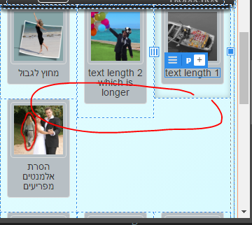
If not, than in xs devices the text line, which is different for each thumbnail, may causes element missplacement as seen below.

I am trying to make an equal text line width.
I'd rather not use media queries for the <p> heigh becasue this differes for each size.
If i could make all text paragraphs equal and wrap inside its parent element that it would solve this.
Or any other way.
I do not use bootstrap 4.
Thank you,
 1 Correct answer
Try adding the following to your stylesheet
#prouctsThumbs .col-xs-4:nth-child(3n+1), #prouctsThumbs .col-sm-4:nth-child(3n+1), #prouctsThumbs .col-md-3:nth-child(4n+1) {
clear: left !important;
}
Copy link to clipboard
Copied
Try adding the following to your stylesheet
#prouctsThumbs .col-xs-4:nth-child(3n+1), #prouctsThumbs .col-sm-4:nth-child(3n+1), #prouctsThumbs .col-md-3:nth-child(4n+1) {
clear: left !important;
}
Copy link to clipboard
Copied
karpiyon wrote
I do not use bootstrap 4.
Bootstrap 4 will give you the option of using Flexbox - clearing columns of differing depths will then be easy, you won't need any extra css or hacks.
