 Adobe Community
- Home
- Dreamweaver
- Discussions
- Re: Question about maintaining proportions of a bl...
- Re: Question about maintaining proportions of a bl...
Question about maintaining proportions of a block element set to 100% height

Copy link to clipboard
Copied
Let's say I have a rectangular container (for instance, a <div>) filling the width of the screen ("100%") but with a very specific height ("450px").
This wrapper contains a block element -- let's say a <span> -- that needs to fill 100% height at all times, while maintaining a very specific aspect ratio for the width (so for the sake of argument, let's say 16:9). Since the container is 450px high, the proportionate width would be 800px -- however, I'd rather not have to specify that manually.
Because the wrapper's height will be changing according to screen resolution, and it would simplify things if I could just change this one property (ie, the wrapper's height) and have the child's code be responsive to that.
Crude example :
<div style="width:100%; height:450px" id="wrapper">
<span style="display:inline-block; height:100%; width:???" id="child"></span>
</div>
If the <span> was an <img>, the task would be easy, by using style="height:100%; width:auto" because the file itself contains the fallback aspect ratio. But in the case of a <span> or a <a>, the browser is flying blind. There has to be some sort of equation in the 'width' to go along with that 100% height telling it to go 16:9.
Note that I don't even know if this is doable without witchcraft or sorcery, I could literally be asking the impossible.
Thanks!


 15
Replies
15
15
Replies
15

Copy link to clipboard
Copied
If I understood your question correctly, the answer in this post html - keep aspect ratio of expandable div - Stack Overflow should provide you with some insights until the experts here pitch in with a better answer.
Thanks,
Preran

Copy link to clipboard
Copied
The reason no one is answering Preran is because there is no definitive answer.
It all depends on the layout method being used, and what the device is that the layout is being displayed on. The possible solution providing the OP is using a layout method such as css flexbox is to use the css calc() function, to calculate the width to height ratio, and apply it to the containing element.
Copy link to clipboard
Copied
Thank you, Paula. Makes sense to me.
Copy link to clipboard
Copied
pziecina wrote
The reason no one is answering Preran is because there is no definitive answer.
It all depends on the layout method being used, and what the device is that the layout is being displayed on.
I'm not sure I understand what "it depends on the layout method being used" means. Was there context or method information lacking in the OP?
Here is the original example (note the ??? location).
<div style="width:100%; height:450px" id="wrapper">
<span style="display:inline-block; width:???; height:100%" id="child"></span>
</div>
...and the original context :
Only the wrapper's height is known, and the child must be 16:10 proportionately. I can make it 100% in height, but I need to be able to tell the width "be 16:10 of the height".
Are you saying this can be achieved via flexbox + calc? Could you be more specific, using my example as context? And are you sure calc alone can't do it? Is it because a flexbox is the only thing that can reference its own self? (In this case, X needs to be relative to Y, and not relative to the outer container's X, like you usually get when you use things like percentages.)
If it cannot be done this way, I am open to leaving the wrapper's height unspecified, and having the child's height be fixed (450px) but would still need to find a way for X to reference Y in order to maintain that 16:10 proportion.
(Sorry for all the silly questions, trying to wrap my brain around a lot of new content in record time to finish before holidays, will read up more extensively on all of this during down time.)
EDIT: I accidentally wrote 16:9 in the OP, I meant 16:10. (I realize the actual number doesn't really matter, but OCD.) 
Copy link to clipboard
Copied
The reason there is no definitive answer, is because maintaining any proportion depends on the device. If you set the height to be 100% on a smartphone, then in portrait mode there is not enough screen width to have such a width so that 16:10 can apply, (unless of course you then take full responsibility for how the page and contents will be show) using the standard viewport meta tag settings.
The same applies to tablet devices. In landscape mode such a proportion can often be applied, but it then also depends on the content, because depending on the content how you control any undisplayed content varies, and if the element is too small for the entire viewport width you have to decide how to display it, (left, right, center, other) and what to do with the extra space, (wrap something around it, or not).
The css calc() function can be used to calculate any elements size even if it is all variables as it is a mathmatical calculation performed by the browser at rendering time. As an example to calculate an element to display at 50% of the viewport height, you would use height: calc (100vh / 2);
That tells the browser to get the height of the viewport, divide it by 2, and set the height of the element to the result.
To read more about using calc() -
Copy link to clipboard
Copied
BTW - There are no silly questions when it comes to modern css, just ones that are difficult to explain, and ones that the answer can dependant on the device, (especially in rwd), or other variables.
What you must remember though, is that I am not a teacher of web development, so the complete answers are often for you to find, (using the links) or for others to give, (or elaborate on my answer).
Copy link to clipboard
Copied
I can't help but feel we're straying from the initial premise, here.
I'll simplify the question by taking the wrapper out of it.
Is it possible to maintain a responsive 16:10 ratio on the size of block elements (like <span> or <a>) where only one of the orientations has been specified (ie, "height:450px")?
Here's a crude example of what I'm (clumsily) trying to ask :
<a href="#" style="height:450px; width:???; background:url('bg.jpg') cover"></a>
Where ??? = 16:10 aspect ratio.
So if height changes, so does width (the way an <img>'s proportions are maintained if you set one of the sides to "auto", since it has the ratio embedded in the image itself to fall back on).
In other words, I'm looking for a way to write : "width:160% of height" in CSS, if that's even possible.
PS: If there's a way to do this without specifying EITHER of the sides and just letting them fill their container -- while maintaining that 16:10 ratio at all times -- even better. (Basically, fill until container height or width is reached, whichever comes first, but never losing shape, only changing scale. Like a series of identical buttons in a responsive nav bar.)

Copy link to clipboard
Copied
The only way to do this is by using JavaScript (probably jQuery)
There will be two scenarios, one where the height is greater than the child width, the other, where the height is less than the child width.
The code (jQuery) would look like
if ($(#wrapper).height() * 1.6 < $(#wrapper).width()) {
var childwidth = $(#wrapper).height * 1.6;
var childheight = $(#wrapper).height;
} else {
// not sure what you want to do here because it will not fill the full height.
}

Copy link to clipboard
Copied
In order to maintain aspect ratio, both H & W values must adjust in relation to each other. 16:9 ratio is customary.
<!doctype html>
<html lang="en">
<head>
<meta charset="utf-8">
<title>Responsive 16:9 Aspect Ratio</title>
<meta name="viewport" content="width=device-width, initial-scale=1">
<meta http-equiv="X-UA-Compatible" content="IE=edge">
<style>
.container {
position: relative;
padding-bottom: 56.25%; /*16:9*/
padding-top: 30px;
height: 0;
overflow: hidden;
}
.container img {
position: absolute;
top: 0;
left: 0;
width: 100%;
height: 100%;
}
</style>
</head>
<body>
16:9 Aspect Ratio
<div class="container">
<img src="https://placeimg.com/640/360/nature" alt="placeholder">
</div>
</body>
</html>
Alt-Web Design & Publishing ~ Web : Print : Graphics : Media
Copy link to clipboard
Copied
To get the 16:10 width ratio from the height using css calc(), you simply multiply by 1.6 - width: calc(100vh * 1.6);
To get the 16:10 height ratio from the width using css calc(), you divide by 1.6 - height: calc:(100vw / 1.6);
But as I say, you would never do this in rwd, unless you first checked that the size to width values made sense to use. Otherwise you could end up with content overflowing, unusable content, or even making the user zoom-in, in order to use the content.
Copy link to clipboard
Copied
pziecina wrote
To get the 16:10 width ratio from the height using css calc(), you simply multiply by 1.6 - width: calc(100vh * 1.6);
To get the 16:10 height ratio from the width using css calc(), you divide by 1.6 - height: calc:(100vw / 1.6);
But as I say, you would never do this in rwd, unless you first checked that the size to width values made sense to use. Otherwise you could end up with content overflowing, unusable content, or even making the user zoom-in, in order to use the content.
Are you saying this is doable with CSS alone (so no javascript, and no <img> references?) Because every example thrown at me included one or the other. Could you show me your method in specific context? I'm embarrassed to admit that unless you literally apply your suggestions to my code, I don't have the skills to properly apply the info you're giving me.
Here is the starting code again :
<a href="#" style="height:450px; width:???; background:url('bg.jpg') cover"></a>
If you can tell me what to replace that entire line with, I'll give it a spin.
I find visuals help, so :
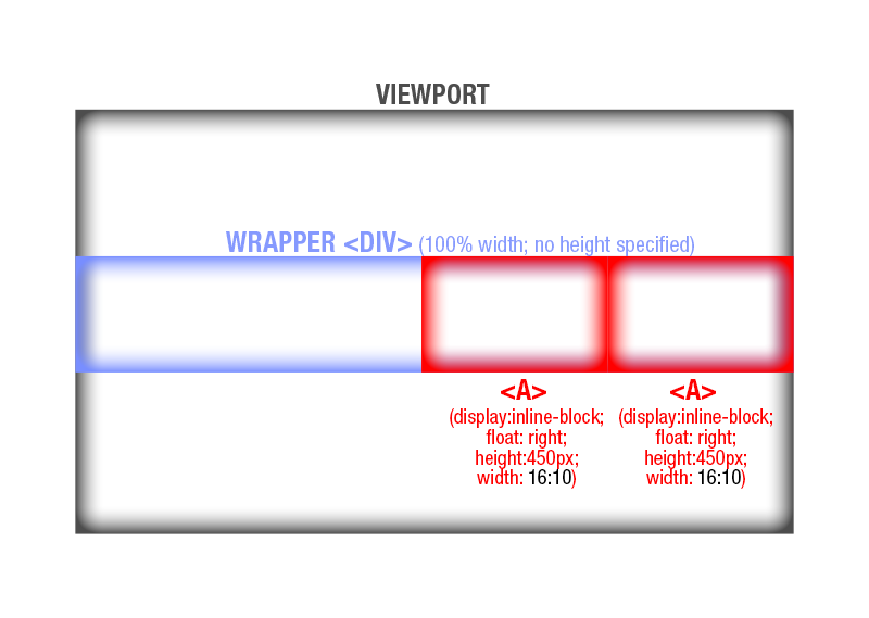
As shown, the <a>'s (child elements) will function like a row of identically-sized buttons in a nav bar, stacked against each other via float. There will be no wrapping or overflowing (the code is responsive to most size contingencies).
I'm still very skeptical that this is even doable. Sounds more like a new feature suggestion for W3C  ie, scaling by simply specifying an aspect ratio on either height or width. As a designer, the concept makes me drool.
Whether it's currently doable or not, at least the idea is out there in the universe
Copy link to clipboard
Copied
Using the height set at 450px the css calc() function would be -
width: calc(450px x 1.6);
css calc will only work if you know what a value is in advanced, (even if it is a % value) as it cannot get a value from an unknown. As rwd does not work well with specific value declerations, (such as px) so using calc() hits a limitation when using rwd except for use with vw/vh/% values.
You should also move any height/width from elements to your css, if you intend to code for rwd in the future.
https://forums.adobe.com/people/Under+S. wrote
I'm still very skeptical that this is even doable. Sounds more like a new feature suggestion for W3C ie, scaling by simply specifying an aspect ratio on either height or width. As a designer, the concept makes me drool.
Whether it's currently doable or not, at least the idea is out there in the universe
The idea has been suggested, but discarded due to the problems I mentioned in previous posts. The general opinion in discussions was that modern web designs (or designers) should make designs that 'flow' for display on all devices that an end user may use. That is one of the reasons css flexbox and css grid layouts are recommended by so many now.
Copy link to clipboard
Copied
pziecina wrote
Using the height set at 450px the css calc() function would be -
width: calc(450px x 1.6);
css calc will only work if you know what a value is in advanced, (even if it is a % value) as it cannot get a value from an unknown. As rwd does not work well with specific value declerations, (such as px) so using calc() hits a limitation when using rwd except for use with vw/vh/% values.
Then Nancy and Ben were right, and this CANNOT be done (without JS or <img>) by changing only one integer, because by your own admission, BOTH the X and the Y need to have that 450px value specified for it to work.
From the beginning, I've been stressing that the goal is to have only 1 field to change and have the rest of the design be responsive to that change. In other words, I want to tell "X" to be 160% of Y. So it has to be able to reference what's in Y without having it manually specified a 2nd redundant time.
Basically, If I'm putting the "450px" specification manually in the calc equation on the X axis, then the code isn't referencing Y. It's simply repeating 450px in both X and Y, with an additional calculation on X. Your method forces me to have 2 fields to change every time I want to make the construct bigger or smaller, thus losing sight of the original goal.
Unless new information is brought forth, I'm simply going to conclude that maintaining the aspect ratio of a block element where only one of the sides is specified by a static number (and the other side is represented by an equation referencing the other side) is just not doable in CSS in 2018.
pziecina wrote
You should also move any height/width from elements to your css, if you intend to code for rwd in the future.
As specified many times, the examples provided are crude representations of what I'm trying to explain in as few lines as possible. I don't make it a habit of styling elements directly in the HTML/PHP file. The CSS will be in a stylesheet and that stylesheet will be responsive.
Copy link to clipboard
Copied
If you only wish to specify one value once, then you would place that value in a css variable, and reference the variable in the css calc() function, which means you would only ever change one value, but that is for a future when IE is no longer in use, as IE does not support css variables and requires that the value it requires is also placed in the css variable as a seperate value, (so you would have to change in 2 places, even though both are part of the same css decleration).
You are going to have to wait a couple of years to do what you wish reliably, but it will/is possible.
Copy link to clipboard
Copied
pziecina wrote
If you only wish to specify one value once, then you would place that value in a css variable, and reference the variable in the css calc() function, which means you would only ever change one value, but that is for a future when IE is no longer in use, as IE does not support css variables and requires that the value it requires is also placed in the css variable as a seperate value, (so you would have to change in 2 places, even though both are part of the same css decleration).
You are going to have to wait a couple of years to do what you wish reliably, but it will/is possible.
Perfect answer, thank you.
And to everyone else for the alternate solutions.
Until a css-only method that functions on all 3 browsers becomes commonplace a couple of years down the road -- because I was recently warned to hold off on CSS variables -- I will probably fall back on <img> tags wrapped in <a> tags, rather than applying a background image to the <a> tag like I planned on doing.
An <a> tag cannot respond to a JPG's embedded dimensions like an <img> tag can.
 AdChoices