 Adobe Community
- Home
- Dreamweaver
- Discussions
- Adobe fonts look different on Mac Safari/Chrome
- Adobe fonts look different on Mac Safari/Chrome
Adobe fonts look different on Mac Safari/Chrome

Copy link to clipboard
Copied
Hi, sorry if this is the wrong place to ask but was speaking to someone from the Web support team and they suggested to post this here.
I designed a website with dreamweaver, using background color to hide/reveal text on hover. This works fine in Dreamweaver and on IE/Firefox/Chrome on Windows 10 perfectly, however on Safari and Chrome on Mac, there seems to be a different calculation of the height of the background color. Firefox appears as should. It doesn't seem to be related to screen size, and developer tools shows that it's only the height of the "boxes" that is any different, while the width stays the same. Is there some chance that the ios/browser combination interprets the vertical ascent/descent of the web font differently? Any ideas how to get around this issue? If it helps, the font is Operetta8. If there's any more information that can help, let me know.
Many thanks!
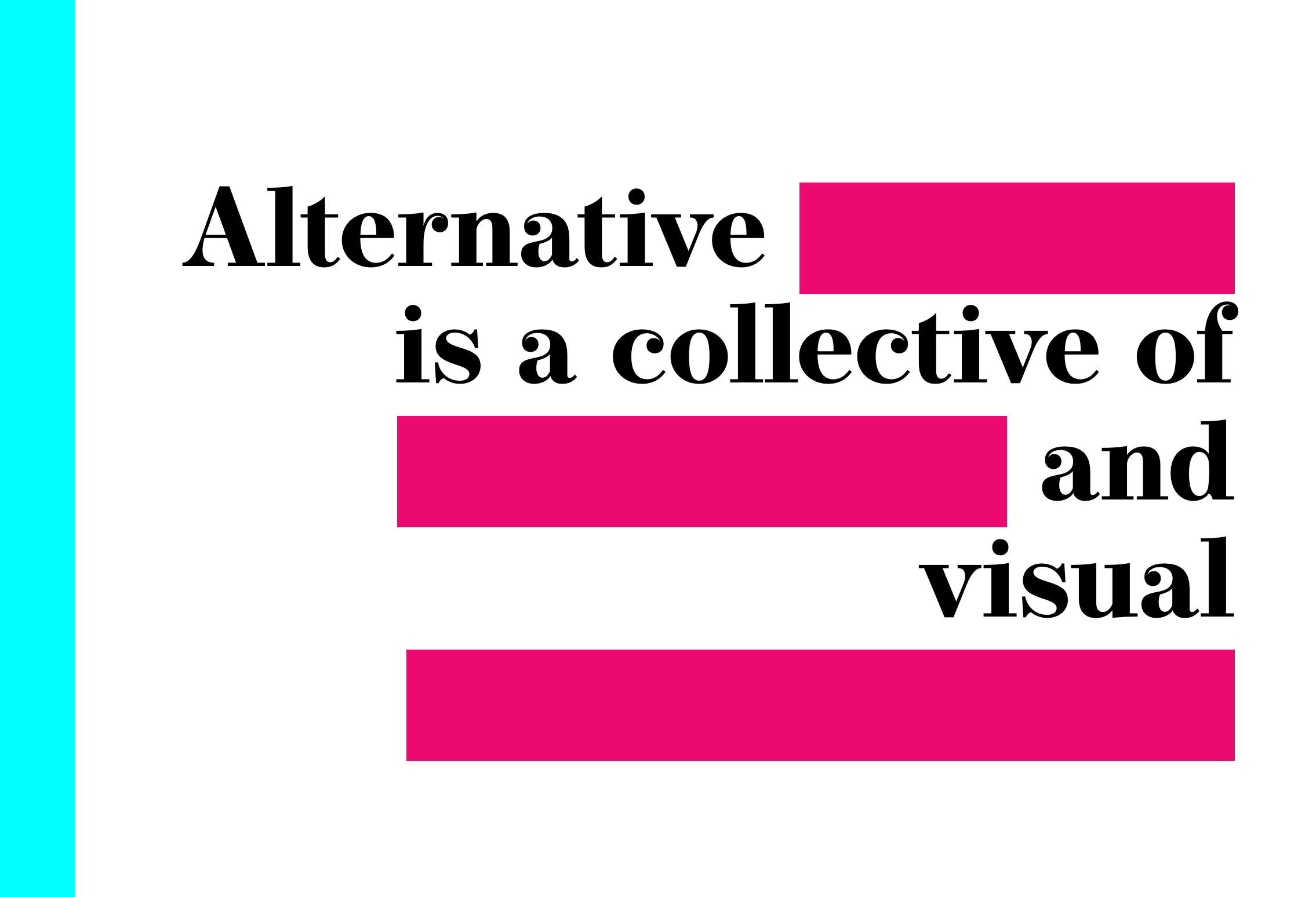
Here is how it should appear (Mac/Firefox):
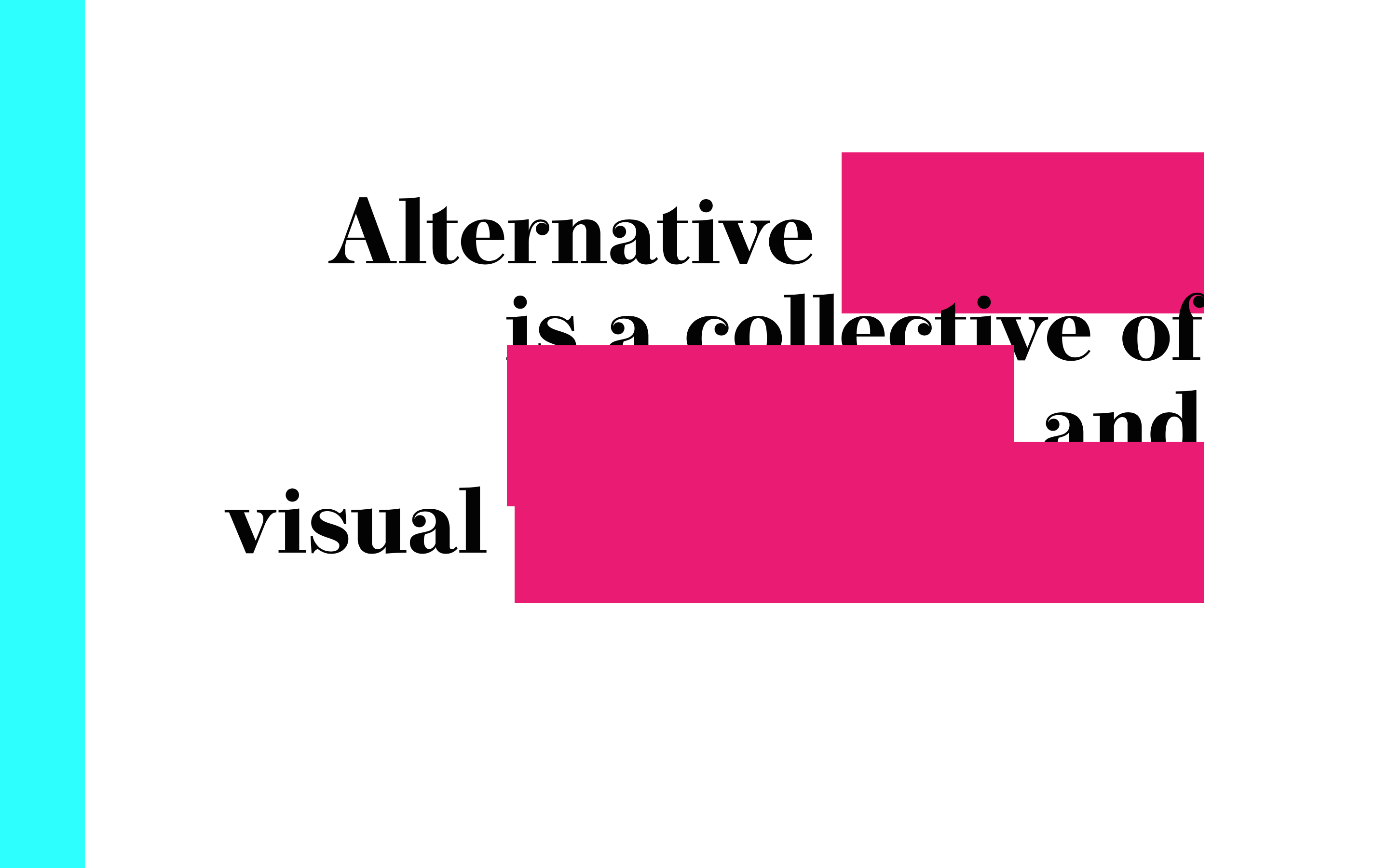
And here it is on chrome on Mac:


 8
Replies
8
8
Replies
8

Copy link to clipboard
Copied
Is the zoom level set to 100% in Chrome?
If it is, could you post a link to your work in progress so we can see the code?
Copy link to clipboard
Copied
Yes, zoom level is at 100%, also the issue is replicated in mobile, 13/15/27 macs.
The link is: www.alternative-fictions.com/index1.htm - the person from web support said that it didn't seem to be the code from what he could see, but if there is something I could add to the code, that would be great.

Copy link to clipboard
Copied
I take it you are testing on windows desktop with firefox, and on iOS mobile devices, (safari, chrome).
First position absolute will not work correctly as the position will appear to move depending on screen size, (50% of 10 inch screen is smaller than 50% of 20 inch screen).
Also on iOS devices, it does not matter which browser you use, they all use safari webkit rendering engine, (the only difference being, is that you may get newer features in browser updates from Chrome, but you have to wait for a iOS update for safari).
Copy link to clipboard
Copied
The position absolute doesn't isn't relevant to the question I asked. My question is exclusively about the height of the fonts between the different devices and browsers. If it is the case that all iOS devices use the same rendering engine a. why does Firefox display the site correctly on iOS? b. could you explain what that means? i.e. does it mean that with iOS, webfonts will always behave differently than with Windows? Is there anything that can be done about it?
Copy link to clipboard
Copied
All browsers use a slightly different way of working out the base font size when using em or rem, (IE and edge is normally a couple of pixels for body text) which is measured in pixels. Using the em value it takes its base measurement from the base font size, unless you set a base font in your css, (target the body element).
Try setting a font-size, that way only slight variations should occure.
Copy link to clipboard
Copied
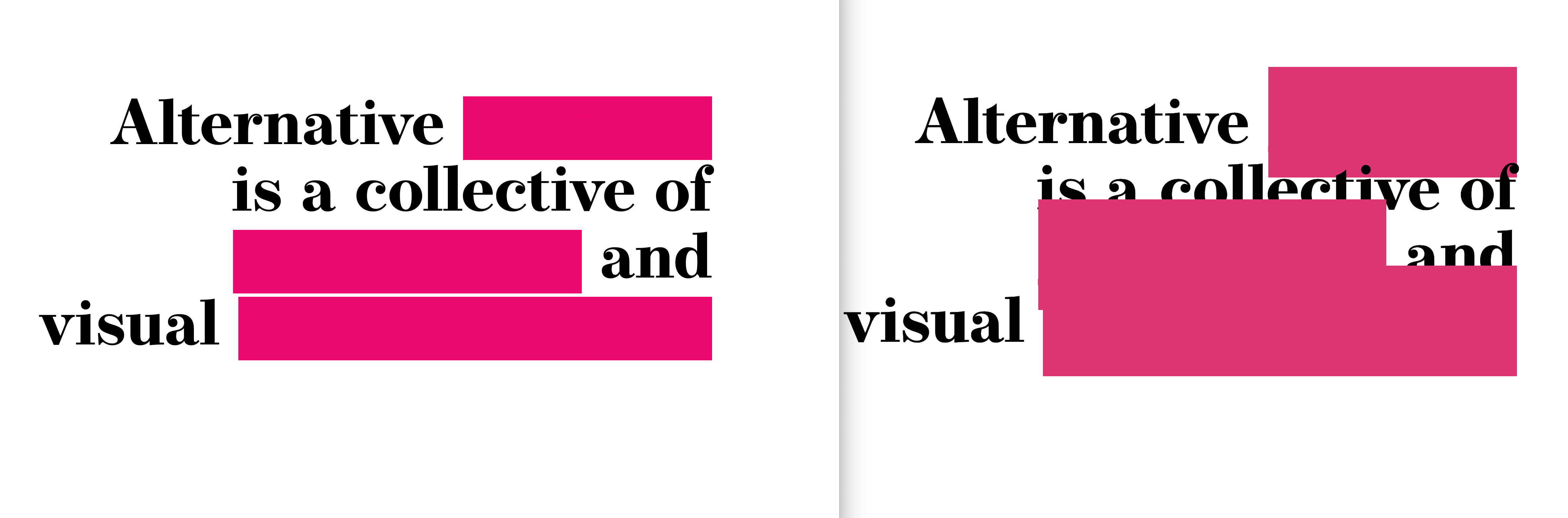
I've just tried your suggestion and changed the font size to px but it's still the same. There's around 70px different in the height either way I try it, though the width is the same. It's not about the size of the text, it's the height. I've just posted a side by side comparison to try and make it a bit clearer.
At this point I'm wondering if this is just a quirk of this font along with the combination of os/browser...
Copy link to clipboard
Copied
It looks like iOS and Mac Chrome don't like your line-height setting on your frontpage class.
Changing it to...
line-height:normal
...seems to do what you want though.
Copy link to clipboard
Copied
Unfortunately that didn't solve the issue - it just changed the line height. I'm posting the different browsers side by side so it's a bit clearer what I mean - the issue is the height of the redacted boxes, not the distance between lines. Saying that, playing around with different fonts, I think the issue is nothing to do with the code, but to do with the font itself.
 AdChoices