 Adobe Community

Copy link to clipboard
Copied
Hello, all,
I'm trying to use collapse on a higher z-index than the rest of the page, so when expanded it will cover part of the page content.
However, I can't seem to get Bootstrap to co-operate with my desired design. Upon clicking the element that expands and collapses the content, the hidden content starts out "over" the page content, but as soon as the expanding is completed it "sinks below" the page content.
How can I get the expanded content to stay "above" the page content?
V/r,
^ _ ^


 1 Correct answer

The closest youll get to anything available in Bootstrap which will do what you need is using data-toggle, without writing your own js or jquery.
Use the bootstrap class position-absolute on the div you want to toggle , the one which is activated by clicking on the 'archives' text. This will force it above the rest of the page content. Be aware the absolutely positioned div must be inside a parent container with the bootstrap class position-relative.
Once you have that set up you can put as many d
...
 29
Replies
29
29
Replies
29

Copy link to clipboard
Copied
Sounds like what you really want is a Modal window to overlay the entire screen.
<div class="container">
<h2>Modal Example</h2>
<!-- Button to Open the Modal -->
<button type="button" class="btn btn-primary" data-toggle="modal" data-target="#myModal">
Open modal
</button>
<!-- The Modal -->
<div class="modal fade" id="myModal">
<div class="modal-dialog">
<div class="modal-content">
<!-- Modal Header -->
<div class="modal-header">
<h4 class="modal-title">Modal Heading</h4>
<button type="button" class="close" data-dismiss="modal">×</button>
</div>
<!-- Modal body -->
<div class="modal-body">
Modal body..
</div>
<!-- Modal footer -->
<div class="modal-footer">
<button type="button" class="btn btn-danger" data-dismiss="modal">Close</button>
</div>
</div>
</div>
</div>
</div>
Alt-Web Design & Publishing ~ Web : Print : Graphics : Media
Copy link to clipboard
Copied
Like a modal, but no dark background, no preventing other links from being clicked, not centered but actually starting just over the point where the click to expand exists.
V/r,
^ _ ^
Copy link to clipboard
Copied
That's called a Popover.
Alt-Web Design & Publishing ~ Web : Print : Graphics : Media
Copy link to clipboard
Copied
Can it be populated with accordion links? This is for 'archived' blog entries.
V/r,
^ _ ^
UPDATE: Since the content is an attribute of whatever the trigger element is, I don't think I can place links inside.
Copy link to clipboard
Copied
Can you post a graphic showing exactly what you're trying to achieve?
Blog archives are typically successive posts on a single page. Or links to the detail page populated from your database.
Alt-Web Design & Publishing ~ Web : Print : Graphics : Media
Copy link to clipboard
Copied
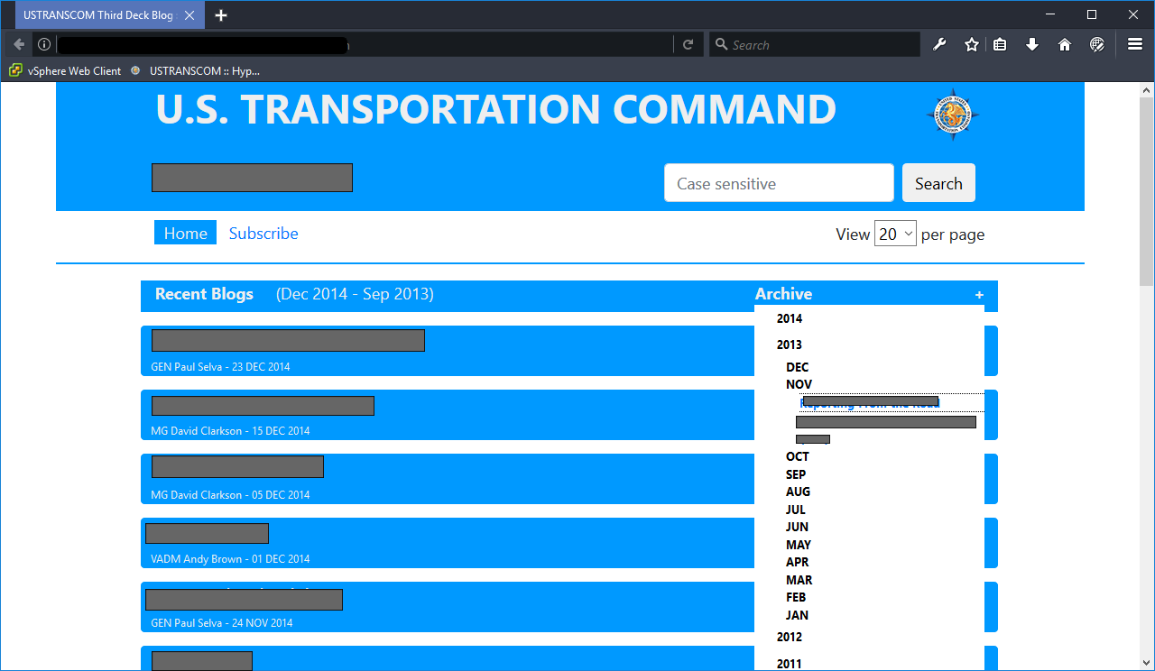
Here is how the boss wants it to look. I've got an issue, now, where if I don't put it inside the element that expands/collapses it then it will push down anything below it (even with a z-index of 100). But if I do put it in the element that expands/collapses it, then the first click will bring it out, but when I click on a month the first element thinks I'm clicking it to close it. To get this screencap I had to click five times.
How can I do this correctly?
V/r,
^ _ ^
Copy link to clipboard
Copied
Could you not deploy a menu 'Dropdown'?
https://v4-alpha.getbootstrap.com/components/dropdowns/#menu-items
Copy link to clipboard
Copied
I gotta say, that's closer to what I'm trying to do. If I can do that without using a button so to keep the header looking as it currently does, that would be awesome.
I'll give that a shot and report back.
Thanks!
V/r,
^ _ ^
Copy link to clipboard
Copied
WolfShade wrote
I gotta say, that's closer to what I'm trying to do. If I can do that without using a button so to keep the header looking as it currently does, that would be awesome.
You dont have to use a button your could just use a <div> tag.
Copy link to clipboard
Copied
I'm still not doing something right. I haven't converted everything from collapse to dropdown, yet, but it's still taking five clicks to drill down to a blog title link. Here's what I have, so far:
<div class="row" id="blogs">
    <div class="col-1"><!--- Left buffer ---></div>
    <div class="col-7 headerRow" id="mainHeader"><!--- Main header --->
        Recent Blogs
    </div>
    <div class="col-3 headerRow dropdown" title="Archive">
        <div class="dropdown-toggle" data-toggle="dropdown" aria-haspopup="true" aria-expanded="false" id="archiveHeader">Archive</div>
        <div id="archivesDiv" class="dropdown-menu" aria-labelledby="archiveHeader"><!--- Archive links --->
        <cfoutput query="arcQuery" group="year">
            <div class="years" data-toggle="dropdown" data-target="##months#arcQuery.year#" aria-expanded="false" aria-controls="months#arcQuery.year#" title="#arcQuery.year#">#arcQuery.year#</div>
            <div class="months" id="months#arcQuery.year#">
        <cfoutput group="date1">
                <div data-toggle="collapse" data-target="###replace(arcQuery.date1,' ','','all')#" aria-expanded="false" aria-controls="#replace(arcQuery.date1,' ','','all')#" title="#left(arcQuery.date1,3)#">#left(arcQuery.date1,3)#</div>
                <div class="days collapse" id="#replace(arcQuery.date1,' ','','all')#">
        <cfoutput>
                    <div style="border-top: 1px dotted black;"><a href="index_post.cfm?entid=#arcQuery.id#" title="#arcQuery.topic#">#arcQuery.topic#</a></div>
        </cfoutput>
                </div>
        </cfoutput>
            </div>
        </cfoutput>
        </div>
    </div>
    <div class="col-1"><!--- Right buffer ---></div>
</div>
What am I doing incorrectly? (This is so not my forte.)
V/r,
^ _ ^
Copy link to clipboard
Copied
To be honest doing this with Bootstrap is an evil way (no insult intended to you personally just talking generally) as you have 3 or 4 collapsable menus to take into consideration. If you use Bootstrap you'll end up with code like spaghetti junction and a myriad of classes, arias data-content, data-toggle and goodness knows what.
Bootstrap really has to be one of the most awful coding frameworks available today. The code stinks.
Copy link to clipboard
Copied
Unfortunately, I am kind of committed to it as all my code is set for Bootstrap v4. And I do like it better than W3. (Not a fan of anything from W3Fools. Although I will admit they are getting better about updating their definitions.)
Everything else I've done with Bootstrap is working fine. I just don't get how this keeps thinking that I'm trying to close the first level when I click on a sub and it's not within the same DIV container. Maddening.
But thanks for the idea of the dropdown. I'll keep at it and see if I can't shake something loose.
V/r,
^ _ ^
Copy link to clipboard
Copied
Problem with Bootstrap it has a set of default components, beyond those compoents its useless and you have to start coding your own. Your dropmenu menu is quite complex being as though it has several levels of menus. Bootstrapless example below just to make a point how easy it is If you get to grips with some html and css.
<!DOCTYPE html>
<html>
<head>
<meta charset="UTF-8">
<title>Bootrapless Dropdown Menu</title>
<script src="https://code.jquery.com/jquery-3.3.1.slim.min.js" integrity="sha384-q8i/X+965DzO0rT7abK41JStQIAqVgRVzpbzo5smXKp4YfRvH+8abtTE1Pi6jizo" crossorigin="anonymous"></script>
<script>
$(document).ready(function(){
$('.archives h6').css('cursor' , 'pointer').click(function(){
$(this).next('div').toggle();
$(this).toggleClass('active');
});
$('.archived_blogs a').css('cursor' , 'pointer').click(function(){
$(this).next('ul').toggle();
$(this).toggleClass('activeRight');
});
});
</script>
<style>
body {
font-family: helvetica, sans-serif;
}
* {
box-sizing: border-box;
}
.blogs {
width: 85%;
margin: 0 auto;
}
@media screen and (max-width: 768px) {
.blogs {
width: 95%;
margin: 0 auto;
}
}
.blog_header {
display: flex;
justify-content: space-between;
flex-wrap: wrap;
background-color: #2e89f6;
padding: 12px 30px;
}
h6 {
color: #fff;
margin: 0;
padding: 5px 0 5px 0;
font-size: 18px;
font-weight: 400;
}
.recent_blogs {
width: 65%;
}
@media screen and (max-width: 768px) {
.recent_blogs {
width: 100%;
}
}
.archives {
width: 35%;
position: relative;
}
@media screen and (max-width: 768px) {
.archives {
width: 100%;
}
}
.archived_blogs {
display: none;
position: absolute;
top: 2.1em;
background-color: #fff;
width: 100%;
padding: 10px 20px 0 20px;
border: 1px solid #ccc;
}
.archived_blogs ul {
margin: 0;
padding: 0;
list-style: none;
}
.archived_blogs li {
margin: 0;
padding: 0;
}
.archived_blogs a {
display: block;
text-decoration: none;
padding: 8px 0;
border-top: 1px solid #ccc;
color: #666;
}
.archived_blogs ul ul{
display: none;
}
.archived_blogs ul ul a{
padding: 8px 0 8px 20px;
background-color: #e6e6e6;
color: #000;
}
.archived_blogs ul ul ul a{
padding: 8px 0 8px 20px;
background-color: #f2f2f2;
color: #000;
}
.archives span:after {
float: right;
content: '\002B';
font-weight: bold;
font-size: 21px;
}
.active span:after {
float: right;
content: "\2212";
font-weight: bold;
font-size: 21px;
}
.page_content {
width: 85%;
margin: 0 auto;
text-align: center;
}
</style>
</head>
<body>
<div class="blogs">
<div class="blog_header">
<div class="recent_blogs"><h6>Recent Blogs (De 2014 - Sep 2013)</h6></div>
<!-- end recent_blogs -->
<div class="archives">
<h6>Archives<span></span></h6>
<div class="archived_blogs">
<ul>
<li><a href="#" style="border-top: none;">2014</a>
<ul>
<li><a href="#">December</a>
<ul>
<li><a href="#">Blog Entry 1</a></li>
<li><a href="#">Blog Entry 2</a></li>
<li><a href="#">Blog Entry 3</a></li>
<li><a href="#">Blog Entry 4</a></li>
<li><a href="#">Blog Entry 5</a></li>
</ul>
</li>
<li><a href="#">November</a>
<ul>
<li><a href="#">Blog Entry 1</a></li>
<li><a href="#">Blog Entry 2</a></li>
<li><a href="#">Blog Entry 3</a></li>
<li><a href="#">Blog Entry 4</a></li>
<li><a href="#">Blog Entry 5</a></li>
</ul>
</li>
<li><a href="#">October</a>
<ul>
<li><a href="#">Blog Entry 1</a></li>
<li><a href="#">Blog Entry 2</a></li>
<li><a href="#">Blog Entry 3</a></li>
<li><a href="#">Blog Entry 4</a></li>
<li><a href="#">Blog Entry 5</a></li>
</ul>
</li>
<li><a href="#">September</a>
<ul>
<li><a href="#">Blog Entry 1</a></li>
<li><a href="#">Blog Entry 2</a></li>
<li><a href="#">Blog Entry 3</a></li>
<li><a href="#">Blog Entry 4</a></li>
<li><a href="#">Blog Entry 5</a></li>
</ul>
</li>
</ul>
</li>
<li><a href="#">2013</a>
<ul>
<li>Decemeber</li>
<li>November</li>
<li>October</li>
<li>September</li>
</ul>
</li>
<li><a href="#">2012</a>
<ul>
<li>December</li>
<li>November</li>
<li>October</li>
<li>September</li>
</ul>
</li>
<li><a href="#">2011</a>
<ul>
<li>December</li>
<li>November</li>
<li>October</li>
<li>September</li>
</ul>
</li>
</ul>
</div>
<!-- end archived_blogs -->
</div>
<!-- end archives -->
</div>
<!-- end blog_header -->
</div>
<!-- end blogs -->
<div class="page_content">
<h2>Page content goes here. Page content goes here. Page content goes here.Page content goes here.</h2>
</div>
<!-- end page_content -->
</body>
</html>
Copy link to clipboard
Copied
HTML, JavaScript, ColdFusion, SQL I've been working with since 2000.
CSS is another story. I'm only just recently getting into CSS, not by choice. Our front-end guy left. He is the best front-end developer I've ever worked with. So, it's very s-l-o-w going and I really don't have the mindset (or a designer's eye) for it.
OOP, I get. Complexity, I can navigate. But, to me, CSS isn't always intuitive. So there's a lot of trial-and-error.
In another thread, I posted a link to an animated gif of Peter Griffin (Family Guy) fighting with window blinds, and the caption "CSS". I won't repost it, here, but it explains my frustration with CSS.
The code you posted is impressive, but it's a LOT of code to write/maintain (just the CSS portion) to create that effect. Just curious - how cross-browser compatible is it?
V/r,
^ _ ^
Copy link to clipboard
Copied
It should be cross browser compatible if you include the prefixes for flex.
I guess to someone who doesnt write a lot of css it might look a lot but theres not much there to be honest compared to all the css Bootstrap uses to create similar effects, its just you dont see it because its hidden from view, classes are applied directly to the html.
Personally l prefer to keep the html as clean as possible rather than clog it up with zillions of class names because l mainly work in the html and need to understand it very quickly to manipulate it. Bootdtrap uses much more html than is strictly necsssary making code management slower and harder to maintain. We once frowned upon messy code and divitus back in the day, well its truly back in the shape of frameworks.
Anyway each to his or her own.
If you can handle jsvascript, sql, html and cf then css is a breeze, you need to have the right mind set to learn it off course but its pretty simple.
Copy link to clipboard
Copied
Bootstrap's regular build has everything for every possible scenario. Ideally, a good developer builds what he/she needs and then creates a custom Bootstrap build -- stripping out unwanted classes and components from the CSS and JS.
For someone new to Bootstrap and CSS, the learning curve is greater than it would be for someone who uses CSS everyday.
Alt-Web Design & Publishing ~ Web : Print : Graphics : Media
Copy link to clipboard
Copied
https://forums.adobe.com/people/Nancy+OShea wrote
Bootstrap's regular build has everything for every possible scenario.
Not unless you code it yourself............just shows those that use Bootstrap are restricted to their own tiny world
Im not even talking about a custom build lm talking about the hideous amount of classes you have to use in the html and a lot of redundant divs. Strip those out and well it wont look pretty.

Copy link to clipboard
Copied
Hmm, this is interesting. A positive comment from someone that knows and uses Bootstrap and a negative comment from someone that doesn't.
Copy link to clipboard
Copied
BenPleysier wrote
Hmm, this is interesting. A positive comment from someone that knows and uses Bootstrap and a negative comment from someone that doesn't.
And negative comments from 2 people who are supposedly Bootstrap experts but can provide no answers.........unless they can find some pre-made code on Google and link to it...................humm
Copy link to clipboard
Copied
Just a lucky guess
Copy link to clipboard
Copied
BenPleysier wrote
Just a lucky guess
No need for guessing, I've observed too many of yours and Nancys Bootstrap answers.....most just point to Google links.
Copy link to clipboard
Copied
Glad for the diligent supervision.
Copy link to clipboard
Copied
Youre way passed diligent supervision.
Copy link to clipboard
Copied
Enough, already! None of this bickering is helping me, any, and serves nothing.
If you don't have a suggestion to help resolve my issue, don't post.
^ _ ^
-
- 1
- 2
 AdChoices