 Adobe Community
Copy link to clipboard
Copied
When this site was last edited 3-4 months ago, I think I remember the images being centered on desktop, with gray bars on either side. I just learned that is no longer the case. Perhaps bootstrap was updated? Or I just have a faulty memory. In any case, I seem to be missing something and would like to center the images horizontally.
2017 Festival Photos | Durham Blues & Brews Festival
Somewhat related, the images are on the small side at 640px wide. A later edit project is to build multiple sizes using srcset. An article referenced on this forum is from 2014. Is it still a recommended method in 2017 (nearly 2018)?
 1 Correct answer
Add either of the following two style rules to the bottom of your CSS
If you want the image to expand full width - no centering required
.carousel img {
width: 100%;
height: auto;
}
If you just want to center the image
.carousel img {
margin: auto;
}
Copy link to clipboard
Copied
What's this for?
<link href="http://getbootstrap.com/examples/carousel/carousel.css" rel="stylesheet">
It's 404 Not Found. And besides, GetBootstrap is not a CDN.
Bigger images would help a lot. Try adding this to your custom CSS.
.carousel-inner img {width:100%; height:100% !important}
And don't forget to fix your code errors.
Showing results for http://www.durhambluesandbrewsfestival.com/photos/2017.htm - Nu Html Checker
Alt-Web Design & Publishing ~ Web : Print : Graphics : Media
Copy link to clipboard
Copied
I don't know what that getbootstrap link was about. I didn't build the original framework. But I removed it without apparent consequence. I also did the other suggested edits but images are still not centered.
Copy link to clipboard
Copied
Add either of the following two style rules to the bottom of your CSS
If you want the image to expand full width - no centering required
.carousel img {
width: 100%;
height: auto;
}
If you just want to center the image
.carousel img {
margin: auto;
}
Copy link to clipboard
Copied
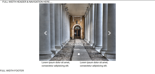
I was going to suggest putting the carousel into a smaller container.

Below is the code I used.
<!doctype html>
<html lang="en-US">
<head>
<meta charset="utf-8">
<title>Bootstrap 3.7 Carousel</title>
<meta name="viewport" content="width=device-width, initial-scale=1">
<meta http-equiv="X-UA-Compatible" content="IE=edge">
<!-- Latest compiled and minified Bootstrap CSS-->
<link rel="stylesheet" href="https://maxcdn.bootstrapcdn.com/bootstrap/3.3.7/css/bootstrap.min.css" integrity="sha384-BVYiiSIFeK1dGmJRAkycuHAHRg32OmUcww7on3RYdg4Va+PmSTsz/K68vbdEjh4u" crossorigin="anonymous">
<style>
.center-block {float:none}
.carousel img {width:100%; height:100%}
</style>
</head>
<body>
<div class="container-fluid">
FULL WIDTH HEADER & NAVIGATION HERE....
</div>
<div class="container">
<div class="row">
<div class="col-sm-8 center-block">
<!--begin Bootstrap Carousel-->
<div id="myCarousel" class="carousel slide" data-ride="carousel" data-interval="5200">
<!-- Indicators -->
<ol class="carousel-indicators">
<li data-target="#myCarousel" data-slide-to="0" class="active"></li>
<li data-target="#myCarousel" data-slide-to="1"></li>
<li data-target="#myCarousel" data-slide-to="2"></li>
<li data-target="#myCarousel" data-slide-to="3"></li>
</ol>
<!-- Wrapper for slides -->
<div class="carousel-inner" role="listbox">
<div class="item active">
<img src="https://placeimg.com/640/480/arch/4" alt="...">
<div class="carousel-caption">
<h3>Heading 3</h3>
<p>Details....</p>
</div>
</div>
<div class="item">
<img src="https://placeimg.com/640/480/arch/3" alt="...">
<div class="carousel-caption">
<h3>Heading 3</h3>
<p>Details....</p>
</div>
</div>
<div class="item">
<img src="https://placeimg.com/640/480/arch/2" alt="...">
<div class="carousel-caption">
<h3>Heading 3</h3>
<p>Details....</p>
</div>
</div>
<div class="item">
<img src="https://placeimg.com/640/480/arch/1" alt="...">
<div class="carousel-caption">
<h3>Heading 3</h3>
<p>Details....</p>
</div>
</div>
<!--end active-->
</div>
<!-- Left and right controls -->
<a class="left carousel-control" href="#myCarousel" role="button" data-slide="prev">
<span class="glyphicon glyphicon-chevron-left" aria-hidden="true"></span>
<span class="sr-only">Previous</span> </a> <a class="right carousel-control" href="#myCarousel" role="button" data-slide="next">
<span class="glyphicon glyphicon-chevron-right" aria-hidden="true"></span>
<span class="sr-only">Next</span> </a>
<!--end carousel-->
</div>
<!--begin 2 columns-->
<div class="col-sm-6">
<p>Lorem ipsum dolor sit amet, consectetur adipisicing elit. </p>
</div>
<div class="col-sm-6">
<p>Lorem ipsum dolor sit amet, consectetur adipisicing elit. </p>
</div>
<!--/column--></div>
<!--/row--></div>
<!--/container--></div>
<div class="container-fluid">
<div class="row">
FULL WIDTH FOOTER
</div>
</div>
<!--latest jQuery 3-->
<script src="https://code.jquery.com/jquery-3.2.1.min.js" integrity="sha256-hwg4gsxgFZhOsEEamdOYGBf13FyQuiTwlAQgxVSNgt4=" crossorigin="anonymous"></script>
<!--Bootstrap-->
<script src="https://maxcdn.bootstrapcdn.com/bootstrap/3.3.7/js/bootstrap.min.js" integrity="sha384-Tc5IQib027qvyjSMfHjOMaLkfuWVxZxUPnCJA7l2mCWNIpG9mGCD8wGNIcPD7Txa" crossorigin="anonymous"></script>
</body>
</html>
Alt-Web Design & Publishing ~ Web : Print : Graphics : Media
Copy link to clipboard
Copied
Perfect - just the answer I was looking for.

