 Adobe Community
- Home
- Dreamweaver
- Discussions
- Dreamweaver CC -- Media Queries not working ?
- Dreamweaver CC -- Media Queries not working ?
Dreamweaver CC -- Media Queries not working ?

Copy link to clipboard
Copied
Created desktop site via Dreamweaver using HTML5 and CSS. That WORKS.
The ISSUE comes with MEDIA QUERY CODING !!
Why are the media queries not bringing responsive sites for mobile and tablet?
Should query be composed of 'each section' shown on the desktop CSS, but given adjustments on percentages / pixels to mobile size and tablet size??
To have MOBILE responsive: Create One lengthy query for each section on Homepage -- One lengthy query for each section on Graphic Design page -- One lengthy query for each section on Illustration page -- One lengthy query for each section on Textile Design page -- One lengthy query for each section on About page.
-------- The Graphic Design, Illustration, and Textile Design pages each have a slide show consisting of six images.
When all that query coding for mobile's site is completed, then must code for TABLET's responsive site !! ??
TWO WEBSITES !! ?? beyond the desktop site !! = Three Websites.
Do Fluid Grids create responsive web development automatically?
Is there a book that explains how Media Query should be written for several pages on a website for mobile and tablet?
Does Adobe Classroom in a Book for Dreamweaver CC 2018 explain how to Code Media Query for several pages ?
MaryAlice


 1
Reply
1
1
Reply
1

Copy link to clipboard
Copied
I suggest you read the chapter below on Responsive Web Design.
Responsive Web Design Introduction
I don't recommend using legacy Fluid Grid Layouts. Adobe removed that feature from DW CC for a reason.
If you can work with code, Bootstrap is a responsive framework for creating one website that displays well on all devices -- xs, sm, md & lg.
Bootstrap is integrated in DW CC. The quickest way to get started is with the Starter Templates in DW CC.
Go to File > New > Starter Templates > Bootstrap Templates.
Choose a layout & hit Create button. See screenshots.
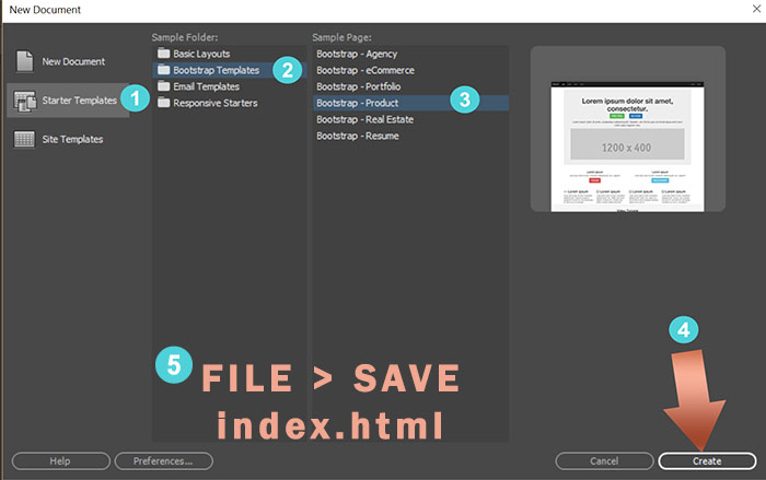
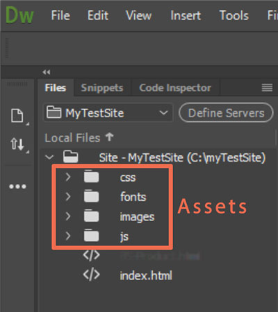
Save As index.html. DW will create Assets and files for you in your local site folder.
You should now have a responsive web page that works in all device widths.
Alt-Web Design & Publishing ~ Web : Print : Graphics : Media
 AdChoices