 Adobe Community
- Home
- Dreamweaver
- Discussions
- drop down menu doesnt toggle when absolute positio...
- drop down menu doesnt toggle when absolute positio...

Copy link to clipboard
Copied
Hi everyone!
I'm working on an online portfolio and for tablet and mobile view, I created a drop down hamburger menu. For the tablet view, I had to apply an absolute positioning class, so it wouldn't disrupt the text below. I applied the class to the div tag around the three links in the menu. Now the toggle function doesn't work anymore. It still works fine for mobile, where I didn't have to apply the absolute position, which means that the problem must lie in the class I applied. This confuses me though, because when I had the issue with the menu pushing down the main part, I took to google and overwhelmingly the answer was to use absolute position.
Does anyone know what might have gone wrong?


 1 Correct answer

If youre looking for a no frills simple mobile navigation:
<!DOCTYPE html>
<html>
<head>
<meta charset="UTF-8">
<title>Simple Mobile Navigation</title>
<meta name="viewport" content="width=device-width, initial-scale=1">
<script src="https://code.jquery.com/jquery-3.2.1.min.js" integrity="sha256-hwg4gsxgFZhOsEEamdOYGBf13FyQuiTwlAQgxVSNgt4=" crossorigin="anonymous"></script>
<script>
jQuery(document).ready(function() {
$('.mobile-view').click(function() {
$('.desktop-view').slideToggle();
});
});
</script>
<st
...
 5
Replies
5
5
Replies
5

Copy link to clipboard
Copied
linnspitz wrote
...Does anyone know what might have gone wrong?
Not without seeing your code.
Could you post a link to your work in progress so we can see what's happening in our browsers?
Copy link to clipboard
Copied
linnspitz wrote
Hi everyone!
I'm working on an online portfolio and for tablet and mobile view, I created a drop down hamburger menu. For the tablet view, I had to apply an absolute positioning class, so it wouldn't disrupt the text below. I applied the class to the div tag around the three links in the menu. Now the toggle function doesn't work anymore. It still works fine for mobile, where I didn't have to apply the absolute position, which means that the problem must lie in the class I applied. This confuses me though, because when I had the issue with the menu pushing down the main part, I took to google and overwhelmingly the answer was to use absolute position.
Does anyone know what might have gone wrong?
Try adding a z-index to the absolutely positioned container css.....
z-index: 1000;
Copy link to clipboard
Copied
Thanks for the answers! Here's my code, sorry I didn't post it before.
.png)
.png)
.png)

Copy link to clipboard
Copied
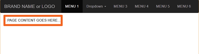
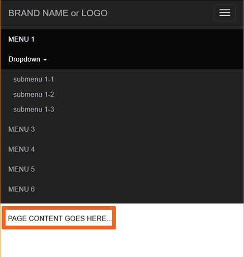
BOOTSTRAP RESPONSIVE NAVBAR
CODE:
<!doctype html>
<html lang="en">
<head>
<meta charset="utf-8">
<title>Bootstrap 3.3.7 Starter</title>
<meta name="viewport" content="width=device-width, initial-scale=1">
<meta http-equiv="X-UA-Compatible" content="IE=edge">
<!-- Latest compiled and minified Bootstrap CSS-->
<link rel="stylesheet" href="https://maxcdn.bootstrapcdn.com/bootstrap/3.3.7/css/bootstrap.min.css" integrity="sha384-BVYiiSIFeK1dGmJRAkycuHAHRg32OmUcww7on3RYdg4Va+PmSTsz/K68vbdEjh4u" crossorigin="anonymous">
<style>
.center-block {float:none}
</style>
</head>
<body>
<!--begin top nav bar-->
<nav class="navbar navbar-inverse" role="navigation">
<div class="container-fluid">
<div class="navbar-header"> <a class="navbar-brand" href="#"> BRAND NAME or LOGO </a>
<button type="button" class="navbar-toggle" data-toggle="collapse" data-target="#myNavbar"> <span class="icon-bar"></span> <span class="icon-bar"></span> <span class="icon-bar"></span> </button>
</div>
<div class="collapse navbar-collapse" id="myNavbar">
<ul class="nav navbar-nav navbar-right">
<li class="active"><a href="#">MENU 1</a></li>
<li class="dropdown"> <a class="dropdown-toggle" data-toggle="dropdown" href="#">Dropdown <span class="caret"></span></a>
<ul class="dropdown-menu">
<li><a href="#">submenu 1-1</a></li>
<li><a href="#">submenu 1-2</a></li>
<li><a href="#">submenu 1-3</a></li>
</ul>
</li>
<li><a href="#">MENU 3</a></li>
<li><a href="#">MENU 4</a> </li>
<li><a href="#">MENU 5</a> </li>
<li><a href="#">MENU 6</a></li>
</ul>
</div>
</div>
<!--end top nav-->
</nav>
<div class="container">
<div class="row">
<div class="col-md-10 center-block">
PAGE CONTENT GOES HERE...
</div>
</div>
</div>
<!--latest jQuery 3-->
<script src="https://code.jquery.com/jquery-3.2.1.min.js" integrity="sha256-hwg4gsxgFZhOsEEamdOYGBf13FyQuiTwlAQgxVSNgt4=" crossorigin="anonymous"></script>
<!--Bootstrap-->
<script src="https://maxcdn.bootstrapcdn.com/bootstrap/3.3.7/js/bootstrap.min.js" integrity="sha384-Tc5IQib027qvyjSMfHjOMaLkfuWVxZxUPnCJA7l2mCWNIpG9mGCD8wGNIcPD7Txa" crossorigin="anonymous"></script>
</body>
</html>
Alt-Web Design & Publishing ~ Web : Print : Graphics : Media
Copy link to clipboard
Copied
If youre looking for a no frills simple mobile navigation:
<!DOCTYPE html>
<html>
<head>
<meta charset="UTF-8">
<title>Simple Mobile Navigation</title>
<meta name="viewport" content="width=device-width, initial-scale=1">
<script src="https://code.jquery.com/jquery-3.2.1.min.js" integrity="sha256-hwg4gsxgFZhOsEEamdOYGBf13FyQuiTwlAQgxVSNgt4=" crossorigin="anonymous"></script>
<script>
jQuery(document).ready(function() {
$('.mobile-view').click(function() {
$('.desktop-view').slideToggle();
});
});
</script>
<style>
header {
background-color: #609;
text-align: right;
}
.mobile-view {
display: none;
border-bottom: 1px solid #fff;
}
.mobile-view a {
display: block;
padding: 10px 25px;
text-decoration: none;
color: #fff;
}
@media screen and (max-width: 768px) {
.mobile-view {
display: block;
}
}
@media screen and (max-width: 768px) {
.desktop-view {
display: none;
}
}
.desktop-view ul {
margin: 0;
padding: 0;
overflow: hidden;
float: right;
}
@media screen and (max-width: 768px) {
.desktop-view ul {
width: 100%;
}
}
.desktop-view ul li {
display: inline-block;
list-style: none;
text-align: right;
}
@media screen and (max-width: 768px) {
.desktop-view ul li {
float: none;
width: 100%;
text-align: left;
border-bottom: 1px solid #fff;
}
}
.desktop-view ul li a {
display: block;
padding: 10px 25px;
text-decoration: none;
color: #fff;
}
.desktop-view ul li a:hover {
background-color:#909;
}
</style>
</head>
<body>
<header>
<div class="mobile-view"><a href="#">Mobile Menu</a></div>
<nav class="desktop-view">
<ul>
<li><a href="#">Portfolio</a></li>
<li><a href="#">About Me</a></li>
<li><a href="#">Contact</a></li>
</ul>
<br style="clear: both;">
</nav>
</header>
</body>
</html>
 AdChoices