 Adobe Community

Copy link to clipboard
Copied
I'm having some issues with compatibility in IE11 and flexbox. My site is working correctly in Chrome, Firefox, Edge but not IE. I've researched Google and this forum and learned of "bugs" and issues with columns etc.. in IE but everything I've tried still isn't correcting the issue. I've pasted the code below. Thank you for the help.
<div class="container-fluid hero-band-contain d-flex flex-column">
<img src="images/hero_image.jpg" alt="" width="10048" height="4304" class="img-fluid"/>
<div class="hero-image-overlay">
<h1 class="sethshead">Southeast Texas Health System</h1>
<h2 class="leveraging">Leveraging partnership and participation among rural community Texas hospitals to deliver the highest quality care through active colaboration.</h2>
<a href="about.html" class="btn btn-primary btn-lg who-we-are-button">WHO WE ARE</a>
</div>
</div>
body {
height: 100%;
}
.hero-band-contain {
padding: 0px;
}
.hero-image-overlay {
position: absolute;
}
.sethshead {
color: #2E2E2E;
font-size: 63px;
font-family: 'Oswald', sans-serif;
margin-left: 10%;
margin-top: 9%;
}
.leveraging {
color: #2E2E2E;
font-size: 25px;
font-family: 'Raleway', sans-serif;
font-weight: lighter;
margin-top: 1%;
margin-left: 10%;
width: 46%;
}
.who-we-are-button {
font-family: 'Raleway', sans-serif;
font-size: 28px;
background-color: #7AAC3B;
border-color: #8BBB4E;
margin-top: 2%;
margin-left: 10%
}


 1 Correct answer

...
Reshleman wrote
I'm having some issues with compatibility in IE11 and flexbox. My site is working correctly in Chrome, Firefox, Edge but not IE. I've researched Google and this forum and learned of "bugs" and issues with columns etc.. in IE but everything I've tried still isn't correcting the issue. I've pasted the code below. Thank you for the help.
<div class="container-fluid hero-band-contain d-flex flex-column">
<img src="images/hero_image.jpg" alt="" width="10048" height="4304" class="img-f
 10
Replies
10
10
Replies
10

Copy link to clipboard
Copied
Is this question bootstrap related?
If so I will leave it for someone else to help, if not then can you post a link to the live version of your site?
Copy link to clipboard
Copied
Yes, bootstrap 4. The site is not live yet.

Copy link to clipboard
Copied
<img src="images/hero_image.jpg" alt="#" width="10048" height="4304" class="img-fluid"/>
That's an awfully big image!
This Carousel Template might be what you're looking for.

<!doctype html>
<html lang="en">
<head>
<meta charset="utf-8">
<meta name="viewport" content="width=device-width, initial-scale=1, shrink-to-fit=no">
<title>Carousel Template for Bootstrap 4</title>
<link href="https://maxcdn.bootstrapcdn.com/bootstrap/4.0.0-beta/css/bootstrap.min.css" rel="stylesheet" integrity="sha384-/Y6pD6FV/Vv2HJnA6t+vslU6fwYXjCFtcEpHbNJ0lyAFsXTsjBbfaDjzALeQsN6M" crossorigin="anonymous">
<style>
body {
padding-top: 3rem;
padding-bottom: 3rem;
color: #5a5a5a;
}
.carousel { margin-bottom: 4rem; }
.carousel-caption {
bottom: 3rem;
z-index: 10;
}
.carousel-item {
height: 32rem;
background-color: #777;
}
.carousel-item > img {
position: absolute;
top: 0;
left: 0;
min-width: 100%;
height: 32rem;
}
@media (min-width: 40em) {
.carousel-caption p {
margin-bottom: 1.25rem;
font-size: 1.25rem;
line-height: 1.4;
}
}
</style>
</head>
<body>
<header>
<nav class="navbar navbar-expand-md navbar-dark fixed-top bg-dark"> <a class="navbar-brand" href="#">Brand/Logo</a>
<button class="navbar-toggler" type="button" data-toggle="collapse" data-target="#navbarCollapse" aria-controls="navbarCollapse" aria-expanded="false" aria-label="Toggle navigation"> <span class="navbar-toggler-icon"></span> </button>
<div class="collapse navbar-collapse" id="navbarCollapse">
<ul class="navbar-nav mr-auto">
<li class="nav-item active"> <a class="nav-link" href="#">Home <span class="sr-only">(current)</span></a> </li>
<li class="nav-item"> <a class="nav-link" href="#">Link</a> </li>
<li class="nav-item"> <a class="nav-link" href="#">Link</a> </li>
<li class="nav-item"> <a class="nav-link" href="#">Link</a> </li>
<li class="nav-item"> <a class="nav-link" href="#">Link</a> </li>
</ul>
</div>
</nav>
</header>
<!--CACROUSEL-->
<main role="main">
<div id="myCarousel" class="carousel slide" data-ride="carousel">
<ol class="carousel-indicators">
<li data-target="#myCarousel" data-slide-to="0" class="active"></li>
<li data-target="#myCarousel" data-slide-to="1"></li>
<li data-target="#myCarousel" data-slide-to="2"></li>
</ol>
<div class="carousel-inner">
<div class="carousel-item active"> <img class="first-slide" src="https://placeimg.com/1500/200/nature" alt="First slide">
<div class="container">
<div class="carousel-caption text-left">
<h1>Example headline.</h1>
<p>Cras justo odio, dapibus ac facilisis in, egestas eget quam. Donec id elit non mi porta gravida at eget metus. Nullam id dolor id nibh ultricies vehicula ut id elit.</p>
<p><a class="btn btn-lg btn-primary" href="#" role="button">Sign up today</a></p>
</div>
</div>
</div>
<div class="carousel-item"> <img class="second-slide" src="https://placeimg.com/1500/200/arch" alt="Second slide">
<div class="container">
<div class="carousel-caption">
<h1>Another example headline.</h1>
<p>Cras justo odio, dapibus ac facilisis in, egestas eget quam. Donec id elit non mi porta gravida at eget metus. Nullam id dolor id nibh ultricies vehicula ut id elit.</p>
<p><a class="btn btn-lg btn-primary" href="#" role="button">Learn more</a></p>
</div>
</div>
</div>
<div class="carousel-item"> <img class="third-slide" src="https://placeimg.com/1500/200/tech" alt="Third slide">
<div class="container">
<div class="carousel-caption text-right">
<h1>One more for good measure.</h1>
<p>Cras justo odio, dapibus ac facilisis in, egestas eget quam. Donec id elit non mi porta gravida at eget metus. Nullam id dolor id nibh ultricies vehicula ut id elit.</p>
<p><a class="btn btn-lg btn-primary" href="#" role="button">Browse gallery</a></p>
</div>
</div>
</div>
</div>
<a class="carousel-control-prev" href="#myCarousel" role="button" data-slide="prev"> <span class="carousel-control-prev-icon" aria-hidden="true"></span> <span class="sr-only">Previous</span> </a> <a class="carousel-control-next" href="#myCarousel" role="button" data-slide="next"> <span class="carousel-control-next-icon" aria-hidden="true"></span> <span class="sr-only">Next</span> </a> </div>
</main>
<!--latest jQuery 3-->
<script src="https://code.jquery.com/jquery-3.2.1.min.js" integrity="sha256-hwg4gsxgFZhOsEEamdOYGBf13FyQuiTwlAQgxVSNgt4=" crossorigin="anonymous"></script>
<!--Popper JS-->
<script src="https://cdnjs.cloudflare.com/ajax/libs/popper.js/1.11.0/umd/popper.min.js" integrity="sha384-b/U6ypiBEHpOf/4+1nzFpr53nxSS+GLCkfwBdFNTxtclqqenISfwAzpKaMNFNmj4" crossorigin="anonymous"></script>
<!--latest Bootstrap 4 JS-->
<script src="https://maxcdn.bootstrapcdn.com/bootstrap/4.0.0-beta/js/bootstrap.min.js" integrity="sha384-h0AbiXch4ZDo7tp9hKZ4TsHbi047NrKGLO3SEJAg45jXxnGIfYzk4Si90RDIqNm1" crossorigin="anonymous"></script>
</body>
</html>
Alt-Web Design & Publishing ~ Web : Print : Graphics : Media
Copy link to clipboard
Copied
Thanks for the response, Nancy. I haven't resized any images yet. I've attached a screenshot of what I'm going after. It works as designed in everything but IE. It appears as though the escape logo is throwing everything off, but I'm obviously no expert.
Copy link to clipboard
Copied
That's nothing complicated. It's just just 2 columns.
<div class="container">
<div class="row">
<div class="col-sm"> One of 2 columns </div>
<div class="col-sm"> Two of 2 columns </div>
</div>
</div>Alt-Web Design & Publishing ~ Web : Print : Graphics : Media
Copy link to clipboard
Copied
Yes, the screenshot is of the code I pasted in a previous response on this thread. Sorry if I wasn't clear. I kind of asked two questions in one.
Copy link to clipboard
Copied
I was able to fix the second issue by removing the flexbox code and using mx-auto, and .text-center on the parent container. It's easy to overthink this stuff. Thank you all for the help.

Copy link to clipboard
Copied
Our home page uses Flexbox:
We use our own Flexbox page building tool, though, and we tend to be far more thorough than Adobe in terms of supporting browsers and devices.
Copy link to clipboard
Copied
Reshleman wrote
I'm having some issues with compatibility in IE11 and flexbox. My site is working correctly in Chrome, Firefox, Edge but not IE. I've researched Google and this forum and learned of "bugs" and issues with columns etc.. in IE but everything I've tried still isn't correcting the issue. I've pasted the code below. Thank you for the help.
<div class="container-fluid hero-band-contain d-flex flex-column">
<img src="images/hero_image.jpg" alt="" width="10048" height="4304" class="img-fluid"/>
<div class="hero-image-overlay">
<h1 class="sethshead">Southeast Texas Health System</h1>
<h2 class="leveraging">Leveraging partnership and participation among rural community Texas hospitals to deliver the highest quality care through active colaboration.</h2>
<a href="about.html" class="btn btn-primary btn-lg who-we-are-button">WHO WE ARE</a>
</div>
</div>
body {
height: 100%;
}
.hero-band-contain {
padding: 0px;
}
.hero-image-overlay {
position: absolute;
}
.sethshead {
color: #2E2E2E;
font-size: 63px;
font-family: 'Oswald', sans-serif;
margin-left: 10%;
margin-top: 9%;
}
.leveraging {
color: #2E2E2E;
font-size: 25px;
font-family: 'Raleway', sans-serif;
font-weight: lighter;
margin-top: 1%;
margin-left: 10%;
width: 46%;
}
.who-we-are-button {
font-family: 'Raleway', sans-serif;
font-size: 28px;
background-color: #7AAC3B;
border-color: #8BBB4E;
margin-top: 2%;
margin-left: 10%
}
Id say you probably have zero need for the 2 flex classes on your container-fluid <div>. Looks like you are trying to set some text ontop of the image in which case you would just need to make your 'hero-band-contain' css have a position of position: relative; and give a top/left position to your hero-image-overlay css:
.hero-band-contain {
padding: 0px;
position: relative;
}
.hero-image-overlay {
position: absolute;
top: 30px;
left: 50px;
}
Copy link to clipboard
Copied
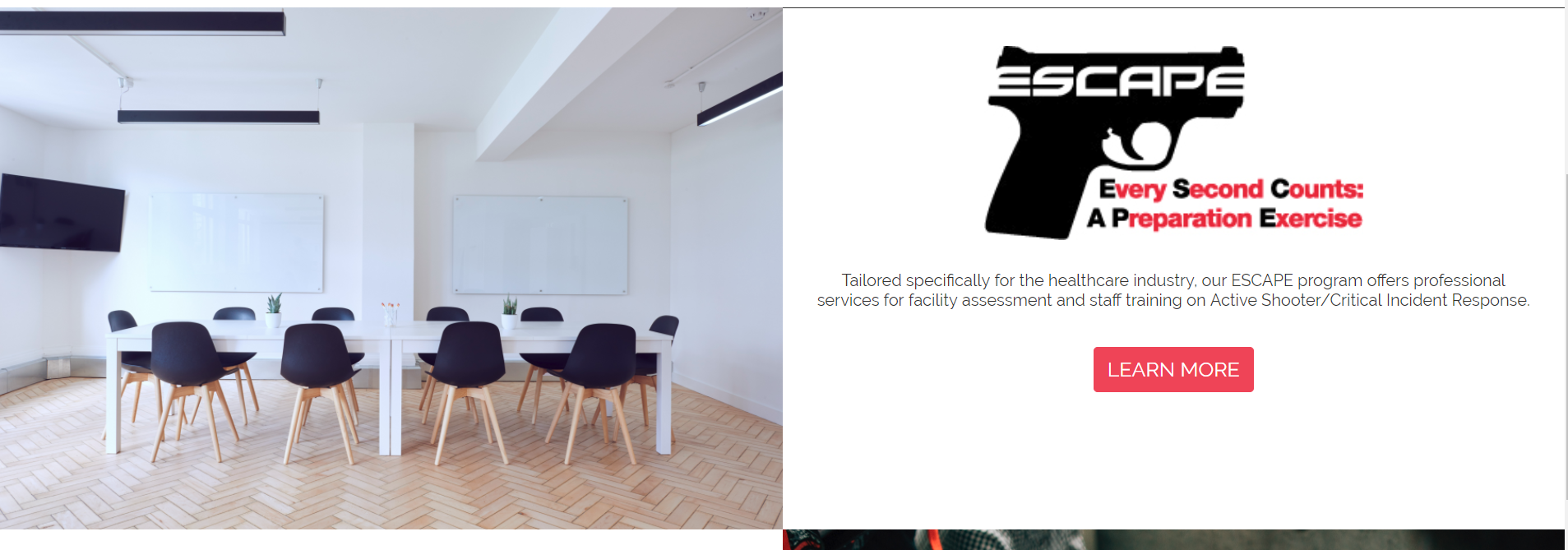
Osgood_, thank you that worked! I have one more section that I thought I was getting fancy with and again it works in other browsers just fine. Maybe I over complicated this one as well. I have an image in a column and text in another column that is centered. When the screen gets to mobile the image is hidden. When I have a chrome window open and an IE window open it's looking like the problem is occurring with the .escape-logo not scaling correctly. I'm using flex-column and align-items center like before but not over an image. Thanks, for the help.
<div class="container-fluid escape-container">
<div class="row">
<div class="col-xl-6 col-lg-6 col-md-6 col-sm-6 meeting"><img src="images/meeting.jpg" alt="" width="7242" height="4833" class="img-fluid meeting d-md-block d-none"/></div>
<div class="col-xl-6 col-lg-6 col-md-6 d-flex flex-column align-items-center"><img src="images/ESCAPE.Logo.jpg" alt=""width="50%" height="180px" class="img-fluid escape-logo"/>
<h3 class="text-center escape-text">Tailored specifically for the healthcare industry, our ESCAPE program offers professional services for facility assessment and staff training on Active Shooter/Critical Incident Response.</h3>
<a href="escape.html" class="btn btn-primary btn-lg escape-button">LEARN MORE</a>
</div>
</div>
</div>
.escape-container {
margin-top: 3%;
border-top: 0.5px solid #2B2B2B;
}
.meeting{
padding: 0px;
}
.escape-logo {
margin-top: 5%;
}
.escape-text {
color: #2E2E2E;
font-size: 20px;
font-family: 'Raleway', sans-serif;
font-weight: lighter;
margin-top: 4%;
width: 95%;
}
.escape-button {
font-family: 'Raleway', sans-serif;
font-size: 25px;
background-color: #de3d56;
margin-top: 4%;
border-color: #de3d56;
}
 AdChoices