 Adobe Community

Copy link to clipboard
Copied
Please take a look at www.vlearningcommunity.org on an iPhone. The blue bars on each page extend past the right margin. The size of the blue bar image original and within Dreamweaver is 1000 px wide. The brown logo image at the top of the page is also 1000 px wide, but it doesn't run off the page. This doesn't happen on a desktop. Would you please let me know how to fix it?
Also I wish the content spread across the page regardless of the monitor size, desktop, mobile, etc. Even on a desktop there are light blue margins on each side.
Thank you for your help!
Jen


 1 Correct answer

Swimmingdog wrote
Thank you for your response!
Would someone please help with my original blue bar running off the page question? The brown logo image works as it should.
Thank you. I appreciate it.
Jen
Question 1:
When I see
<img src="Blue Bar.jpg" alt="" width="1000" height="29"/>
I immediately see that
- there is an illegal value (space) for the src attribute
- absolute values for the dimension attributes without additional style rules means that the image will always keep those measurements.
Solution:
- a
 5
Replies
5
5
Replies
5

Copy link to clipboard
Copied
You've used pixels to define your elements without establishing any media queries, meaning that the page and its elements will not re-size the viewport based on how the end user is accessing your site. Google for tips on creating responsive web design.
You also should look into fixing the coding errors: Showing results for http://www.vlearningcommunity.org/ - Nu Html Checker . And more importantly for your business, you have embedded all of your most important information in images which cannot be indexed by search engines.
Chris
Copy link to clipboard
Copied
Thank you for your response!
Would someone please help with my original blue bar running off the page question? The brown logo image works as it should.
Thank you. I appreciate it.
Jen
Copy link to clipboard
Copied
Swimmingdog wrote
Thank you for your response!
Would someone please help with my original blue bar running off the page question? The brown logo image works as it should.
Thank you. I appreciate it.
Jen
Question 1:
When I see
<img src="Blue Bar.jpg" alt="" width="1000" height="29"/>
I immediately see that
- there is an illegal value (space) for the src attribute
- absolute values for the dimension attributes without additional style rules means that the image will always keep those measurements.
Solution:
- add a class to the image, e.g. img-fluid
- in the style sheet add .img-fluid {max-width: 100%;}
- rename the image file to Blue_Bar.jpg
- change the name accordingly in the src attribute
Question 2:
The wrapper has the following style rules attached to it
#wrapper {
width: 100%;
min-width: 740px;
max-width: 1000px;
margin-left: auto;
margin-right: auto;
background-color: #FFFFFF;
text-align: center;
padding-bottom: 0px;
color: #6B2905;
font-size: 20px;
font-weight: normal;
font-style: normal;
}
This means that the width will always be between 740px and 1000px.
Solution:
- remove both of the highlighted lines
As a side note: have a look at Showing results for http://www.vlearningcommunity.org/ - Nu Html Checker
Copy link to clipboard
Copied
Thank you, I found this very helpful! It allowed me to adjust the blue bars.
I appreciate all of the responses and will be working through the various suggestions.
Best wishes, Jen

Copy link to clipboard
Copied
Code errors and strange <video> banner that doesn't work aside,
1) Your site is not mobile friendly. See link below.
Mobile-Friendly Test - Google Search Console
2) The layout must be rebuilt with % widths to fit all devices. That includes the blue bar which is too wide to fit smart phone viewports under 576 px wide.
3) The viewport meta tag is missing from your document.
<!DOCTYPE html>
<html lang="en">
<head>
<meta charset="utf-8">
<meta http-equiv="X-UA-Compatible" content="IE=edge">
<meta name="viewport" content="width=device-width, initial-scale=1">
<title>Unique Page Tilte</title>
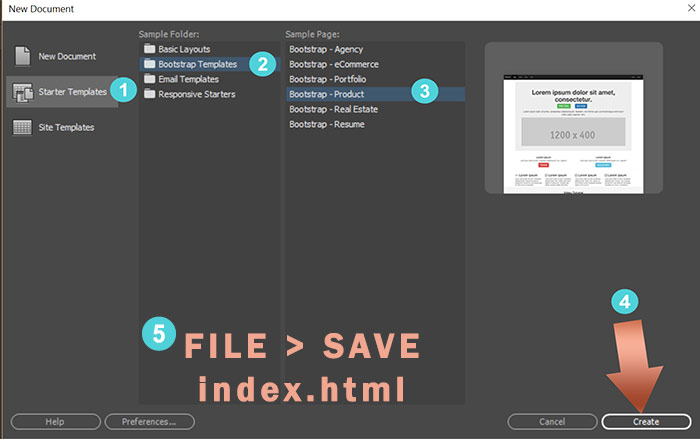
If you are new to responsive web design, I suggest you try one of the responsive starter templates in current versions of DW. Go to File > New > Starter Templates. Select one and hit the Create button.
Alt-Web Design & Publishing ~ Web : Print : Graphics : Media
 AdChoices