 Adobe Community
- Home
- Dreamweaver
- Discussions
- Make my site fit for every screen size?
- Make my site fit for every screen size?

Copy link to clipboard
Copied
I'm working on a school project, making a website for a beauty salon. I've managed to get the front page done, and been viewing it in Safari to check that everything seems okay. When I felt happy about the outcome I sent the link to a friend, and on his computer the website turned out completely different! I tried open the site in Firefox, and the same happened to me... Is there any code or settings I can do so that my page would adapt to fit any screen size/ browser? I'm getting really stressed and frustrated right now because I'm not that good at this coding stuff yet, and I can't just "test it in every browser"... If I change it so it works in Firefox it becomes to small for Safari and opposite. Really, really hope there is something I can do, and that someone can explain it to me in a easy way 🙂
Here is my site [Link removed by moderator]
It's uploaded via FTP so you can see my coding as well.

This is how it's supposed to look like

And this is how it turns out in other browsers...


 1 Correct answer

Copy & paste revised code below into a new, blank document.

<!doctype html>
<html lang="en">
<head>
<meta charset="UTF-8">
<title>Meraki</title>
<!--viewport meta tag for mobile devices-->
<meta name="viewport" content="width=device-width, initial-scale=1">
<!--Remove IE compatibility mode-->
<meta http-equiv="X-UA-Compatible" content="IE=edge">
<style>
body {
background-color: #d9b5b5;
font-family: coming-soon;
font-style: normal;
font-weight: 400;
text-align: center;
}
.container {
backg
...
 10
Replies
10
10
Replies
10

Copy link to clipboard
Copied
Please try sending the link again
Copy link to clipboard
Copied
Copy link to clipboard
Copied
I have tried in Internet Explorer, Edge, Chrome and Firefox and they all give me the same display.
All I can suggest is that you add the following line just above the TITLE element
<meta name="viewport" content="width=device-width, initial-scale=1">
Copy link to clipboard
Copied
Would you please send me a Screenshot on how it looks? 🙂 Or does it kinda look like the first screenshot I included? I see now that my settings for the site automatically sets to "50% side zoom" in Safari when I visit this page, could the problem actually be that simple? That my site is actually okay it's just has to be zoomed a little bit in Safari for some reason?
I will add the code you mention to my site, thanks!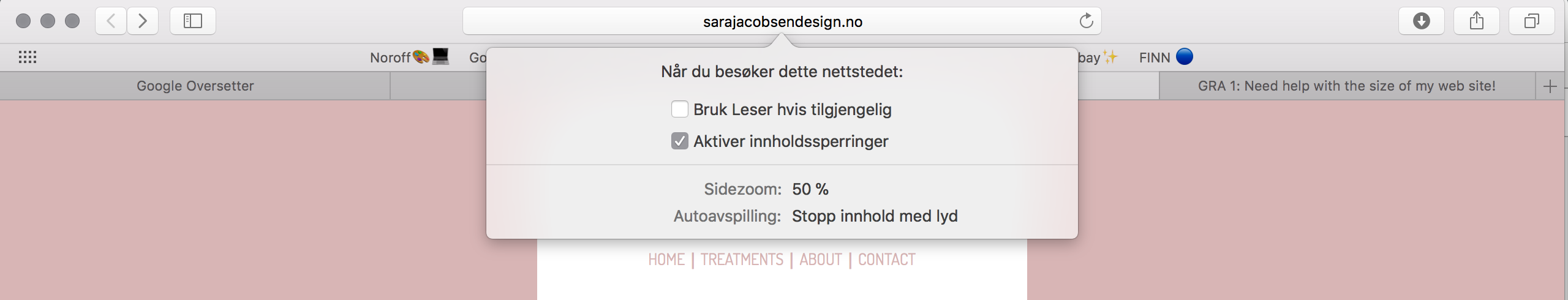
Copy link to clipboard
Copied

Copy link to clipboard
Copied
Copy & paste revised code below into a new, blank document.

<!doctype html>
<html lang="en">
<head>
<meta charset="UTF-8">
<title>Meraki</title>
<!--viewport meta tag for mobile devices-->
<meta name="viewport" content="width=device-width, initial-scale=1">
<!--Remove IE compatibility mode-->
<meta http-equiv="X-UA-Compatible" content="IE=edge">
<style>
body {
background-color: #d9b5b5;
font-family: coming-soon;
font-style: normal;
font-weight: 400;
text-align: center;
}
.container {
background-color: #FFF;
width: 80%;
margin: 0 auto;
}
header {
width: 80%;
margin: 0 auto
}
header img {
max-width: 100%;
margin: 0 auto;
padding-bottom: 10px;
}
nav {font-size: 1.2rem;}
nav ul li {
list-style: none;
display: inline-block;
}
nav ul li a {
text-decoration: none;
color: #D9B5B5;
}
nav ul li a:visited { color: #000; }
nav ul li a:hover, nav ul li a:active, nav ul li a:focus { text-decoration: underline }
.content {
width: 75%;
margin: 0 auto;
padding-top: 30px;
}
.content img { max-width: 100%; }
.content p {
font-size: 24px;
font-family: cedarville-cursive, cursive;
font-weight: 400;
}
footer {
width: 50%;
margin: 0 auto;
font-family: dosis;
font-weight: 400;
padding-top: 80px;
font-size: 14px;
}
</style>
</head>
<body>
<div class="container">
<header>
<img src="http://sarajacobsendesign.no/Logo/Logo%206.png" alt="Miraki logo"/>
<nav>
<ul>
<li><a href="Meraki.html" title="HOME">HOME</a></li> |
<li><a href="#">TREATMENTS</a></li> |
<li><a href="#">ABOUT</a></li> |
<li><a href="#">CONTACT</a></li>
</ul>
</nav>
</header>
<div class="content">
<img src="http://sarajacobsendesign.no/Treatments/Div/Div2.jpg" alt="Beautiful woman"/>
<h2>MERAKI</h2>
<p>(v.) to do something with soul creativity, or love: to put something of yourself in your work.</p>
</div>
<footer>2018 Meraki Beauty, Design by Sara Jacobsen</footer>
<!--/container--></div>
<!--Adobe Edge Web Fonts-->
<script>var __adobewebfontsappname__="dreamweaver"</script>
<script src="http://use.edgefonts.net/dosis:n2,n4:default;patrick-hand:n4:default;coming-soon:n4:default;comforta..." type="text/javascript"></script>
</body>
</html>
Save and test in all devices and viewport widths. The revised code is valid, semantically correct and responsive. Let me know if you have questions.
Nancy
Alt-Web Design & Publishing ~ Web : Print : Graphics : Media
Copy link to clipboard
Copied
Thanks! I've done some changes to the page now, and it seems to work now! But, I stumbled over a new problem...The last picture in the page won't be in line with the rest of them. Someone know why? I first tried to make these "treatments" pictures as a simple picture with text under, but it didn't work out, so I just took the easy way and made the picture + text into an picture. But as you can see on the page the last picture won't stay where it's supposed to... It's way further down the page then the rest of it.
Copy link to clipboard
Copied
Obviously you're not using the semantic, responsive and error-free code I provided in Reply #6  .
.
- Your code is not semantic.
- Your code is not responsive on all screen sizes.
- Your code contains many errors.
Showing results for http://sarajacobsendesign.no/Meraki.html - Nu Html Checker
Nancy
Alt-Web Design & Publishing ~ Web : Print : Graphics : Media
Copy link to clipboard
Copied
I did some changes on my site yesterday before I saw your reply, and wouldn’t my site go back to the way it were before if I copied that code? Should I just copy the code, and paste it into a new dociment in Dreamweaver and go from there? Like starting over? 🙂 And then just make the changes I want to? My site is now working in all browsers, but I think with your code it would be even better and work in other devices such as phones, ipads etc? I want to learn and understand as much as possible, so if my site would be better with the help if your code I will try that!
Copy link to clipboard
Copied
Work with the code I provided. Post back if you have questions.
Alt-Web Design & Publishing ~ Web : Print : Graphics : Media
 AdChoices