 Adobe Community
making website responsive
Copy link to clipboard
Copied
Copy link to clipboard
Copied
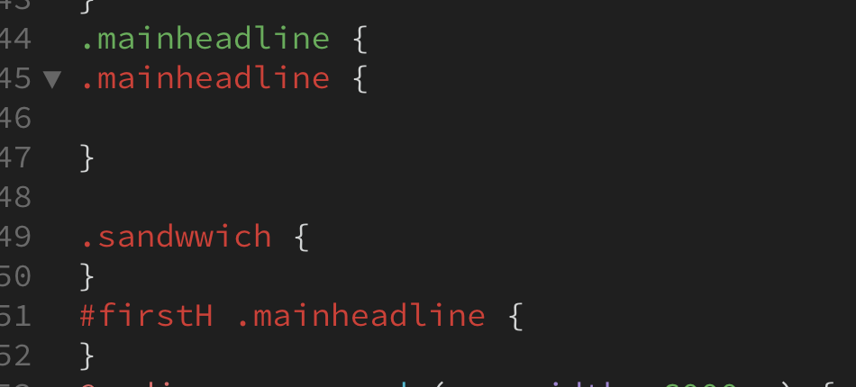
The red indicates invalid CSS code. What you have posted in your screenshot looks like LESS or SASS code copied from somewhere.
Valid CSS code syntax:
.mainheadline {
property: value;
property: value;
}
CSS Tutorials - https://www.w3schools.com/css/
Alt-Web Design & Publishing ~ Web : Print : Graphics : Media
Copy link to clipboard
Copied
Thank you. Actually. I managed to turn all red into green. However, when I am trying to make them responsive, i.e. smartphone mode, the code does not make an effect.
responsive code is like
@media screen and (max-width: 1000px) {
.sandwwich {
}
}
Hope it is correct? If yes, then why desktop mode version does not adjuct into mobile phone mode?
Thanks
Copy link to clipboard
Copied
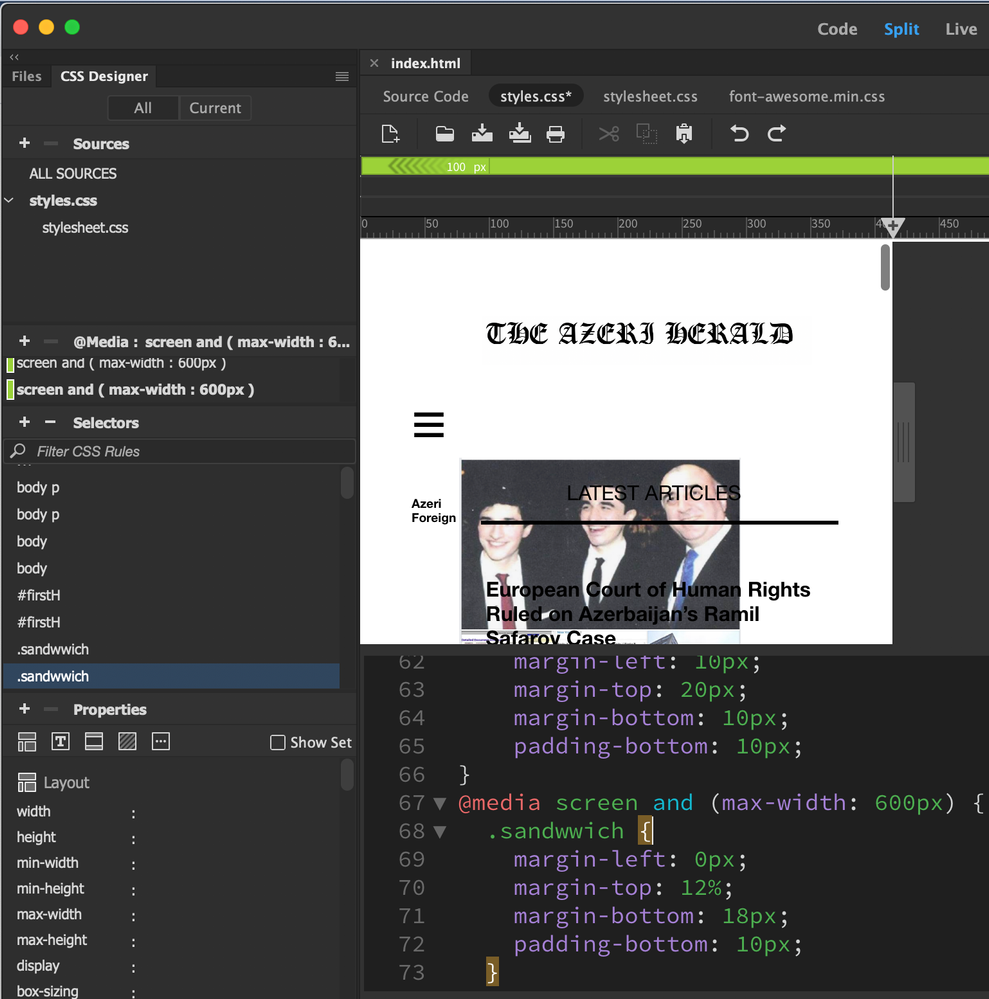
Maybe you spelt 'sandwich' incorrectly:
<p class="sandwich">I like sandwiches at anytime of the day, the more the better.</p>
Desktop:
.sandwich {
color: red;
}
Mobile:
@media screen and (max-width: 768px) {
.sandwich {
color: green;
}
}
Copy link to clipboard
Copied
Thanks again. But I do not think that the issue is spelling. For example, I wish to lift up the sandwich menu to the level of the logo. So that it stays in one line with logo. But CSS buttons do not function on .sandwwich file. It is just not moving up.
Would be thankful for any suggestion.
Thanks
Copy link to clipboard
Copied
Spelling matters.
A misspelled css selector in your media query can't take over for the intended selector elsewhere in your code if it doesn't match exactly.
.sandwich != .sandwwich
Your screenshot shows you have an error in your selector name, that needs to be repaired.
Copy link to clipboard
Copied
Two block-level elements cannot occupy the same row at the same time. Your sandwich menu and logo image are both block-level elements.
If you want them on the same row, you'll need to restructure your HTML code. Below an example with Bootstrap 4 responsive framework.
<!doctype html>
<html lang="en">
<head>
<meta charset="utf-8">
<title>Bootstrap 4 Centered Navbar with Logo </title>
<meta http-equiv="X-UA-Compatible" content="IE=edge">
<meta name="viewport" content="width=device-width, initial-scale=1">

<!-- Bootstrap CSS -->
<link rel="stylesheet" href="https://maxcdn.bootstrapcdn.com/bootstrap/4.3.1/css/bootstrap.min.css">
</head>

<body>
<nav class="navbar navbar-expand-md navbar-light">
<button class="navbar-toggler" type="button" data-toggle="collapse" data-target="#mynavbar" aria-controls="mynavbar" aria-expanded="false" aria-label="Toggle navigation"> <span class="navbar-toggler-icon"></span> </button>
<!--BRAND/LOGO here-->
<a class="navbar-brand" href="#"><img src="https://dummyimage.com/300x65" alt="logo"></a>

<div class="collapse navbar-collapse justify-content-md-center" id="mynavbar">
<ul class="navbar-nav">
<li class="nav-item active"> <a class="nav-link" href="#">Centered nav <span class="sr-only">(current)</span></a> </li>
<li class="nav-item"> <a class="nav-link" href="#">Link</a> </li>
<li class="nav-item"> <a class="nav-link" href="#">Link</a> </li>
<li class="nav-item"> <a class="nav-link" href="#">Link</a> </li>
<li class="nav-item dropdown"> <a class="nav-link dropdown-toggle" href="https://example.com" id="mydropdown" data-toggle="dropdown" aria-haspopup="true" aria-expanded="false">Dropdown</a>
<div class="dropdown-menu" aria-labelledby="mydropdown"> <a class="dropdown-item" href="#">Action</a> <a class="dropdown-item" href="#">Another action</a> <a class="dropdown-item" href="#">Something else here</a> </div>
</li>
</ul>
</div>
</nav>


<!--Supporting scripts. First jQuery, then popper, then Bootstrap JS-->

<script src="https://code.jquery.com/jquery-3.2.1.min.js" integrity="sha256-hwg4gsxgFZhOsEEamdOYGBf13FyQuiTwlAQgxVSNgt4=" crossorigin="anonymous"></script>
<script src="https://cdnjs.cloudflare.com/ajax/libs/popper.js/1.14.7/umd/popper.min.js"></script>
<script src="https://maxcdn.bootstrapcdn.com/bootstrap/4.3.1/js/bootstrap.min.js"></script>
</body>
</html>
Alt-Web Design & Publishing ~ Web : Print : Graphics : Media


