 Adobe Community
- Home
- Dreamweaver
- Discussions
- Moving image to center just isn't happening...
- Moving image to center just isn't happening...

Copy link to clipboard
Copied
I'm working with a Bootstrap template that has worked well in almost everything up until now. In a section referred to as the "Team" section there are 4 images and I want to reduce that to ONE single image for this domain. That one image I want in the CENTER. Pretty simple. However I've spend hours trying every way possible to do it and i just can't figure it out. I learned on how Bootstrap 4 does not have center-block so I went to trying the d-block m-x-auto but that didn't work. The image moves a tad towards the center but not much at all.
I don't like messing around with a template's style-css much but I toyed with that particular section's (the "Team" section; see image) to adjust the css. I was again able to get it to move slightly but hardly at all. I almost want to give up 
Here's the main css section for the image I'm playing with:
#team .member .pic img {
max-width: 100%;
}
#team .member .pic img {
display: block;
margin-left: auto;
margin-right: auto;
max-width: 75%;
}
----------------------------------------------------------
#team .member .pic img {
display: flex;
align-items: center;
justify-content: center;
height: 100vh;
overflow:hidden;
}
--------------------------------------------------------------------
#team .member .pic img {
vertical-align: middle;
horizontal-align: middle;
max-width: 75%;
]
________________________________________-
#team .member .pic img {
margin: auto;
width: 80%;
padding: 10px;
}
_____________________________________________
So I tried them all. I de-sized the image because I read that it may not work at 100% size when trying to move to center. But still none were able to centralize the image I wanted in that section for this template. Any suggestions I'm all ears.
And here is a simple, basic attempt of me making a simple text-align: center; addition to the css which - according to the "Properties" claims (circled on the right) the image should be in the center - but it's not.


 1 Correct answer

I am not sure why it should be that hard.
<div class="container">
<div class="row">
<div class="col-md-8 text-center member">
<img class="img-fluid pic" src="img/team-1.jpg" alt="Michael">
<h4>Michael Kolecky</h4>
Chief Executive Officer
<div class="social">
</div>
</div>
</div>
</div>
Although an image is an inline-block element, it is being followed by a block element (h4) which will automatically create its own line. Therefore the image, being the only element
...
 6
Replies
6
6
Replies
6

Copy link to clipboard
Copied
Which version of Bootstrap? Version 3 uses floats while version 4 uses flexbox. You cannot mix BS3 with BS4.
Below is a centered div and image with BS4.
<!doctype html>
<html lang="en">
<head>
<meta charset="utf-8">
<title>Bootstrap 4 Starter</title>
<meta http-equiv="X-UA-Compatible" content="IE=edge">
<meta name="viewport" content="width=device-width, initial-scale=1">
<!--Bootstrap 4 CSS-->
<link href="https://maxcdn.bootstrapcdn.com/bootstrap/4.0.0-beta/css/bootstrap.min.css" rel="stylesheet" integrity="sha384-/Y6pD6FV/Vv2HJnA6t+vslU6fwYXjCFtcEpHbNJ0lyAFsXTsjBbfaDjzALeQsN6M" crossorigin="anonymous">
</head>
<body>
<!--main content-->
<main class="container">
<div class="row">
<div class="col-md-8 mx-auto text-center">
<img class="img-fluid" src="https://dummyimage.com/400x350" alt="logo">
</div>
</div>
</main>
<!--latest jQuery Core-->
<script src="https://code.jquery.com/jquery-3.2.1.min.js" integrity="sha256-hwg4gsxgFZhOsEEamdOYGBf13FyQuiTwlAQgxVSNgt4=" crossorigin="anonymous"></script>
<!--Popper JS-->
<script src="https://cdnjs.cloudflare.com/ajax/libs/popper.js/1.11.0/umd/popper.min.js" integrity="sha384-b/U6ypiBEHpOf/4+1nzFpr53nxSS+GLCkfwBdFNTxtclqqenISfwAzpKaMNFNmj4" crossorigin="anonymous"></script>
<!--latest Bootstrap 4 JS-->
<script src="https://maxcdn.bootstrapcdn.com/bootstrap/4.0.0-beta/js/bootstrap.min.js" integrity="sha384-h0AbiXch4ZDo7tp9hKZ4TsHbi047NrKGLO3SEJAg45jXxnGIfYzk4Si90RDIqNm1" crossorigin="anonymous"></script>
</body>
</html>
Alt-Web Design & Publishing ~ Web : Print : Graphics : Media
Copy link to clipboard
Copied
Below is with Bootstrap 3.
<!doctype html>
<html lang="en">
<head>
<meta charset="utf-8">
<title>Bootstrap 3.3.7 Starter</title>
<meta name="viewport" content="width=device-width, initial-scale=1">
<meta http-equiv="X-UA-Compatible" content="IE=edge">
<!--Bootstrap 3 CSS-->
<link rel="stylesheet" href="https://maxcdn.bootstrapcdn.com/bootstrap/3.3.7/css/bootstrap.min.css" integrity="sha384-BVYiiSIFeK1dGmJRAkycuHAHRg32OmUcww7on3RYdg4Va+PmSTsz/K68vbdEjh4u" crossorigin="anonymous">
<style>
.display-block {float:none}
</style>
</head>
<body>
<main class="container">
<div class="row">
<div class="col-md-8 display-block text-center">
<h1>Hello World!</h1>
<h2 class="text-info">Centered with Bootstrap 3</h2>
<img class="img-reponsive" src="https://dummyimage.com/400x350" alt="logo">
</div>
</div>
</main>
<!--latest jQuery 3-->
<script src="https://code.jquery.com/jquery-3.2.1.min.js" integrity="sha256-hwg4gsxgFZhOsEEamdOYGBf13FyQuiTwlAQgxVSNgt4=" crossorigin="anonymous"></script>
<!--Bootstrap 3 JS-->
<script src="https://maxcdn.bootstrapcdn.com/bootstrap/3.3.7/js/bootstrap.min.js" integrity="sha384-Tc5IQib027qvyjSMfHjOMaLkfuWVxZxUPnCJA7l2mCWNIpG9mGCD8wGNIcPD7Txa" crossorigin="anonymous"></script>
</body>
</html>
Alt-Web Design & Publishing ~ Web : Print : Graphics : Media
Copy link to clipboard
Copied
It worked - a little...
Hi Nancy. The Bootstrap template version (oddly) was not found on the css but I went back to the site I originally found the template and read that it's a Bootstrap 4. So I'll show you the original script of <div> section and the adjustments I made/results:
Original:
<div class="row">
<div class="col-lg-3 col-md-6">
<div class="member">
<div class="pic"><img src="img/team-1.jpg" alt=""></div>
<h4>Michael Kolecky</h4>
<span>Chief Executive Officer</span>
<div class="social">
</div>
</div>
</div>
I removed the grid <div class="col-lg-3 col-md-6"> and replaced it with <div class="col-md-8 display-block text-center"> AND inserted the class="img-fluid" ...which is what I assume I should have done and ended with this:
Result:
<div class="row">
<div class="member">
<div class="col-md-8 mx-auto text-center">
<div class="pic"><img class="img-fluid" src="img/team-1.jpg" alt=""></div>
<h4>Michael Kolecky</h4>
<span>Chief Executive Officer</span>
<div class="social">
</div>
</div>
</div>
</div>
The end results were that the image move a little more from the left than any of the previous div's or css adjustments I had previously tried. Here is what I got via Dreamweaver:
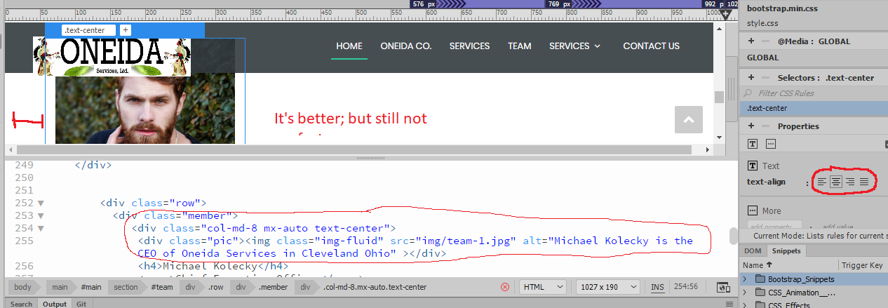
I can also see through "Properties" that it is supposed to be centered as well (circled on the right). I guess I can live with it like it is because it is Bootstrap and will adjust via screen size but I'm a tad perfectionist and just want to know why it's not perfectly centered(?)
Copy link to clipboard
Copied
I am not sure why it should be that hard.
<div class="container">
<div class="row">
<div class="col-md-8 text-center member">
<img class="img-fluid pic" src="img/team-1.jpg" alt="Michael">
<h4>Michael Kolecky</h4>
Chief Executive Officer
<div class="social">
</div>
</div>
</div>
</div>
Although an image is an inline-block element, it is being followed by a block element (h4) which will automatically create its own line. Therefore the image, being the only element on that line, will be centred as specified in the column container.
To illustrate what I mean, if you were to place text (no block elements) after the image, both, the image + the text would be centred.
You may have noticed that I removed the span element surround Chief Executive Officer. This has no effect unless you wish to style the text. I also removed the element with a class of member and placed the class in the column container.
To learn more about elements, Google the subject or go to HTML Block and Inline Elements
In case you do want some text (inline) after the image you could have a look at changing the image to a block level element and centring it that way as per
<div class="container">
<div class="row">
<div class="col-md-8 text-center member">
<img class="img-fluid d-block mx-auto pic" src="img/team-1.jpg" alt="Michael">
Michael
<h4>Michael Kolecky</h4>
Chief Executive Officer
<div class="social">
</div>
</div>
</div>
</div>
I hope this helps
Copy link to clipboard
Copied
I never looked into inline-block elements and block elements; let alone how some <div>'s can be moved or inserted into other <div>'s and such to solve the issue. That will greatly help me for future sites as for placing items (text/images/etc) horizontally or vertically aligned to each other 
Problem solved and learned a lot! 

Copy link to clipboard
Copied
Below is an alternative way using Bootstrap flexbox classes :
<div class="row">
<div class="col-md-6 mx-auto">
<div class="member">
<div class="pic d-flex justify-content-center"><img src="img/team-1.jpg" alt=""></div>
<h4>Michael Kolecky</h4>
<span>Chief Executive Officer</span>
<div class="social"></div>
<!-- end social -->
</div>
<!-- end member -->
</div>
</div>
<!-- end row -->
 AdChoices