 Adobe Community
- Home
- Dreamweaver
- Discussions
- Nav bar with centred logo and social media icons?
- Nav bar with centred logo and social media icons?
Nav bar with centred logo and social media icons?

Copy link to clipboard
Copied
Hopefully one of the good people of this forum can help me out with a question about navigation menus - I'm looking to create a responsive navbar for a friends website that has it's logo centred, and has social media icons as part of the menubar as well as text (unless it's better practise to have them as icons at the footer of the website?), so it would kind of look like
Food - Location - Logo - Logo - contact - Twitter icon - Facebook icon
which can then collapse down to the "hamburger" icon for mobile/smaller screen widths
Still working in Dreamweaver CS5 if that matters by the way!
Any hope/advice appreciated!
Simon


 11
Replies
11
11
Replies
11

Copy link to clipboard
Copied
I wrote a document on this below.
Bootstrap 4.2.1 Navbar with Centered Brand/Logo
Your social icons could go on either side of logo or in your footer. It's your choice. Personally I put less important content below the fold.
Alt-Web Design & Publishing ~ Web : Print : Graphics : Media

Copy link to clipboard
Copied
Below is an alternatiive solution without Bootstrap.
Line for line you will find its less code than Bootstrap uses if you care to disect the Bootstrap css file and js file.
The code is an isolated component where you should be able to change the css properties to style the navigation quite easily WITHOUT having to introduce more css than is necessary as you do when re-styling the default Bootstrap ones to meet your own requirements, which leaves lots of redundancies attached to your page, bad practice.
<!DOCTYPE html>
<html>
<head>
<meta charset="UTF-8" />
<title>Centered Nav</title>
<style>
* {
box-sizing: border-box;
}
body {
margin: 0
}
.main-nav {
display: flex;
justify-content: space-between;
align-items: center;
width: 90%;
margin: 0 auto;
background-color: #000;
padding: 0 30px;
}
.main-nav ul {
display: flex;
margin: 0;
padding: 0;
}
.main-nav li {
list-style: none;
margin: 0;
padding: 0;
}
.main-nav a {
display: block;
text-decoration: none;
padding: 10px;
color: #fff;
}
.logo {
color: #fff;
}
.toggle-nav {
display: none;
}
@media screen and (max-width: 768px) {
.main-nav {
flex-direction: column;
width: 100%;
}
.logo {
display: flex;
align-items: center;
justify-content: space-between;
width: 100%;
order: -1;
}
.main-nav ul {
display: none;
}
.toggle-nav {
display: block;
}
.main-nav ul {
width: 100%;
}
.main-nav a {
width: 100%;
text-align: center;
border-top: 1px solid #fff;
}
}
</style>
<link rel="stylesheet" href="https://use.fontawesome.com/releases/v5.7.2/css/all.css">
<script src="https://code.jquery.com/jquery-3.2.1.min.js"></script>
<script>
$(document).ready(function(){
$('.toggle-nav').css('cursor' , 'pointer').click(function(){
$('.main-nav ul').slideToggle();
});
$(window).resize(function() {
var width = $(document).width();
if (width > 768) {
$('.main-nav ul').css('display','flex');
}
if (width <= 768) {
$('.main-nav ul').css('display','none');
}
});
});
</script>
</head>
<body>
<nav class="main-nav">
<ul>
<li><a href="#">Food</a></li>
<li><a href="#">Location</a></li>
</ul>
<div class="logo">
<h4>Logo</h4>
<div class="toggle-nav"><i class="fas fa-bars"></i></div>
</div>
<ul>
<li><a href="#">Contact</a></li>
<li><a href="#">Icon</a></li>
<li><a href="#">Icon</a></li>
</ul>
</nav>
</body>
</html>
Copy link to clipboard
Copied
osgood_ Nancy OShea thanks to both for the replies so far – I haven't got the latest version of Dreamweaver so I'm not able to access that Bootstrap?
Two things about Osgoods reply is that the menu doesn't go down into a hamburger type menu when the screen is shrunk down, it needs to do this so the logo is still showing but the other options are in the hamburger icon menu
Also with both methods the menu items aren't equally spaced out across the navbar itself, is there a way to do this please?
Thanks!
Copy link to clipboard
Copied
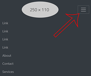
This is the kind of menu bar I'm looking to achieve to give one of quite a few examples out there!
Copy link to clipboard
Copied
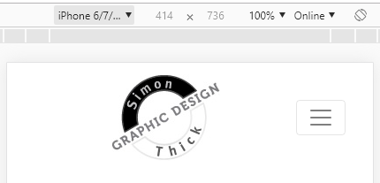
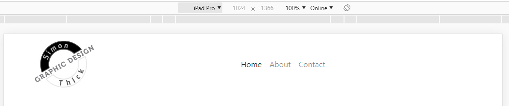
You asked for a navbar with centered logo that is responsive on smaller devices. I gave you what you asked for using a Bootstrap document. However it won't work without Bootstrap and jQuery source files. See screenshot of the responsive (hamburger) menu.
Bootstrap is an open source framework. You don't have to have the latest version of DW to use it. But it makes things much easier if you do.
Your example site is made on Squarespace (Holy excessive code, Batman!!!). Also it's not quite what you described originally. It has a header block with a centered logo. Below the header is a navbar.
Of course this is all doable with Bootstrap or plain vanilla code (your choice). But you must understand how to build responsively and be up to speed with the latest HTML, CSS and JavaScript standards. CS5 is outdated software. It won't help you with modern coding practices.
Alt-Web Design & Publishing ~ Web : Print : Graphics : Media
Copy link to clipboard
Copied
Well unfortunately the latest version of Dreamweaver isn't affordable for long periods (thank you Adobe) as I don't use it enough to justify the cost so I'm just trying to do the best with what I've got and/or can afford.
It is good that this forum exists so users here can point out the more intricate ways that websites are now built, such as the example I mentioned especially for those of us like myself who only dip into it on a need to do basis which isn't regularly and therefore it can be tricky to find time outside of work to try and catch up with everything that goes on and how to utilise it best – and Squarespace having excessive code certainly isn't a shocker!
So how is that kind of menu best achieved with vanilla code? I will have a look at the Boostrap link in your reply too, thank you 
Copy link to clipboard
Copied
hourtayter wrote
and Squarespace having excessive code certainly isn't a shocker!
I know. I only mentioned it for the benefit of certain folk around here who complain about Bootstrap being excessive .
Vanilla JS
Basic Responsive Navigation #2 with Vanilla JS
Alt-Web Design & Publishing ~ Web : Print : Graphics : Media
Copy link to clipboard
Copied
There is such a vast difference in the whole web design area now compared to when I did it in the first job, when it was all table row and columns, and the company MD made us use Hotdog to hand code everything as he wasn't sure about the longevity of that new Dreamweaver programme!
It is a bit of a job to keep up with things as they've developed over the years, made easier by folks like yourself helping out n these forum s when people like myself who have some knowledge which might have also dated a bit come for help and to boost our knowledge – something that is better too I think otherwise we'll all just give-up and go for template designs which you don't learn from and aren't necessarily well produced.
Back on topic, I have gotten the above variants of the centred logo nav bar ok, having a bit of trouble with the same nav bar layout albeit with a left sided logo but the menu bar is going down into the hamburger icon when the page is made smaller, know there's something I've missed here but can't quite pick out what it is Welcome to the gallery section

Copy link to clipboard
Copied
If that is what you want, logo left and menu items centred, then copy the following code and paste into a new document.
<!doctype html>
<html>
<head>
<meta charset="UTF-8">
<title>Untitled Document</title>
<script src="https://code.jquery.com/jquery-3.3.1.slim.min.js" integrity="sha384-q8i/X+965DzO0rT7abK41JStQIAqVgRVzpbzo5smXKp4YfRvH+8abtTE1Pi6jizo" crossorigin="anonymous"></script>
<meta name="viewport" content="width=device-width, initial-scale=1, shrink-to-fit=no">
<link rel="stylesheet" href="https://stackpath.bootstrapcdn.com/bootstrap/4.3.1/css/bootstrap.min.css" integrity="sha384-ggOyR0iXCbMQv3Xipma34MD+dH/1fQ784/j6cY/iJTQUOhcWr7x9JvoRxT2MZw1T" crossorigin="anonymous">
</head>
<body>
<header>
<div class="container">
<div class="row">
<div class="col">
<nav class="navbar navbar-expand-lg navbar-light justify-content-between">
<a class="navbar-brand mr-auto ml-auto" href="#"><img src="http://simonthick.info/images/topbutton.jpg" alt="Simon Graphic Design Thick Logo"></a>
<button class="navbar-toggler" type="button" data-toggle="collapse" data-target="#navbar_collapse" aria-controls="navbar_collapse" aria-expanded="false" aria-label="Toggle navigation">
<span class="navbar-toggler-icon"></span>
</button>
<div class="collapse navbar-collapse justify-content-center" id="navbar_collapse">
<div class="navbar-nav">
<a class="nav-item nav-link active" href="#">Home</a>
<a class="nav-item nav-link" href="#">About</a>
<a class="nav-item nav-link" href="#">Contact</a>
</div>
</div>
</nav> </div>
</div>
</div>
</header>
<script src="https://cdnjs.cloudflare.com/ajax/libs/popper.js/1.14.7/umd/popper.min.js" integrity="sha384-UO2eT0CpHqdSJQ6hJty5KVphtPhzWj9WO1clHTMGa3JDZwrnQq4sF86dIHNDz0W1" crossorigin="anonymous"></script>
<script src="https://stackpath.bootstrapcdn.com/bootstrap/4.3.1/js/bootstrap.min.js" integrity="sha384-JjSmVgyd0p3pXB1rRibZUAYoIIy6OrQ6VrjIEaFf/nJGzIxFDsf4x0xIM+B07jRM" crossorigin="anonymous"></script>
</body>
</html>
Copy link to clipboard
Copied
Was going to do the icons and links to the right but I got there with that thanks very much!
Am going to have to get my Dreamweaver upgraded though and look into Bootstrap and all it entails, especially given how much gets said about it and how widespread it's use is (course there'll be little calls out to other web tech like flexbox too I imagine), though there seems to be a bit written about bloated Boostrap code I'm sure Nancy OShea can shimmy in on that point and how much of an issue it is/to deal with that!
Thanks to all who've offered help on this little issue
Copy link to clipboard
Copied
None of the answers to date address your exact requirements according to the example navigation you provided at the link you posted. That can only be achieved by a certain amount of hand coding and manipulation.
My experience of Bootstrap is it generally uses more code than is strictly necesssry to achieve almost everything. If youre not an experienced coder it wont seem like that as you just deploy a lot of css classes directly within the html itself, which adds up to even more of a bloated solution. This makes managing the code quite difficult in my opnion, if you ever need to troubleshoot an issue.
Bootstrap is generally used by 2 classifications of developer, those that know very little coding and are prepared to suffer a poor and frustrating solution because they know no better or are incapable of devising their own and those who are generally very experienced and working in teams where a workflow such as Bootstrap can be 'beneficial' as everyone needs to be interchangable or replaceable. In my opinion its not a good fit for a small enterprise or an individual freelance developer looking to progress.
Depends really on your own ambitions. If youre a 'day tripper' then most likely you will fall into the clutches of Bootstrap or another framework. If youre looking to establish yourself as a developer and make a living out of building websites then its best to learn html and css, its only then you have the knowledge to make up your own mind.
 AdChoices