 Adobe Community

Copy link to clipboard
Copied
Hi,
I have received help on the following page: VPCFO Mission
The keys are that the page needs to be responsive. I don't have media queries setup correctly yet.
One thing I wonder is how to make the "Our Mission" and "Our Vision" boxes closer together but still be centered and responsive. Do I change the margin for the CSS of big-title-box of Our Mission to auto auto auto 100px and the margin of big-title-box of Our Vission to auto 100px auto auto for the desktop media query and then remove the 100px margins for the media query when the responsiveness takes effect and the Our Vission box falls underneath the Our Mission box?
I want those two boxes to be centered but closer together without touching. Also it would be good to eliminate the red horizontal border line that is outside of each box (Our Mission and Our Vission) when the screensize shrinks and Our Vission falls underneath of Our Mission.
I assume I need to do this with media queries also but I am struggling at the moment.


 1 Correct answer

This should solve pretty much most of your issues:
<!DOCTYPE html>
<html>
<head>
<meta charset="utf-8">
<meta name="viewport" content="width=device-width, initial-scale=1, maximum-scale=1">
<title>VPCFO Mission</title>
<link href="https://fonts.iu.edu/style.css?family=BentonSans:regular,bold|BentonSansCond:regular|GeorgiaPro:regular" media="screen" rel="stylesheet" type="text/css"/>
<script type="text/javascript" src="lightbox.js"></script>
<style>
body {
font-family:"Palatino Linotype", "Book Antiqua", Pa
...
 3
Replies
3
3
Replies
3

Copy link to clipboard
Copied
If you're not adverse to Bootstrap (it's free), you can get something pretty close for all devices without writing a single line of CSS media queries.
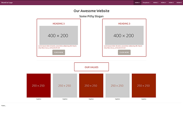
Copy & paste the code below into a new, blank document. Save and test in multiple viewports.
<!doctype html>
<html lang="en">
<head>
<meta charset="utf-8">
<title>Bootstrap Panels, United Color Theme</title>
<!--for mobile devices-->
<meta name="viewport" content="width=device-width, initial-scale=1">
<!--for IE browsers-->
<meta http-equiv="X-UA-Compatible" content="IE=edge">
<!--BOOTSTRAP 3 UNITED COLOR THEME-->
<link rel="stylesheet" href="http://maxcdn.bootstrapcdn.com/bootswatch/3.3.7/united/bootstrap.min.css">
<style>
body { padding-top: 71px }
.center-block { float: none }
.panel-body {border: medium double #920000;}
</style>
</head>
<body>
<!--begin top nav bar-->
<nav class="navbar navbar-inverse navbar-fixed-top">
<div class="container-fluid">
<div class="navbar-header"> <a class="navbar-brand" href="#">Brand or Logo </a>
<button type="button" class="navbar-toggle" data-toggle="collapse" data-target="#myNavbar">
<span class="icon-bar"></span> <span class="icon-bar"></span> <span class="icon-bar"></span> </button>
</div>
<div class="collapse navbar-collapse" id="myNavbar">
<ul class="nav navbar-nav navbar-right">
<li class="active"><a href="#">MENU 1</a></li>
<li class="dropdown"> <a class="dropdown-toggle" data-toggle="dropdown" href="#">Dropdown <span class="caret"></span></a>
<ul class="dropdown-menu">
<li><a href="#">submenu 1-1</a></li>
<li><a href="#">submenu 1-2</a></li>
<li><a href="#">submenu 1-3</a></li>
</ul>
</li>
<li><a href="#">MENU 3</a></li>
<li><a href="#">MENU 4</a> </li>
<li><a href="#">MENU 5</a> </li>
<li><a href="#">MENU 6</a></li>
</ul>
</div>
</div>
<!--end top nav--></nav>
<!--begin content-->
<div class="container">
<div class="row">
<div class="col-sm-10 center-block text-center">
<h1>Our Awesome Website</h1>
<h2>Some Pithy Slogan</h2>
</div>
</div>
<div class="row">
<!--begin 2 columns-->
<div class="col-sm-5">
<div class="panel panel-body text-danger">
<h3 class="text-center">HEADING 3</h3>
<img class="img-responsive center-block" src="http://dummyimage.com/400x200.jpg" alt="...">
<p class="text-danger">Lorem ipsum dolor sit amet, consectetur adipiscing elit. Mauris vitae libero lacus, vel hendrerit nisi! </p>
<button type="button" class="btn btn-lg btn-default center-block">CLICK HERE</button>
</div>
</div>
<div class="col-sm-2">
</div>
<div class="col-sm-5">
<div class="panel panel-body text-danger">
<h3 class="text-center">HEADING 3</h3>
<img class="img-responsive center-block" src="https://dummyimage.com/400x200.jpg" alt="...">
<p class="text-danger">Lorem ipsum dolor sit amet, consectetur adipiscing elit. Mauris vitae libero lacus, vel hendrerit nisi! </p>
<button type="button" class="btn btn-lg btn-default center-block">CLICK HERE</button>
</div>
</div>
</div>
<hr>
<!--MIDDLE CONTENT-->
<div class="row">
<div class="col-sm-4 center-block">
<div class="panel panel-body text-danger">
<h3 class="text-center">OUR VALUES</h3>
</div>
</div>
</div>
</div>
<!--LOWER CONTENT-->
<div class="container-fluid">
<div class="row">
<div class="col-sm-11 center-block text-center">
<ul class="list-inline">
<li><img class="img-thumbnail" src="https://dummyimage.com/250x250/92000/fff.jpg" alt="...">
<br>Caption</li>
<li><img class="img-thumbnail" src="https://dummyimage.com/250x250/ccc/920.jpg" alt="..."><br>Caption</li>
<li><img class="img-thumbnail" src="https://dummyimage.com/250x250/920/fff.jpg" alt="..."><br>Caption</li>
<li><img class="img-thumbnail" src="https://dummyimage.com/250x250/ccc/920.jpg" alt="..."><br>Caption</li>
<li><img class="img-thumbnail" src="https://dummyimage.com/250x250/920/fff.jpg" alt="..."><br>Caption</li>
</ul>
</div>
<!--/row--></div>
<hr>
<div class="row">
<footer class="col-sm-12">
<p class="small">Footer....</p>
</footer>
<!--/row--></div>
<!--/container--></div>
<!--latest jQuery 3-->
<script src="https://code.jquery.com/jquery-3.2.1.min.js" integrity="sha256-hwg4gsxgFZhOsEEamdOYGBf13FyQuiTwlAQgxVSNgt4=" crossorigin="anonymous"></script>
<!--Latest Bootstrap 3 JS-->
<script src="https://maxcdn.bootstrapcdn.com/bootstrap/3.3.7/js/bootstrap.min.js" integrity="sha384-Tc5IQib027qvyjSMfHjOMaLkfuWVxZxUPnCJA7l2mCWNIpG9mGCD8wGNIcPD7Txa" crossorigin="anonymous"></script>
</body>
Alt-Web Design & Publishing ~ Web : Print : Graphics : Media
Copy link to clipboard
Copied
This should solve pretty much most of your issues:
<!DOCTYPE html>
<html>
<head>
<meta charset="utf-8">
<meta name="viewport" content="width=device-width, initial-scale=1, maximum-scale=1">
<title>VPCFO Mission</title>
<link href="https://fonts.iu.edu/style.css?family=BentonSans:regular,bold|BentonSansCond:regular|GeorgiaPro:regu..." media="screen" rel="stylesheet" type="text/css"/>
<script type="text/javascript" src="lightbox.js"></script>
<style>
body {
font-family:"Palatino Linotype", "Book Antiqua", Palatino, serif;
font-size: 17px;
background: #CCCCCB;
}
* {
box-sizing: border-box;
}
.page_wrapper {
padding: 40px;
}
@media screen and (max-width: 480px) {
.page_wrapper {
padding: 10px;
}
}
header {
text-align: center;
}
header h1 {
margin: 0;
padding: 20px 0 30px 0;
font-size: 45px;
font-weight: 400;
}
.horizontal_line {
position: relative;
}
.line {
position: absolute;
top: 50%;
background-color: #770e29;
height: 2px;
width: 100%;
z-index: -10;
}
/* OUR MISSION/VISION */
.our_mission_vision {
display: flex;
flex-wrap: wrap;
justify-content: space-between;
width: 80%;
margin: 0 auto;
}
@media screen and (max-width: 920px) {
.our_mission_vision {
width: 90%;
}
}
@media screen and (max-width: 768px) {
.our_mission_vision {
width: 100%;
}
}
.our_mission_wrapper, .our_vision_wrapper {
display: flex;
border: 2px solid #770e29;
background-color: #CCCCCB;
padding: 7px;
width: 47%;
}
@media screen and (max-width: 768px) {
.our_mission_wrapper, .our_vision_wrapper {
width: 100%;
margin: 0 0 30px 0;
}
}
.our_mission, .our_vision {
flex: 1;
border: 1px solid #770e29;
background-color: #fff;
padding: 20px;
}
.our_mission h2, .our_vision h2 {
margin: 0;
padding: 0 0 15px 0;
font-weight: 400;
letter-spacing: 1px;
text-align: center;
color: #a80532;
font-size: 32px;
text-transform: uppercase;
}
.our_mission p, .our_vision p {
margin: 0;
padding: 0;
}
/* OUR VALUES */
.our_values {
display: flex;
justify-content: center;
margin: 30px auto;
}
@media screen and (max-width: 768px) {
.our_values {
margin: 0 auto;
}
}
.our_values_wrapper {
border: 2px solid #770e29;
background-color: #CCCCCB;
padding: 7px;
width: 30%;
}
@media screen and (max-width: 920px) {
.our_values_wrapper {
width: 50%;
}
}
@media screen and (max-width: 768px) {
.our_values_wrapper {
width: 100%;
}
}
.values {
flex: 1;
border: 1px solid #770e29;
background-color: #fff;
padding: 20px;
}
.values h2 {
margin: 0;
padding: 0;
font-weight: 400;
letter-spacing: 1px;
text-align: center;
color: #a80532;
font-size: 28px;
text-transform: uppercase;
}
/* THUMBS */
.thumbs {
display: flex;
flex-wrap: wrap;
justify-content: center;
width: 100%;
margin: 0 auto;
padding: 0;
}
@media screen and (max-width: 768px) {
.thumbs {
margin: 30px auto;
}
}
.thumbs img {
max-width: 100%;
height: auto;
}
.thumbs li {
margin: 0 1.5%;
padding: 0;
list-style: none;
width: 16%;
}
@media screen and (max-width: 768px) {
.thumbs li {
width: 22%;
}
}
@media screen and (max-width: 500px) {
.thumbs li {
margin: 0 3%;
width: 31%;
}
}
.thumbs li p {
text-align: center;
color: #770e29;
font-size: 18px;
}
/* FOOTER */
footer {
font-size: 33 pt;
width: 90%;
margin: 0 auto;
text-align: center;
}
footer a {
text-decoration: none;
color: black;
font-size: 15pt;
font-family: BentonSansComp Book;
}
</style>
</head>
<body>
<div class="page_wrapper">
<header>
<a href="https://www.iu.edu/"><img style="height:108.57px; width:92px; margin: 0 auto .5em auto;" src="https://treasurer.iu.edu/_assets/images/block-iu.png" width="246" height="287" alt=""/></a><h1>Office of the Vice President & Chief Financial Officer </h1>
</header>
<div class="horizontal_line">
<div class="line"></div>
<div class="our_mission_vision">
<div class="our_mission_wrapper">
<div class="our_mission">
<h2>Our Mission</h2>
<p>We serve Indiana University's mission by promoting the well-being of our employees and the financial health of our University.</p>
</div>
<!-- end our_mission -->
</div>
<!-- end our_mission_wrapper -->
<div class="our_vision_wrapper">
<div class="our_vision">
<h2>Our Vision</h2>
<p>We aspire to be trusted partners to all, interacting with respect, integrity, and accountability. We will be an engaged workforce who values collaboration, professional growth, and each other.</p>
</div>
<!-- end our_vision -->
</div>
<!-- end our_vision_wrapper -->
</div>
<!-- end our_mission_vision -->
</div>
<!-- end-horizontal_line -->
<div class="horizontal_line">
<div class="line"></div>
<div class="our_values">
<div class="our_values_wrapper">
<div class="values">
<h2>Our Values</h2>
</div>
<!-- end values -->
</div>
<!-- end our_values_wrapper -->
</div>
<!-- end our_values -->
</div>
<!-- end-horizontal_line -->
<ul class="thumbs">
<li style="background-color: #CCCCCB; border: none;"><img src="https://treasurer.iu.edu/_assets/images/collaboration3.png" />
<p class="caption">Collaboration</p>
</li>
<li style="background-color: #CCCCCB; border: none;"><img src="https://treasurer.iu.edu/_assets/images/integrity3.jpg" />
<p class="caption">Integrity</p>
</li>
<li style="background-color: #CCCCCB; border: none;"><img src="https://treasurer.iu.edu/_assets/images/trust3.png" />
<p class="caption">Trust</p>
</li>
<li style="background-color: #CCCCCB; border: none;"><img src="https://treasurer.iu.edu/_assets/images/respect3.png" />
<p class="caption">Respect</p>
</li>
<li style="background-color: #CCCCCB; border: none;"><img src="https://treasurer.iu.edu/_assets/images/growth3.png" />
<p class="caption">Growth</p>
</li>
</ul>
<footer>
<p style="text-align: center; font-size: 15pt; text-decoration: none"><a href="https://fms.iu.edu/">Financial Management Services</a> <span class="red">|</span> <a href="https://www.budu.iu.edu/">University Budget Office</a> <span class="red">|</span> <a href="http://hr.iu.edu">Human Resources</a> <span class="red">|</span> <a href="http://www.indiana.edu/~purchase/">Office of Procurement Services</a> <span class="red">|</span> <a href="https://treasurer.iu.edu/">Office of the Treasurer</a></p>
</footer>
</div>
<!-- end page_wrapper -->
</body>
</html>
Copy link to clipboard
Copied
osgood_: Yes thank you very much. I will study the code to see how it is different than mine to see how you fixed it. Your code works great!
Nancy OShea: Thank you for your post and code. I have a page in development to try to implement the content I need in the bootstrap framework you provided but I'm only about 33% there.
ALsp: Yes I only work with web development as a portion of my work so I have a lot to learn. This forum has been helpful to me for years so thank you all for the help you provide.
 AdChoices