 Adobe Community
- Home
- Dreamweaver
- Discussions
- Need help with responsive table stacking order
- Need help with responsive table stacking order

Copy link to clipboard
Copied
Hi everyone,
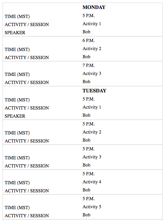
I am building a responsive table and am not having any luck getting it to stack the way I need it to. I've attached a screenshot of what I would like it to do and a link to what I have so far.
Thank you for any help you can give me.
http://offers.premierinc.com/table-delete_table-delete.html


 1 Correct answer

Try the code below, based on the Codepen example. I think that is what you want.
There are some non-breaking spaces in the code - & nbsp; (make sure you ajoin the & and n ( ) - Forum wont show non-breaking spaces.
<!DOCTYPE >
<html>
<head>
<meta charset="UTF-8" />
<title>Timetable</title>
<style>
.timetable {
border-collapse: collapse;
border: 1px solid #000;
width: 60%;
margin: 0 auto;
}
.timetable td {
font-family: helvetica;
border: 1px solid #000;
padding: 10px;
background-color: #f2f2f2;
}
.desktop th {
font-fa
...
 10
Replies
10
10
Replies
10

Copy link to clipboard
Copied
I didn't style it very elaborately, but check this out on a small device:
Copy link to clipboard
Copied
Hi!
Thank you very much you figured out how to get them to stack!! One question though. How can I bump up the "TIME (MST)" to the line above and show the text "SPEAKER"? Seems like it's trying to compensate for the MONDAY and TUESDAY. You can see in the screenshot. Thank you thank you!!

Copy link to clipboard
Copied
This one should also work Responsive Table Demo
Copy link to clipboard
Copied
I'll just quickly address Aiizaku's comment. There is nothing wrong with using tables for data. That's what they are intend for. You just need to keep your code clean and "small" as possible. CSS can do the rest.
Since Ben Pleysier chimed in, I'll bow out of this discussion before it turns irrelevant. I'm sure Ben can fix you up just fine. If, however, you are interested in my example, feel free to contact me off the forum. I'm easy to find.
Copy link to clipboard
Copied
I am sorry that ALsp has left you in the lurch because of me. I'll therefore go ahead to explain his code based on his extension that can be found at PVII Mobile-Friendly Tables for Dreamweaver
If you have a look at the code:

the second row should be similar to the first, leaving out the first cell, namely
<tr class=" makeit_rwd_block_odd ">
<td colspan="1" data-th="TIME (MST)" data-mft-header="TIME (MST)">6 P.M.</td>
<td colspan="1" data-th="ACTIVITY / SESSION" data-mft-header="ACTIVITY / SESSION"><span>Activity 2</span></td>
<td data-th="SPEAKER" data-mft-header="SPEAKER"><span>Bob</span></td>
</tr>
All of this is not necessary if you purchase the extension, this will prompt you into using the correct method.
Copy link to clipboard
Copied
Hi Ben!
Thank you for your help and your example. I see what you are saying. I have tried to install his extension manager but am running into issues. I will revisit and see why in a few. The issue I am having is being able to have all the "monday items to fall under monday" if that makes sense. I looked on github for over an hour and found nothing with that option.
I deleted my original code link but put it back up. I would think it's a matter of how I have the rows and columns grouped?
http://offers.premierinc.com/table-delete_table-delete.html
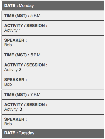
This one was photoshopped.
Copy link to clipboard
Copied
Try the code below, based on the Codepen example. I think that is what you want.
There are some non-breaking spaces in the code - & nbsp; (make sure you ajoin the & and n ( ) - Forum wont show non-breaking spaces.
<!DOCTYPE >
<html>
<head>
<meta charset="UTF-8" />
<title>Timetable</title>
<style>
.timetable {
border-collapse: collapse;
border: 1px solid #000;
width: 60%;
margin: 0 auto;
}
.timetable td {
font-family: helvetica;
border: 1px solid #000;
padding: 10px;
background-color: #f2f2f2;
}
.desktop th {
font-family: helvetica;
text-align: left;
background-color: #000;
color: #fff;
padding: 10px;
}
.mobile {
display: none;
}
.timetable .border_none {
border-bottom: 1px solid #f2f2f2;!important
}
@media screen and (max-width: 768px) {
table, thead, tbody, th, td, tr {
display: block;
}
.display-none {
display: none;
}
.mobile {
display: block;
}
.mobile th {
font-family: helvetica;
text-align: left;
background-color: #666;
color: #fff;
padding: 10px;
}
tr {
margin: 0 0 0 0;
}
tr:nth-child(odd) {
background: #ccc;
}
.timetable td {
border: none;
border-bottom: 1px solid #eee;
position: relative;
padding-top: 6px;
padding-bottom: 6px;
padding-left: 50%;
background-color: transparent;
}
.timetable td:before {
position: absolute;
top: 0;
left: 6px;
width: 45%;
padding-right: 10px;
padding-top: 6px;
white-space: nowrap;
}
td:nth-of-type(2):before { content: "Time (MST)"; }
td:nth-of-type(3):before { content: "Activity/Session"; }
td:nth-of-type(4):before { content: "Speaker"; }
}
</style>
</head>
<body>
<table class="timetable">
<tr class="mobile">
<th>Day: Monday</th>
</tr>
<tr class="display-none desktop">
<th class="display-none ">Date</th>
<th>Time</th>
<th>Activity/Session</th>
<th>Speaker</th>
</tr>
<tr>
<td class="display-none border_none">& nbsp;</td>
<td>5pm</td>
<td>Activity 1</td>
<td>Bob</td>
</tr>
<tr>
<td class="border_none display-none">Monday</td>
<td>6pm</td>
<td>Activity 2</td>
<td>Bob</td>
</tr>
<tr>
<td class="display-none">& nbsp;</td>
<td>7pm</td>
<td>Activity 3</td>
<td>Bob</td>
</tr>
<tr class="mobile">
<th>Day: Tuesday</th>
</tr>
<tr>
<td class="display-none border_none">& nbsp;</td>
<td>5pm</td>
<td>Activity 1</td>
<td>Bob</td>
</tr>
<tr>
<td class="display-none border_none">& nbsp;</td>
<td>5pm</td>
<td>Activity 2</td>
<td>Bob</td>
</tr>
<tr>
<td class="border_none display-none">Tuesday</td>
<td>5pm</td>
<td>Activity 3</td>
<td>Bob</td>
</tr>
<tr>
<td class="display-none border_none">& nbsp;</td>
<td>5pm</td>
<td>Activity 4</td>
<td>Bob</td>
</tr>
<tr>
<td class="display-none border_none">& nbsp;</td>
<td>5pm</td>
<td>Activity 5</td>
<td>Bob</td>
</tr>
<tr>
<td class="display-none">& nbsp;</td>
<td>5pm</td>
<td>Activity 1</td>
<td>Bob</td>
</tr>
</table>
</body>
</html>
Copy link to clipboard
Copied
Hey osgood!!!
Thank you for your help. Yours works perfectly. I just posted a fix myself as well. Yours is cleaner code though:)
And... I like how you got this to stay when responsive.
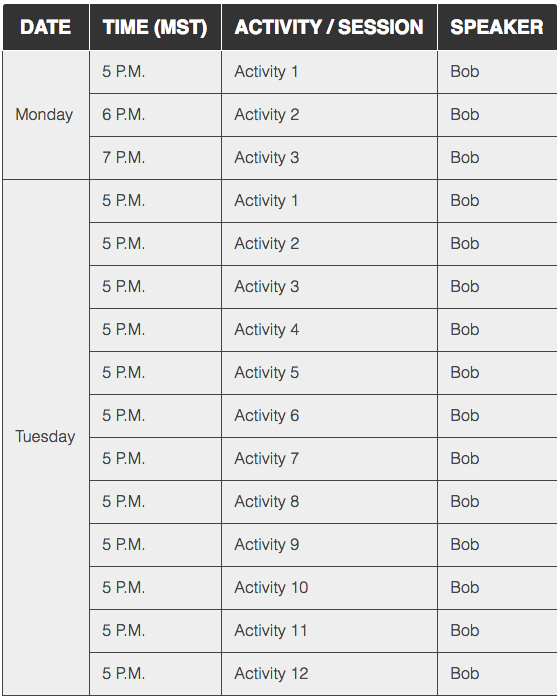
| DATE | TIME (MST) | ACTIVITY / SESSION | SPEAKER |
|---|
Mine gets lost. Is there a way I can incorporate that back into the current code I have like you did?

Copy link to clipboard
Copied
You will get more flexiblity by making this into a <div> <li> or using Media queue w/ a CSS Grid system. Tables are not responsive by nature.
However you can add CSS overflow to the table which will contain the content in a box and add a scroll feature.
<div style="overflow-x:auto;">
<table>
...
</table>
</div>
Copy link to clipboard
Copied
Thanks for all your help everyone! I ended up using rowspans to get it to work. So in order to get the three events to drop under Monday I did something like this:
<tr>
<th scope="row" rowspan="3">Wednesday <br>March 6</th>
<td>12:00 – 5:30 PM</td>
<td width="35%">Optional Golf Round (By Registration)</td>
</tr>
<tr>
<td>6:00 – 6:30 PM</td>
<td>Welcome / Opening Remarks</td>
<td width="35%">Michael J. Alkire, Chief Operating Officer, Premier</td>
</tr>
<tr>
<td style="background-color:#ebecee">6:30 – 8:30 PM</td>
<td style="background-color:#ebecee">Networking Reception / Dinner</td>
<td width="35%" style="border-left: 0px;background-color:#ebecee"></td>
</tr>
Check it out here:
http://offers.premierinc.com/table-delete_table-delete.html
I would like to figure out how to keep this visible on mobile though...
| DATE | TIME (MST) | ACTIVITY / SESSION | SPEAKER |
|---|
 AdChoices