 Adobe Community

Copy link to clipboard
Copied
Hi,
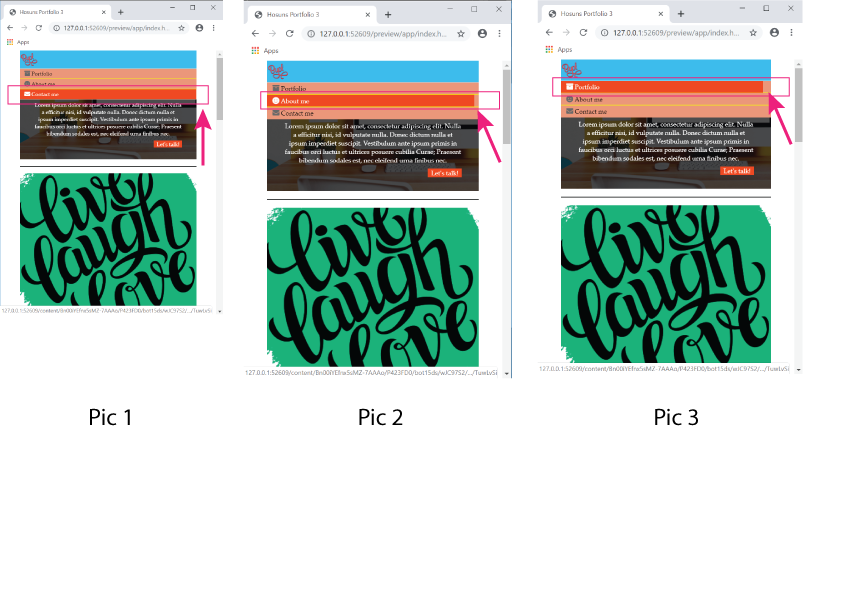
I am making a hamburger menu.
Upon hover, "orange" doesn't snap to "salmon", as seen in Pic 2 and Pic 3.
How can I make it happen?
Hosun Kang


 1 Correct answer

the A tag is an inline TAG, so the hover state just reflect the only string content of it... one of the approach that could fill up all the available space of the parent container, will be to change the display of the A Tag... using a display inline-block, or block value could do the job
an other approach will be to move the :hover pseudo element on th LI Tag instead of keeping it on the A Tag only
 7
Replies
7
7
Replies
7
Copy link to clipboard
Copied
the A tag is an inline TAG, so the hover state just reflect the only string content of it... one of the approach that could fill up all the available space of the parent container, will be to change the display of the A Tag... using a display inline-block, or block value could do the job
an other approach will be to move the :hover pseudo element on th LI Tag instead of keeping it on the A Tag only
Copy link to clipboard
Copied
Hi,
Thank you very much for your reply.
I have one more question.
What is ul li a:focus ? (It makes no difference with or without it.)
ul li a:hover,
ul li a:focus {
color: white;
background-color: orangered;
}
Hosun Kang

Copy link to clipboard
Copied
That is looking a bit of a mess at the moment and I'm sure you will run into issues further on. Can I suggest a bit of a clean up:
Replace your 'header' section with the 'header' section code below:
<header class="header">
<div class="logo">
<img src="images/byol-logo.png" alt="logo">
<div class="hamburger"><i class="fas fa-bars"></i></div>
</div>
<nav class="site-nav">
<ul>
<li><a href="#"><i class="fas fa-archive"></i>Portfolio</a></li>
<li><a href="#"><i class="fas fa-smile"></i>About me</a></li>
<li><a href="#"><i class="fas fa-envelope"></i>Contact me</a></li>
</ul>
</nav>
</header>
Remove any existing css which relates to the 'header and site-nav' section and use the css below:
.header {
display: flex;
justify-content: space-between;
align-items: center;
flex-wrap: wrap;
background-color: deepskyblue;
margin: 0% 1%;
padding: 7px 0;
}
.logo {
margin-left: 20px;
}
.hamburger {
margin-left: auto;
display: none;
color: #fff;
}
.site-nav ul {
display: flex;
margin: 0;
padding: 0;
}
.site-nav li {
display: flex;
list-style: none;
margin: 0;
padding: 0 15px;
}
.site-nav a {
display: block;
padding: 0 2px;
color: black;
text-decoration: none;
}
.site-nav a:hover {
color: white;
background-color: orangered;
}
.site-nav a i {
color: dimgray;
margin-right: 5px;
}
.site-nav a:hover i {
color: white;
}
@media screen and (max-width: 500px) {
.header {
padding: 7px 0 0 0;
}
.logo {
display: flex;
align-items: center;
width: 100%;
padding: 5px 15px;
margin: 0;
}
.logo img {
width: 40px;
}
.hamburger {
display: block;
}
.site-nav {
background-color: darksalmon;
width: 100%;
}
.site-nav ul {
flex-direction: column;
}
.site-nav li {
padding: 0;
}
.site-nav a {
font-size: 14px;
padding: 10px 15px;
width: 100%;
border-bottom: 1px solid yellow;
}
At this point you should be in a good position to hide the 'site-nav' section in the 500px media query and apply some scripting to the hamburger icon to show it on click.
Copy link to clipboard
Copied
Just incase you are having problems below is the complete page code plus the revised css.
<!doctype html>
<html>
<head>
<meta charset="utf-8">
<title>Hosuns Portfolio 3</title>
<style>
* {
margin: 0px;
padding: 0px;
box-sizing: border-box;
}
/*Desktop Global View*/
body {
font-family:Baskerville, "Palatino Linotype", Palatino, "Century Schoolbook L", "Times New Roman", "serif";
margin: 0px 40px;
}
.header {
display: flex;
justify-content: space-between;
align-items: center;
flex-wrap: wrap;
background-color: deepskyblue;
margin: 0% 1%;
padding: 7px 0;
}
.logo {
margin-left: 20px;
}
.hamburger {
margin-left: auto;
display: none;
color: #fff;
}
.site-nav ul {
display: flex;
margin: 0;
padding: 0;
}
.site-nav li {
display: flex;
list-style: none;
margin: 0;
padding: 0 15px;
}
.site-nav a {
display: block;
padding: 0 2px;
color: black;
text-decoration: none;
}
.site-nav a:hover {
color: white;
background-color: orangered;
}
.site-nav a i {
color: dimgray;
margin-right: 5px;
}
.site-nav a:hover i {
color: white;
}
.box1 {
background-color: palegreen;
padding: 16px 32px 26px 32px;
background-image: url(images/hero-background.jpg);
background-size: cover; /*responsiveness*/
color: white;
margin: 1%;
}
.box2 {
margin-top: 16px;
}
.box2 a {
text-decoration: none;
color: white;
background-color: orangered;
padding: 0px 6px;
}
.box2 a:hover {
color: orangered;
background-color: white;
}
h2 {
font-weight: 300;
}
p {
font-size: 13px;
margin-top: 6px;
}
.thumbnails {
display: flex;
flex-wrap: wrap;
justify-content: space-between;
border-top: 1px solid #000;
border-bottom: 1px solid #000;
padding: 15px 0 0 0;
margin: 15px 1% 15px 1%;
}
.thumbnails img {
max-width: 100%;
height: auto;
display: block;
}
.thumbnails div {
width: 32%;
margin: 0 0 15px 0;
}
.footnote {
text-align: center;
}
/*Tablet View*/
@media (max-width: 1024px) {
.box1 {
text-align: center;
}
.box2 {
display: flex;
justify-content: flex-end;
}
.thumbnails {
padding: 15px 0 0 0;
margin: 15px 1% 15px 1%;
}
.thumbnails div {
width: 48%;
}
}
/*Mobile View*/
@media (max-width: 500px) {
.header {
padding: 7px 0 0 0;
}
.logo {
display: flex;
align-items: center;
width: 100%;
padding: 5px 15px;
margin: 0;
}
.logo img {
width: 40px;
}
.hamburger {
display: block;
}
.site-nav {
background-color: darksalmon;
width: 100%;
}
.site-nav ul {
flex-direction: column;
}
.site-nav li {
padding: 0;
}
.site-nav a {
font-size: 14px;
padding: 10px 15px;
width: 100%;
border-bottom: 1px solid yellow;
}
.box1 {
font-size: 10px;
}
.box1 P {
font-size: 12px;
}
.box2 {
margin-top: 8px;
}
.box2 a {
font-size: 12px;
}
.thumbnails div {
width: 100%;
}
}
</style>
<link rel="stylesheet" href="https://use.fontawesome.com/releases/v5.8.1/css/all.css" integrity="sha384-50oBUHEmvpQ+1lW4y57PTFmhCaXp0ML5d60M1M7uH2+nqUivzIebhndOJK28anvf" crossorigin="anonymous">
</head>
<body>
<header class="header">
<div class="logo">
<img src="images/byol-logo.png" alt="logo">
<div class="hamburger"><i class="fas fa-bars"></i></div>
</div>
<nav class="site-nav">
<ul>
<li><a href="#"><i class="fas fa-archive"></i>Portfolio</a></li>
<li><a href="#"><i class="fas fa-smile"></i>About me</a></li>
<li><a href="#"><i class="fas fa-envelope"></i>Contact me</a></li>
</ul>
</nav>
</header>
<main>
<div class="box1">
<h1>I'M A</h1>
<h2>Digital Designer</h2>
<p>Lorem ipsum dolor sit amet, consectetur adipiscing elit. Nulla a efficitur nisi, id vulputate nulla. Donec dictum nulla et ipsum imperdiet suscipit. Vestibulum ante ipsum primis in faucibus orci luctus et ultrices posuere cubilia Curae; Praesent bibendum sodales est, nec eleifend urna finibus nec.</p>
<div class="box2"><a href="#">Let's talk!</a></div>
</div>
<section class="thumbnails">
<div><img src="images/thumbnail1-love.png" alt="pic1"></div>
<div><img src="images/thumbnail2-office.jpg" alt="pic2"></div>
<div><img src="images/thumbnail3-dan.jpg" alt="pic3"></div>
<div><img src="images/thumbnail4-beer.jpg" alt="pic4"></div>
<div><img src="images/thumbnail5-report.png" alt="pic5"></div>
<div><img src="images/thumbnail6-indesign.png" alt="pic6"></div>
</section>
<div class="footnote">
<p class="fn1">Lorem ipsum dolor sit amet, <a href="example.pdf">consectetur</a> adipiscing elit. Nulla a efficitur nisi, id vulputate nulla. Donec dictum nulla et ipsum imperdiet suscipit. <a href="https://#" target="_blank">Vestibulum</a> ante ipsum primis in faucibus orci luctus et ultrices posuere cubilia Curae; Praesent bibendum sodales est, nec eleifend urna finibus nec.</p>
<p class="fn2">2019 | <a href="#" data-tool-tip="Bring Your Own Laptop">BYOL</a></p>
</div>
</main>
</body>
</html>
Copy link to clipboard
Copied
Hi,
Thank you very much for your info.
That was my issue, which was very difficult to explain with a few words.
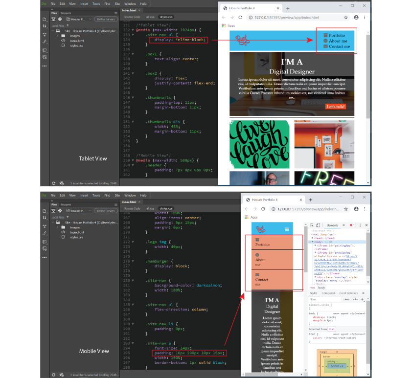
I think I encounter the same problem again.
In Tablet View, I set
display: inline-block;
to make "ul" in a column.
In Mobile View, there was a problem and I adjusted padding.
But there was a problem, as seen in the picture below.
How would I do?
Hosun Kang
Copy link to clipboard
Copied
In your 500px media query add the property marked in red below:
.site-nav ul {
flex-direction: column;
width: 100%;
}
Also in that media query I'm not sure why you have a right padding of 290px set on the anchor tag:
.site-nav a {
font-size: 14px;
padding: 10px 290px 10px 15px;
width: 100%;
border-bottom: 1px solid black;
}
Just set it to 15px, the same as the left-padding:
.site-nav a {
font-size: 14px;
padding: 10px 15px 10px 15px;
width: 100%;
border-bottom: 1px solid black;
}

Copy link to clipboard
Copied
Hover is mouse over and only works on devices that have a mouse.
Active is when the user clicks or taps the element. It usually reverts to the orginal state when released.
Focus is when a user reaches an element with the keyboard tab key. The element is said to be in focus.
Alt-Web Design & Publishing ~ Web : Print : Graphics : Media
 AdChoices