 Adobe Community
- Home
- Dreamweaver
- Discussions
- pseudo elements [How to tweak CSS properties to la...
- pseudo elements [How to tweak CSS properties to la...

Copy link to clipboard
Copied
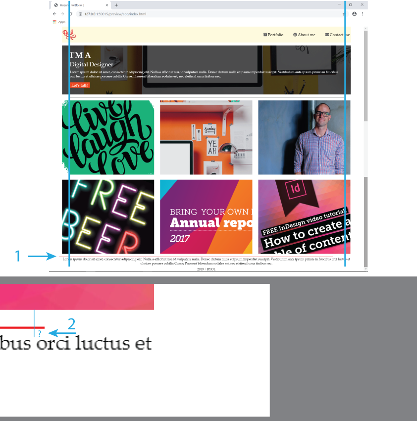
Hi,
I drew two lines (black and red) as pseudo elements.
1.
How would I move the red line to the center?
For the black line, I didn't do anything for it.
2.
With the red line, there is a difference to the photo and to the text.
I gave "margin-top" to .footnote and .fn1, but it didn't work.
How would I shift the text down?
Hosun Kang


 1 Correct answer

It's much cleaner to wrap your thumbnail images in a 'section' element:
<section class="thumbnails">
<div><img src="images/thumbnail1-love.png" alt="pic1"></div>
<div><img src="images/thumbnail2-office.jpg" alt="pic2"></div>
<div><img src="images/thumbnail3-dan.jpg" alt="pic3"></div>
<div><img src="images/thumbnail4-beer.jpg" alt="pic4"></div>
<div><img src="images/thumbnail5-report.png" alt="pic5"></div>
<div><img src="images/thumbnail6-indesign.png" alt="pic6"></div>
</section>
Then use the css below t
...
 6
Replies
6
6
Replies
6

Copy link to clipboard
Copied
I odn't understand what you're trying to do. Have you never heard of the CSS border property?
<!doctype html>
<html>
<head>
<meta charset="utf-8">
<title>Untitled Document</title>
<style>
.top-border {
border-top: 2px solid red;
}
.bottom-border {
border-bottom: 2px dotted #555;
}
</style>
</head>
<body>
<div class="top-border">
<p>This is a division with a solid red top border.</p>
</div>
<div class="bottom-border">
<p>This is a division with a dotted bottom border.</p>
</div>
</body>
</html>
Alt-Web Design & Publishing ~ Web : Print : Graphics : Media
Copy link to clipboard
Copied
It's much cleaner to wrap your thumbnail images in a 'section' element:
<section class="thumbnails">
<div><img src="images/thumbnail1-love.png" alt="pic1"></div>
<div><img src="images/thumbnail2-office.jpg" alt="pic2"></div>
<div><img src="images/thumbnail3-dan.jpg" alt="pic3"></div>
<div><img src="images/thumbnail4-beer.jpg" alt="pic4"></div>
<div><img src="images/thumbnail5-report.png" alt="pic5"></div>
<div><img src="images/thumbnail6-indesign.png" alt="pic6"></div>
</section>
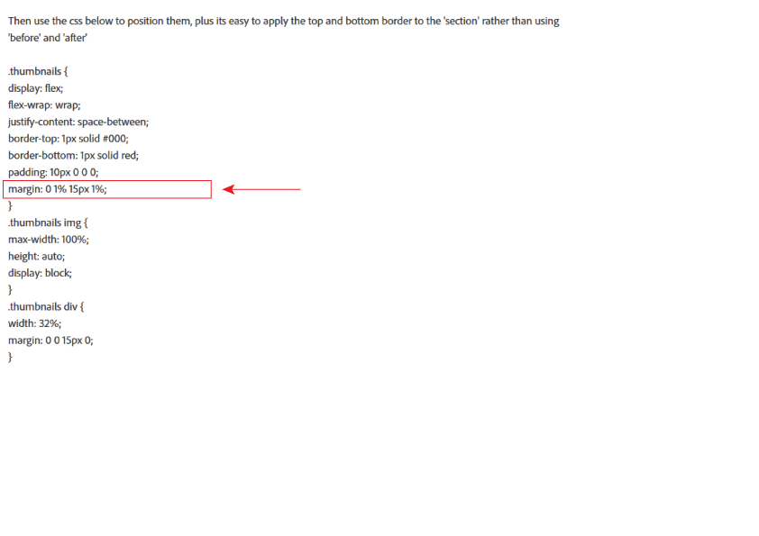
Then use the css below to position them, plus its easy to apply the top and bottom border to the 'section' rather than using 'before' and 'after'
.thumbnails {
display: flex;
flex-wrap: wrap;
justify-content: space-between;
border-top: 1px solid #000;
border-bottom: 1px solid red;
padding: 10px 0 0 0;
margin: 0 1% 15px 1%;
}
.thumbnails img {
max-width: 100%;
height: auto;
display: block;
}
.thumbnails div {
width: 32%;
margin: 0 0 15px 0;
}
/*Tablet View*/
@media (max-width: 1024px) {
.thumbnails div {
width: 48%;
}
}
/*Mobile View*/
@media (max-width: 500px) {
.thumbnails div {
width: 100%;
}
}
Copy link to clipboard
Copied
Hi,
Thank you very much for very useful tips every time.
I have one more question.
In your instruction below, why 1%? not px for measurement unit.
Hosun Kang
Copy link to clipboard
Copied
Hosun wrote
I have one more question.
In your instruction below, why 1%? not px for measurement unit.
I've just applied the same margin as you have applied on box1, so all the containers are equal width.
.box1 {
background-color: palegreen;
padding: 16px 32px 26px 32px;
background-image: url(images/hero-background.jpg);
background-size: cover; /*responsiveness*/
color: white;
margin: 1%;
}
Copy link to clipboard
Copied
Another option is the horizontal rule or <hr> tag. A line used to visually divide elements.
How To Style the HR Element with CSS
Alt-Web Design & Publishing ~ Web : Print : Graphics : Media
Copy link to clipboard
Copied
As a Creative Cloud member, you have a free Adobe Portfolio website available to you. It's hosted on Adobe's servers so there are no hosting or maintenance fees to worry about. It's responsive and no coding skills required. I mention this because what you're struggling with now in Dreamweaver is nearly identical to what Adobe Portfolio provides out of the box.

It's so simple to use, you can showcase your work online in minutes rather than days, weeks or months.
Adobe Portfolio | Build your own personalized website
- Just log-in at the URL above with with your Adobe ID and password.
- Pick a Layout Theme.
- Add some pages, content, images, videos, etc...
- Hit the Publish / Update Live Site button and you are done.
- With one click, you can share your Portfolio projects with your Behance page, another online venue for creatives. Behance
Alt-Web Design & Publishing ~ Web : Print : Graphics : Media
 AdChoices